this post was submitted on 18 Dec 2024
846 points (98.5% liked)

Comic Strips

23272 readers
1163 users here now

Comic Strips is a community for those who love comic stories.

Rules
  1. πŸ˜‡ Be Nice!

    • Treat others with respect and dignity. Friendly banter is okay, as long as it is mutual; keyword: friendly.
  2. 🏘️ Community Standards

    • Comics should be a full story, from start to finish, in one post.
    • Posts should be safe and enjoyable by the majority of community members, both here on lemmy.world and other instances.
    • Any comic that would qualify as raunchy, lewd, or otherwise draw unwanted attention by nosy coworkers, spouses, or family members should be tagged as NSFW.
    • Moderators have final say on what and what does not qualify as appropriate. Use common sense, and if need be, err on the side of caution.
  3. 🧬 Keep it Real

    • Comics should be made and posted by real human beans, not by automated means like bots or AI. This is not the community for that sort of thing.
  4. πŸ“½οΈ Credit Where Credit is Due

    • Comics should include the original attribution to the artist(s) involved, and be unmodified. Bonus points if you include a link back to their website. When in doubt, use a reverse image search to try to find the original version. Repeat offenders will have their posts removed, be temporarily banned from posting, or if all else fails, be permanently banned from posting.
    • Attributions include, but are not limited to, watermarks, links, or other text or imagery that artists add to their comics to use for identification purposes. If you find a comic without any such markings, it would be a good idea to see if you can find an original version. If one cannot be found, say so and ask the community for help!
  5. πŸ“‹ Post Formatting

    • Post an image, gallery, or link to a specific comic hosted on another site; e.g., the author's website.
    • Meta posts about the community should be tagged with [Meta] either at the beginning or the end of the post title.
    • When linking to a comic hosted on another site, ensure the link is to the comic itself and not just to the website; e.g.,
      βœ… Correct: https://xkcd.com/386/
      ❌ Incorrect: https://xkcd.com/
  6. πŸ“¬ Post Frequency/SPAM

    • Each user (regardless of instance) may post up to five (5 πŸ–) comics a day. This can be any combination of personal comics you have written yourself, or other author's comics. Any comics exceeding five (5 πŸ–) will be removed.
  7. πŸ΄β€β˜ οΈ Internationalization (i18n)

    • Non-English posts are welcome. Please tag the post title with the original language, and include an English translation in the body of the post; e.g.,
      SΓ­, por favor [Spanish/EspaΓ±ol]
  8. 🍿 Moderation

    • We are human, just like most everybody else on Lemmy. If you feel a moderation decision was made in error, you are welcome to reach out to anybody on the moderation team for clarification. Keep in mind that moderation decisions may be final.
    • When reporting posts and/or comments, quote which rule is being broken, and why you feel it broke the rules.
Web of Links

founded 2 years ago
MODERATORS
846
beeherhe (lemmy.world)
submitted 1 year ago* (last edited 1 year ago) by paxen@lemmy.world to c/comicstrips@lemmy.world
 
top 50 comments
sorted by: hot top controversial new old
[–] milliams@lemmy.world 52 points 1 year ago (1 children)

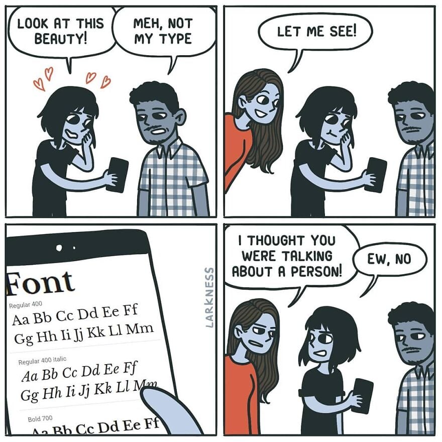
It's a good job they explained the joke.

[–] can@sh.itjust.works 27 points 1 year ago (3 children)

Wasn't there some theory about comics being improved by removing the final panel?

[–] dubyakay@lemmy.ca 10 points 1 year ago (1 children)

Definitely. I was going to post this:

Remove 4th panel.

[–] ChaoticNeutralCzech@feddit.org 8 points 1 year ago* (last edited 1 year ago) (2 children)
[–] tweeks@feddit.nl 5 points 1 year ago

The "ew" saved it.

load more comments (1 replies)
load more comments (2 replies)
[–] sxan@midwest.social 32 points 1 year ago (3 children)

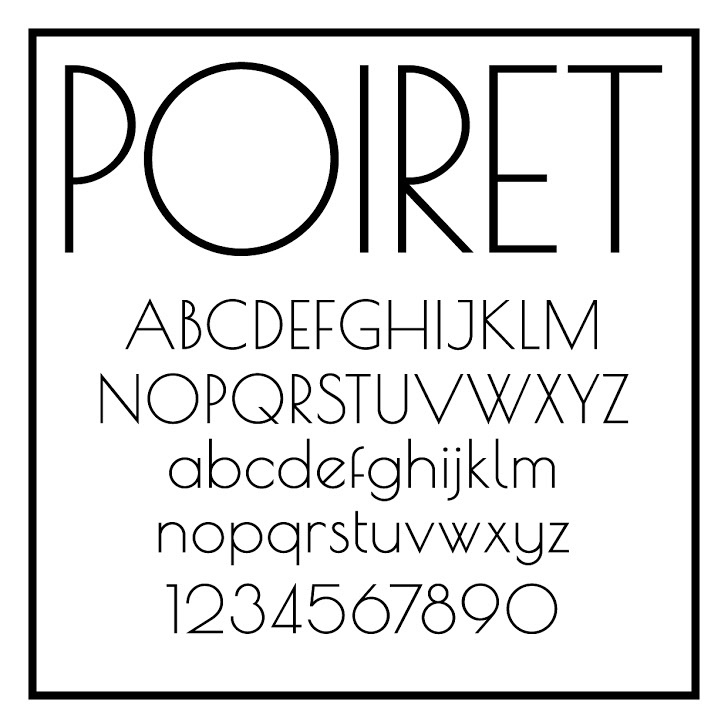
The most beautiful font ever. Although, this Metropolis is pretty nice, too.

[–] Nelots@lemm.ee 26 points 1 year ago (5 children)

Love the lowercase, hate the uppercase. Look at what they did to my boy B.

[–] sxan@midwest.social 5 points 1 year ago (1 children)

I really love the numbers, though.

I've discovered that it's a horrible screen font, though: far too spindly to be easily readable. I still use it, but I have to make it larger than usual and bold, and it's still a little hard to make out sometimes.

Oh, what we sacrifice for aesthetics.

[–] Nelots@lemm.ee 3 points 1 year ago (1 children)

0 seems a bit too indistinguishable from O, but otherwise I'm also a big fan of the numbers.

load more comments (1 replies)
load more comments (4 replies)
[–] surewhynotlem@lemmy.world 8 points 1 year ago (1 children)

I have the urge to drink martini and rewatch The Great Gatsby.

[–] sxan@midwest.social 4 points 1 year ago (1 children)

And Jeeves & Wooster, and Poirot.

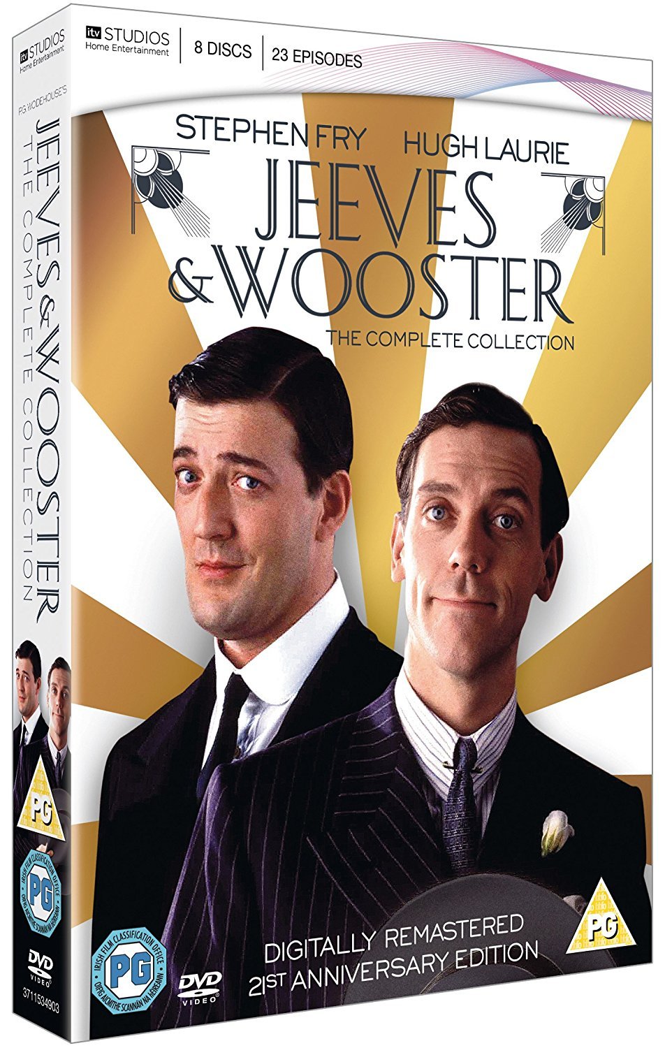
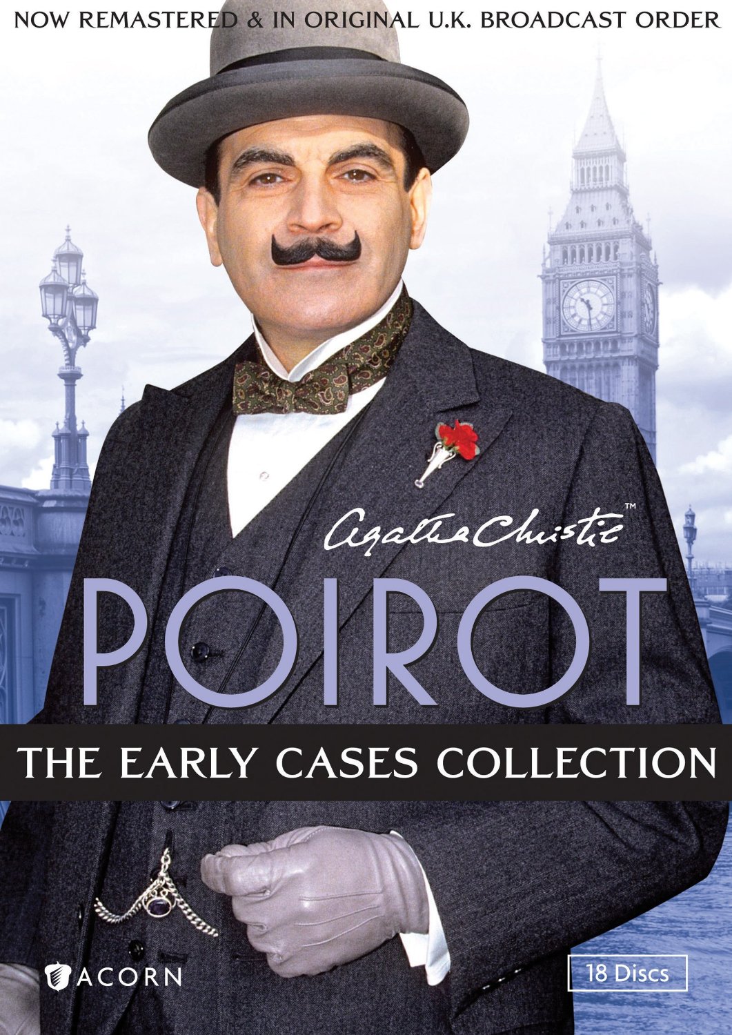
Poirot is obviously the inspiration here, in style and name.

load more comments (1 replies)
[–] pseudo@jlai.lu 3 points 1 year ago (1 children)

This has an art nouveau feeling.

[–] sxan@midwest.social 4 points 1 year ago

I'd say Art Deco, Art Nouveau's successor, but obviously there aren't fine lines between them.

When I think Art Nouveau, I think wavy, curvy script; everything was just a little psychedelic in Art Nouveau.

1920's, in any case.

[–] samus12345@lemm.ee 26 points 1 year ago (2 children)
[–] lugal@sopuli.xyz 21 points 1 year ago (2 children)

Wait, is this Comic Sans? Some just want to see the internet burn

[–] weker01@sh.itjust.works 13 points 1 year ago (2 children)

I feel like the comic sans hate did die down in recent years and justly so. It was overhated IMHO. It's an ok font for certain uses. The problem was mostly people misusing it to serve roles it was never designed for.

[–] eighty@lemmy.one 5 points 1 year ago (1 children)

I saw a meme where it was "big brain" to use it for their IDE/notepad so I tried it out and my god it's not even funny how legible and easy on the eye it is.

[–] LunarLoony@lemmy.sdf.org 6 points 1 year ago (1 children)

They're good, but I find both to be marginally less legible than Source Code Pro where the i and j are clearer, particularly when next to each other. The a is less clear in Source Code Pro though, so I'm still looking for the perfect font.

[–] pseudo@jlai.lu 4 points 1 year ago

It will look good in a children story-book. Not in a professional email.

[–] leftzero@lemmynsfw.com 3 points 1 year ago

Sure, but we use Papyrus, not Comic Sans.

[–] BudgetBandit@sh.itjust.works 13 points 1 year ago (1 children)

I know a person who professionally does something with text. She made it her mission to format every single email in ComicSans, bold, italic, red, centered.

[–] garbagebagel@lemmy.world 6 points 1 year ago (1 children)

See that's funny. My boss using comic sans light blue for emails explaining highly technical shit to non-technical users? Funny in theory, absolutely not in action.

load more comments (1 replies)
[–] rustydrd@sh.itjust.works 20 points 1 year ago (1 children)
[–] Tiefkuehlkost@feddit.org 21 points 1 year ago (4 children)

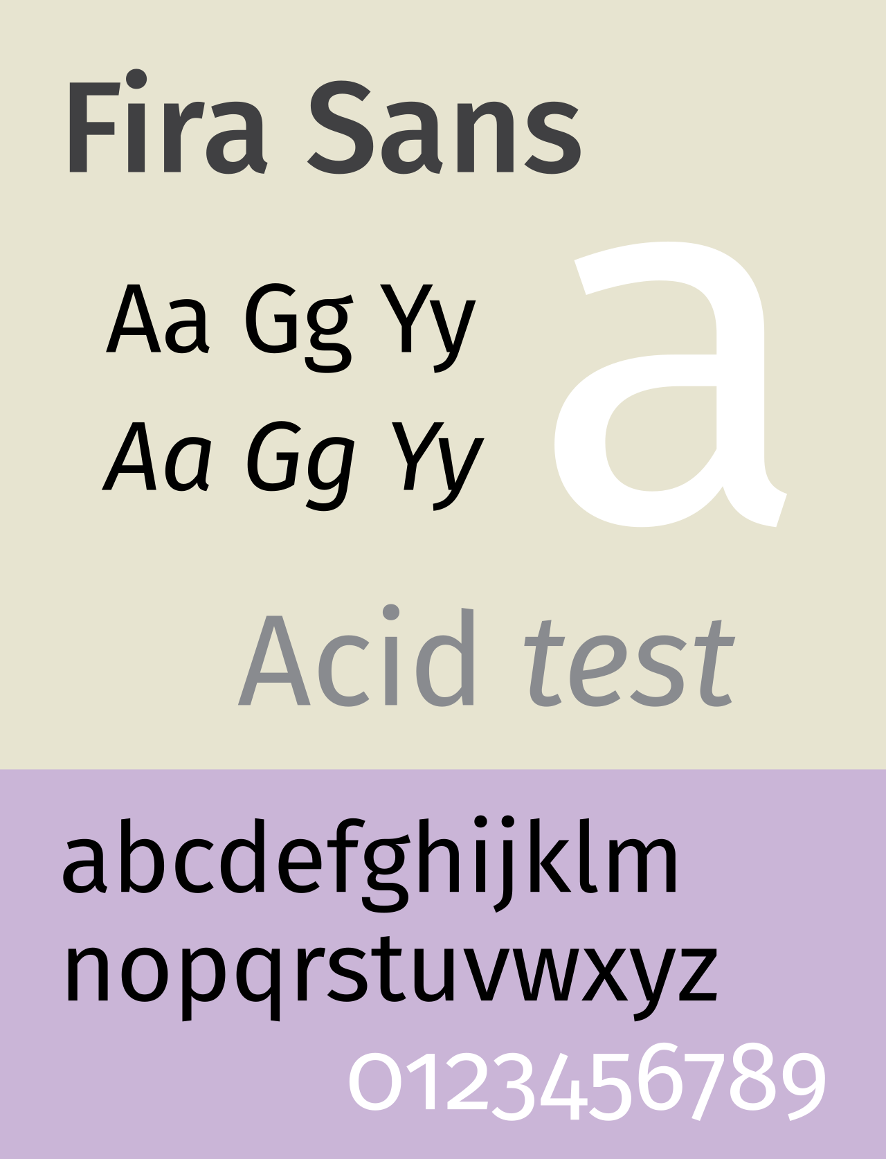
Text looks good, but man the Number hight looks cursed and kinda random.

[–] pyre@lemmy.world 24 points 1 year ago* (last edited 1 year ago) (1 children)

they're called lowercase numbers and they're designed to look good in paragraph text. for example if you're reading this comment, mentioning the year 1997 suddenly puts four full height characters as if I typed one word in all caps, while in lowercase numbers it would look more like if I typed the word iggy (1 is x height while 9 and 7 have descenders like g and y).

they're not designed to be used in math or for longer number sequences. for that you have the full height (uppercase) numbers that most typeface should still have.

0123456789 in lowercase have the same heights as oizgjpbyfq - just as random as that word's letter heights are. which is not random at all, you're just not supposed to use it like that.

[–] Tiefkuehlkost@feddit.org 11 points 1 year ago (1 children)

Oh that makes sense, thanks for the information. Still would not want to use something thats not universal.

[–] pyre@lemmy.world 5 points 1 year ago (2 children)

idk what you mean by universal; this is a typographical choice. the only reason you see more uppercase numbers everywhere is because of typewriters and by extension computers. I don't think people make a point of lining numbers up with cap height in handwriting.

load more comments (2 replies)
[–] pseudo@jlai.lu 4 points 1 year ago* (last edited 1 year ago) (2 children)

Their shape is beautiful (from 3 to 9) but why were they not written on the same line?

[–] pyre@lemmy.world 4 points 1 year ago

lowercase numbers, check my comment above if you're interested

load more comments (1 replies)
load more comments (2 replies)
[–] finitebanjo@lemmy.world 17 points 1 year ago (1 children)

If your font type was a person:

GIMME AN A

They did, in fact, nail it.

[–] pennomi@lemmy.world 14 points 1 year ago (1 children)

I’m more of a sans serif kinda guy

load more comments (1 replies)
[–] Trantarius@lemmy.dbzer0.com 13 points 1 year ago

Atkinson hyperlegibile is hands down the best for reading ebooks. It was designed for visually impaired people, but it's also super easy on the eyes for everyone else. I read so much faster and more comfortably with this that I can't imagine using anything else.

[–] cerement@slrpnk.net 12 points 1 year ago

Baskerville

[–] odious@lemmy.world 8 points 1 year ago (1 children)
[–] TheRealKuni@lemmy.world 3 points 1 year ago

I like Ubuntu Mono but I’ll admit it’s a bit flashy for a code font.

Universal Grotesk

[–] superduperpirate@lemmy.world 7 points 1 year ago (1 children)

This would totally be Brick from The Middle

[–] Dagnet@lemmy.world 6 points 1 year ago (3 children)

ITC Avant Garde, so beautiful

load more comments (3 replies)
[–] fishbone@lemmy.dbzer0.com 6 points 1 year ago (6 children)

Verdana is my fucking jam. Good spacing and very legible at different font sizes. My only two gripes: Lower case "l" (L) being a straight line and the number 0 has no cross through it. Not major though, cause they're still pretty distinct from similar characters.

load more comments (6 replies)
[–] Agent641@lemmy.world 6 points 1 year ago (1 children)

Monaspace Krypton for coding. I'll take no questions.

load more comments (1 replies)
[–] gmtom@lemmy.world 6 points 1 year ago

The subtle kerning of it, the tasteful thickness of it, my god it's even got serifs.

[–] LunarLoony@lemmy.sdf.org 4 points 1 year ago (2 children)

Came across Junicode 2 recently, and wow, what a typeface!

load more comments (2 replies)
[–] Emerald@lemmy.world 4 points 1 year ago* (last edited 1 year ago)

My favorite font foundry is https://indestructibletype.com. Beautiful typefaces, open source, and many different weights. The designer also has some good sex ed videos on his YouTube channel.

[–] fckreddit@lemmy.ml 4 points 1 year ago (2 children)
load more comments (2 replies)
[–] dalekcaan@lemm.ee 3 points 1 year ago

Maybe a bit basic but I'm fond of Helvetica myself

load more comments
view more: next β€Ί