this post was submitted on 18 Dec 2024
846 points (98.5% liked)
Comic Strips
24349 readers
1842 users here now
Comic Strips is a community for those who love comic stories.
Rules
-
😇 Be Nice!
- Treat others with respect and dignity. Friendly banter is okay, as long as it is mutual; keyword: friendly.
-
🏘️ Community Standards
- Comics should be a full story, from start to finish, in one post.
- Posts should be safe and enjoyable by the majority of community members, both here on lemmy.world and other instances.
- Any comic that would qualify as raunchy, lewd, or otherwise draw unwanted attention by nosy coworkers, spouses, or family members should be tagged as NSFW.
- Moderators have final say on what and what does not qualify as appropriate. Use common sense, and if need be, err on the side of caution.
-
🧬 Keep it Real
- Comics should be made and posted by real human beans, not by automated means like bots or AI. This is not the community for that sort of thing.
-
📽️ Credit Where Credit is Due
- Comics should include the original attribution to the artist(s) involved, and be unmodified. Bonus points if you include a link back to their website. When in doubt, use a reverse image search to try to find the original version. Repeat offenders will have their posts removed, be temporarily banned from posting, or if all else fails, be permanently banned from posting.
- Attributions include, but are not limited to, watermarks, links, or other text or imagery that artists add to their comics to use for identification purposes. If you find a comic without any such markings, it would be a good idea to see if you can find an original version. If one cannot be found, say so and ask the community for help!
-
📋 Post Formatting
- Post an image, gallery, or link to a specific comic hosted on another site; e.g., the author's website.
- Meta posts about the community should be tagged with [Meta] either at the beginning or the end of the post title.
- When linking to a comic hosted on another site, ensure the link is to the comic itself and not just to the website; e.g.,
✅ Correct: https://xkcd.com/386/
❌ Incorrect: https://xkcd.com/
-
📬 Post Frequency/SPAM
- Each user (regardless of instance) may post up to five (5 🖐) comics a day. This can be any combination of personal comics you have written yourself, or other author's comics. Any comics exceeding five (5 🖐) will be removed.
-
🏴☠️ Internationalization (i18n)
- Non-English posts are welcome. Please tag the post title with the original language, and include an English translation in the body of the post; e.g.,
Sí, por favor [Spanish/Español]
- Non-English posts are welcome. Please tag the post title with the original language, and include an English translation in the body of the post; e.g.,
-
🍿 Moderation
- We are human, just like most everybody else on Lemmy. If you feel a moderation decision was made in error, you are welcome to reach out to anybody on the moderation team for clarification. Keep in mind that moderation decisions may be final.
- When reporting posts and/or comments, quote which rule is being broken, and why you feel it broke the rules.
Banned Artists
The following artists are banned from the community.
- Jago
- Stonetoss
- GPrime85
It should be noted that when you make reports, it is your responsibility to provide rational reasoning why something should be removed. Saying it simply breaks community rules is not always good enough.
Web Accessibility
Note: This is not a rule, but a helpful suggestion.
When posting images, you should strive to add alt-text for screen readers to use to describe the image you're posting:
Another helpful thing to do is to provide a transcription of the text in your images, as well as brief descriptions of what's going on. (example)
Web of Links
- !linuxmemes@lemmy.world: "I use Arch btw"
- !memes@lemmy.world: memes (you don't say!)
Other Comic Communities of Interest
- !bloomcounty@sopuli.xyz
- !calvinandhobbes@lemmy.world
- !cyanideandhappiness@discuss.online
- !exo@discuss.online
- !foxtrot@slrpnk.net
- !garfield@lemmy.world
- !moomin@sopuli.xyz
- !oglaf@discuss.online (NSFW)
- !outland@slrpnk.net
- !pbf@discuss.online
- !peanuts@discuss.online
- !smbc@discuss.online
- !theboondocks@slrpnk.net
- !thefarside@sh.itjust.works
founded 3 years ago
MODERATORS
you are viewing a single comment's thread
view the rest of the comments
view the rest of the comments
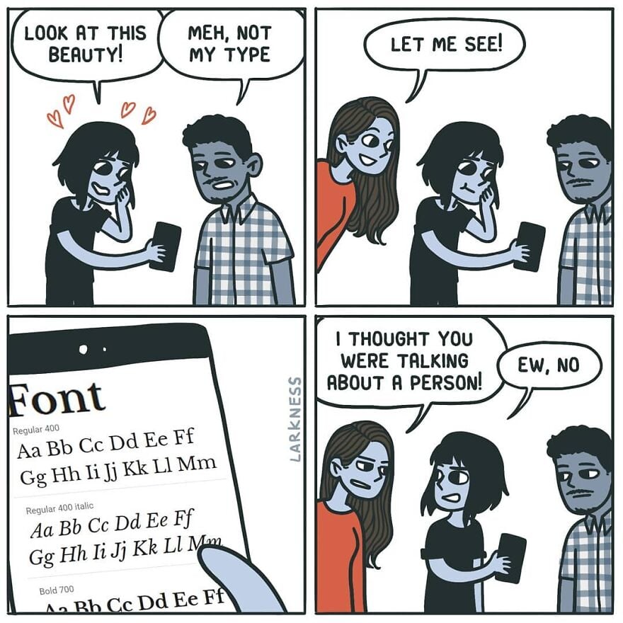
The most beautiful font ever. Although, this Metropolis is pretty nice, too.
Love the lowercase, hate the uppercase. Look at what they did to my boy B.
I really love the numbers, though.
I've discovered that it's a horrible screen font, though: far too spindly to be easily readable. I still use it, but I have to make it larger than usual and bold, and it's still a little hard to make out sometimes.
Oh, what we sacrifice for aesthetics.
0 seems a bit too indistinguishable from O, but otherwise I'm also a big fan of the numbers.
I think the font heavily reuses glyphs. 0 probably literally is the same glyph as O. I'm positive 9 is just a rotated 6 (I guess that's pretty common, although it's really obvious in Poiret).
You might enjoy Futura, the ITC Avant Garde Gothic family, or Century Gothic...
I love Century Gothic and most of Futura, though I'm not sure how I feel about Futura's lowercase j.
Gets the job done, with minimal effort.
What're you looking at?? His gut?? He's working on it!
I have the urge to drink martini and rewatch The Great Gatsby.
And Jeeves & Wooster, and Poirot.
Poirot is obviously the inspiration here, in style and name.
actually disappointed that poirot doesn't have that font
This has an art nouveau feeling.
I'd say Art Deco, Art Nouveau's successor, but obviously there aren't fine lines between them.
When I think Art Nouveau, I think wavy, curvy script; everything was just a little psychedelic in Art Nouveau.
1920's, in any case.