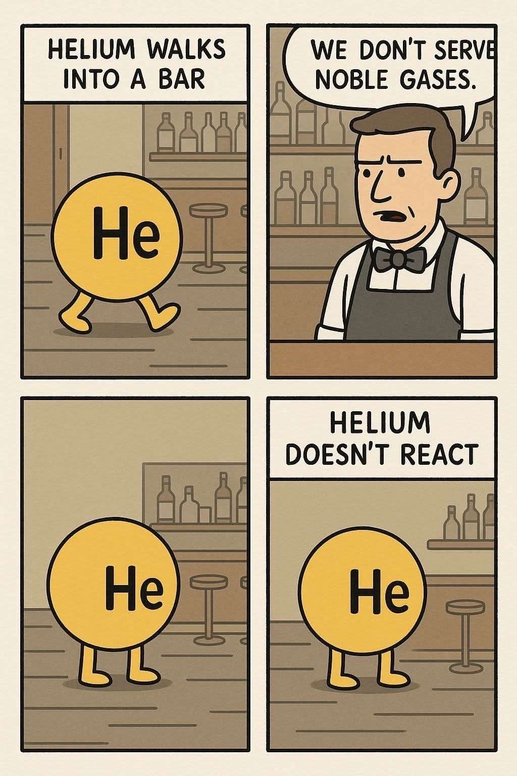
AI comic 😞
A place for majestic STEMLORD peacocking, as well as memes about the realities of working in a lab.
Rules
This is a science community. We use the Dawkins definition of meme.
AI comic 😞
I've resigned myself that this will be the state of memes in the future, but god would I take a paint doodle over this.
.. only for ai to start drawing paint doodles because making an effort is not a human nature
How can you tell?
edit: I learned a lot today
The inconsistent backround,
the cutoff text in the second panel,
that every panel is slightly different but featuring the same content(for example the "He" on helium is very slightly different in every panel, a regular artist would copy paste the text, not draw it every frame),
the font not being consistent(Look at the "E" in "HELIUM WALKS" and then the "E" in "WE DON'T"),
the absence of period symbols(Image Generation LLMs love to do this)
and the artstyle is very specific to other AI comics that are currently floating around the net.
Also, the off-white color used. AI HATES using pure white backgrounds for comics for some reason.
Assuming you’re asking in earnest:
On a surface level, the banal averageness of features. There is no artist’s style — it’s just drawn in form of the “generic web comic” genre.
On a closer level, there are inconsistencies with background details that wouldn’t occur with an actual artist’s work. If somebody was manually drawing the background digitally, they would likely copy and paste the assets to both be consistent and to work efficiently (without a compromise to the work itself). The door and shelf of bottles behind the Helium change between frames, for example. If an artist were drawing this with physical pen and paper, they would care enough to meticulously recreate the bottles between frames if they were even going to include them with that much detail at all.
The text itself is also revealing. Not only is it inconsistent in size, boldness, and centering (ex. from one He to another), but the words spoken by the bartender are running out of space in the speechbubble. Artists can make mistakes like this in their publications, but consistently making errors that a quick lookover would catch shows that the “creator” of the content just wants it made, rather than it made well.
On top of everything others have said, there's no watermark, signature, url, etc from an original artist. Webcomics like this will always have one unless it's removed by a reposter, which yeah, that happens, but I feel not as often these days. And when it does, it's a pretty shitty thing to do, and not a good situation either.
Inconsistent bsckground shelving
the font, all ChatGPT produced "memes" use the same "font"
Another thing not mentioned is how when you zoom in on solid colors you see compression artefacts. Generative AI hates solid colors and sharp lines, so they often have slight imperfections
AI slop
op here, I reposted this from a group chat and didn't notice, sorry for forever cursing your eyes with the forbidden art
I'm a simple man. I see AI, I downvote.
Real question, how can you tell it's AI?
Inconsistencies. The bottles are different in every panel. The door is missing after the first panel despite not being any closer to the bar. The scale is way off from the other two in the last panel. The bar fades out of existence in the last panel, and the wall panel is gone. The text being cut off on the edge of the second panel.
Amongst all the other tells pointed out. The most obvious one right now is whats dubbed “AI-sans font”
There is atm only a single generator that can make this quality though. All ai generators have their unique quirks you learn to identity.
Same yellow-ish pallette
Some things got me suspicious. Some patterns, the art style, the colors are "a strange choosing".. everything is so "overly perfect" except for the letters that feel kind of off... like someone had to unfuck the text. Besides, this is some polished artwork for a random comic with no firm.
But the real give away for me are the bottles
Bottles in the background change every panel
you're lucky my instance host won't let me downvote this AI slop
Don't worry fam, I got you.
Move to a different instance to hate effectively
HeHeHe
Shit makes me high
I am soooooooo disappointed in the hundreds of people upvoting AI slop. Stop it.
Sodium walks into a bar pushing a shy electron, and orders two drinks.
"Three drink minimum" says the barman.
"Oh dont worry", says Sodium, "I'm waiting for him to come out of his shell so that I can hook up with someone else."
Sodium walks into a bar, orders a drink and tips the bartender an electron. The bartender asks what it is for. Sodium says: "nothing. Just feeling positive today".
Not only is it AI, but also floating away in disgust is actually a reaction.