
this post was submitted on 24 Jan 2026
726 points (98.4% liked)
Science Memes
20202 readers
884 users here now
Welcome to c/science_memes @ Mander.xyz!
A place for majestic STEMLORD peacocking, as well as memes about the realities of working in a lab.

Rules
- Don't throw mud. Behave like an intellectual and remember the human.
- Keep it rooted (on topic).
- No spam.
- Infographics welcome, get schooled.
This is a science community. We use the Dawkins definition of meme.
Research Committee
Other Mander Communities
Science and Research
Biology and Life Sciences
- !abiogenesis@mander.xyz
- !animal-behavior@mander.xyz
- !anthropology@mander.xyz
- !arachnology@mander.xyz
- !balconygardening@slrpnk.net
- !biodiversity@mander.xyz
- !biology@mander.xyz
- !biophysics@mander.xyz
- !botany@mander.xyz
- !ecology@mander.xyz
- !entomology@mander.xyz
- !fermentation@mander.xyz
- !herpetology@mander.xyz
- !houseplants@mander.xyz
- !medicine@mander.xyz
- !microscopy@mander.xyz
- !mycology@mander.xyz
- !nudibranchs@mander.xyz
- !nutrition@mander.xyz
- !palaeoecology@mander.xyz
- !palaeontology@mander.xyz
- !photosynthesis@mander.xyz
- !plantid@mander.xyz
- !plants@mander.xyz
- !reptiles and amphibians@mander.xyz
Physical Sciences
- !astronomy@mander.xyz
- !chemistry@mander.xyz
- !earthscience@mander.xyz
- !geography@mander.xyz
- !geospatial@mander.xyz
- !nuclear@mander.xyz
- !physics@mander.xyz
- !quantum-computing@mander.xyz
- !spectroscopy@mander.xyz
Humanities and Social Sciences
Practical and Applied Sciences
- !exercise-and sports-science@mander.xyz
- !gardening@mander.xyz
- !self sufficiency@mander.xyz
- !soilscience@slrpnk.net
- !terrariums@mander.xyz
- !timelapse@mander.xyz
Memes
Miscellaneous
founded 3 years ago
MODERATORS
you are viewing a single comment's thread
view the rest of the comments
view the rest of the comments
Did it cut out the European portion of Russia?
No, it just can't be scaled down and somehow kept in place at the tame time
Its distorted on the Mercator projection quite a bit because of its width. So the true shape looks very different presented like this.
TL;DR Somebody made an awful mistake rendering this map, it's way too low-poly.
It't not exactly the European portion but most of its recognizable parts (Kola peninsula, Caucascus...) are missing because of the horrible SVG compression that deleted vertices presumably by count rather than keeping the most significant* ones. Just look how the Mercator/shrunk versions differ from each other and from an actually good map! Not even they will show every fjord of Iceland but at least they won't reduce it to a triangle!
* A simple illustration would be Colorado, originally defined as a (Mercator) rectangle (between meridians and parallels) but ending up a 697-sided polygon (still way fewer than most surveyed administrative areas that size) largely because of surveying errors. However, if you pick the 1ˢᵗ, 175ᵗʰ, 349ᵗʰ and 523ʳᵈ vertex (or points every 362 mi/582 km along the border), you don't approximate the shape nearly as well as by picking the 4 corners of the defining rectangle.
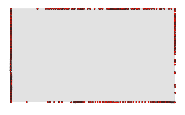
And because corners are always mostly convex (they have to be because turns add up to 360° for closed areas), this compression will remove area more frequently than add it. This makes the map quite disingenuous (maybe not intentionally), as it amplifies the effect OOP was trying to show.
If I were a full-time Lemmy commenter, I'd download the Colorado polygon from OSM, import sone geo-libraries into Python and do all 174** combinations of picking the 1ˢᵗ, 175ᵗʰ, 349ᵗʰ and 523ʳᵈ vertex, visualize each quadrilateral (with great-circe edges) as a video frame with its area printed in the center.
What Colorado might look like using an algorithm similar to OOP's:
(Manually created single frame but accurate to the number of digits shown. Also, I actually used every 228ᵗʰ of the 912 OSM waypoints, which are sometimes redundant (colinear), which I didn't bother to check.)
(Edit: maybe official government geoJSON would help? The best files are "500k" or "1:500,000 resolution", and even they reduce Colorado to 357 vertices. The complete dataset is probably https://www2.census.gov/geo/docs/maps-data/data/grfc/public_grfc_cur25_08.txt (50 MB text file!); see also legend and FIPS but that is for all Colorado's counties, I'd have to merge the polygons and maybe also remove any non-polygon data if there's any.) ArcGIS says they processed the data but they probably left lots of redundant colinear points in, since there's 1565 vertices in their dataset.
** Technically 697 options because 697 is not divisible by 4. But only ¼ of them are fully distinct, as every consecutive 4 maps have an identical starting vertex and just differ in which pair of vertices is 175 apart as opposed to the normal 174.