this post was submitted on 25 Dec 2024
76 points (100.0% liked)
Chapotraphouse
14219 readers
569 users here now
Banned? DM Wmill to appeal.
No anti-nautilism posts. See: Eco-fascism Primer
Slop posts go in c/slop. Don't post low-hanging fruit here.
founded 5 years ago
MODERATORS
you are viewing a single comment's thread
view the rest of the comments
view the rest of the comments

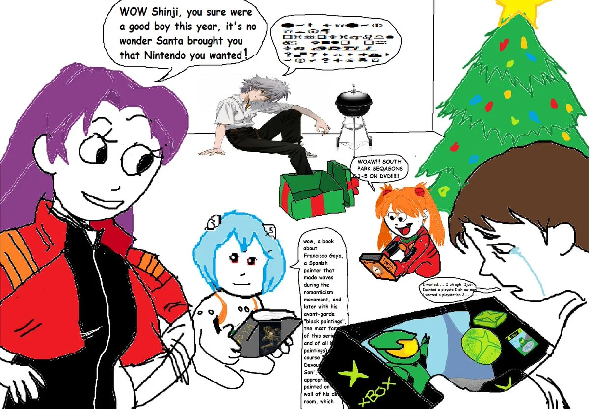
It looks like it might be gibberish. It alternates between Webdings and Wingdings, and it's hard to read because not only is the pixel count pretty bad to begin with, but it has also been flattened vertically by about 50%. Here's a version with the aspect ratio corrected:
Scaling really butchered some of the pictographs, but at least some of the characters are identifiable on here:
Feel free to double-check my work (I'm half asleep and less than half sober), but here's what I've got:
Edit: Here's the best I could do at re-creating it (minus the
GRILLpart; I couldn't get Unicode alt glyphs to show up in my editor):Either way, it just looks like mashing random keys, although the first line gets awfully close to spelling out "Shinji"