33
submitted 2 months ago by cloudless@feddit.uk to c/lemmyapps@lemmy.world

The aim of a streamlined user interface is appreciated, but the current trend towards extreme minimalism can be counterproductive. It often leads to a cumbersome experience where accessing common features or information requires unnecessary navigation.

Take, for instance, the display of the author's name and instance. Certain Lemmy applications deem the instance trivial and choose to hide it, while others omit the author's details from the main feed entirely, necessitating extra steps to uncover them.

Another example is the ability to view upvotes and downvotes as distinct figures. While some may only want the aggregate score, the absence of this feature overlooks the preferences of users who value this detail.

Implementing optional features like displaying author names, instances, or separate up/downvote counts gives users more control over their app experience. This way, those who prefer a clean interface can keep it that way, while those who value specific details can have them readily available.

top 5 comments
sorted by: hot top controversial new old
[-] ptz@dubvee.org 6 points 2 months ago* (last edited 2 months ago)

I agree with most of those and try to accommodate them, but there's some complications and trade-offs.

To me, the instance is important to display for both users and communities. I also prefer to see the display name rather than the system name ("Amazing Bob@lemmy.world" vs "bob@lemmy.world"). In the app I work with, both of those are configurable by the user.

The problem I've been facing, made worse by wanting to make the application highly responsive so mobile experience isn't second-class, are communities (and some users) who use all the available characters in the display names.

Expand Example Screenshots (not picking on this community, it's just one of the worst offenders I'm subscribed to):

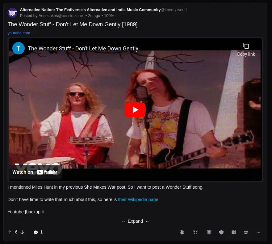
Looks fine in "list" view on desktop.

Also looks fine in card view on desktop

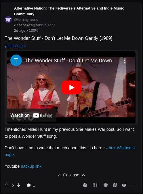
On mobile, now it's starting to turn into a fuster-cluck.

That could have been worse since there are also badges that can apply to the post and are shown in the same row as the community/user at the top; those examples just don't have any that apply.

So, do I truncate display names? If so, always? At a fixed number of characters? Or try to logically cut them off and only show the part before the colon or dash characters (e.g. "Alternative Nation: The Fediverse's Alternative and Indie Music Community".split(':')[0] -> Alternative Nation) ? Just set them to not wrap and hide the overflow?

I'm hope I don't sound hostile here. lol. If anyone has a suggestion, I'm open. Long community / user display names have been a thorn in my side since day 1.

For the other stuff like discrete vote numbers, date/times (rather than fuzzy "2 hours ago" as shown), I use tooltips to display those. Those are only really useful on desktop, though. I've been looking into replacing them with popovers, but that presents new challenges where the UI is now a minefield of pop-ups (something that annoyed me and I disabled in RES).

I guess some of these challenges are self-imposed because I want equity between desktop and mobile without having to write two separate interfaces. I'm already hiding a lot of things in mobile that just won't fit, so I'm not completely achieving that.

So, my point is that a clean interface is typically a compromise of trying to achieve multiple goals in the same application. Life would be much easier if mobile support wasn't expected and I could focus only on a desktop app lol.

[-] wizardbeard@lemmy.dbzer0.com 2 points 2 months ago* (last edited 2 months ago)

I feel like in your example case, the best option in scrolling text. Have settings for if it passively scrolls all the time, when clicked/tapped, or when the content is "focused". If you want to go the extra mile or are making a mobile specific app, have a slider option for scroll speed. Usually the text will stay stationary with the end cut off for a little bit, before scrolling at a constant speed, sometimes stopping for a shorter time at the end than the pause at the beginning.

This is how the grand majority of music player apps I've used handle long song titles/song info lines, and it works well on mobile for this sort of thing.

I'd imagine there's resources out there for UI pattern concepts for stuff like this. If there isn't, someone should make one.


Also, not to be rude but I'd have to wonder about how many desktop users actually want an app/program for something perfectly functional in a web browser, especially when userscripts and custom css theming tools like stylish exist that could theoretically cover any extra functionality that an app could offer.

Personally with things like Facebook, 4chan, Reddit, and Lemmy, I've always used the browser with addons, userscripts, and custom css theming. Apps seem to be best for mobile device browsing, where most of these sorts of sites have crap mobile interfaces, and things like notifications might be useful. But that's just my usage pattern.

[-] ptz@dubvee.org 4 points 2 months ago* (last edited 2 months ago)

Hmm. Interesting. That did not occur to me. Not sure how I feel about it, personally, but I could probably make it an option and let the users decide.

Basically have a section in the user options for overflowing titles:

  • Truncate
  • Scroll
  • Wrap (default)

Edit:

Also, not to be rude but I'd have to wonder about how many desktop users actually want an app/program for something perfectly functional in a web browser, especially when userscripts and custom css theming tools like stylish exist that could theoretically cover any extra functionality that an app could offer.

Uh, I do, lol. I hate having to bolt on a bunch of extra stuff to make the application behave like I feel it already should. Then there's the fact that I use multiple browsers on multiple devices and would have to keep my scripts and plugins in sync - plus, most mobile browsers don't support those (FF mobile is the only one I'm aware of that might/would).

That's just...too much for me.

[-] wahming@monyet.cc 5 points 2 months ago

This is one of the reasons I like sync. It's very very highly customisable

[-] ericbandrews@lemmy.ml 4 points 2 months ago* (last edited 2 months ago)

This is one of Mlem's guiding principles! We strive to offer options to show as much--or as little--information as the user wants, with options to show/hide:

  • Author
  • Author instance
  • Community instance
  • Community subscription status
  • Thumbnails
  • Score
  • Display downvotes separately
  • Time posted
  • Saved status
  • Number of replies

Plus a fully customizable interaction bar--and that's all just for posts.

If you're on iOS, I'd encourage you to give us a try!

this post was submitted on 21 Mar 2024
33 points (100.0% liked)

Lemmy Apps

4992 readers
133 users here now

A home for discussion of Lemmy apps and tools for all platforms.

RULES:


An extensive list of Lemmy apps is available here:

LemmyApps.com

or lemmyapps.netlify.app


Visit our partner Communities!

Lemmy Plugins and Userscripts is a great place to enhance the Lemmy browsing experience. !plugins@sh.itjust.works

Lemmy Integrations is a community about all integrations with the lemmy API. Bots, Scripts, New Apps, etc. !lemmy_integrations@lemmy.dbzer0.com

Lemmy Bots and Tools is a place to discuss and show off bots, tools, front ends, etc. you’re making that relate to lemmy. !lemmy_dev@programming.dev

Lemmy App Development is a place for Lemmy builders to chat about building apps, clients, tools and bots for the Lemmy platform. !lemmydev@lemm.ee

founded 11 months ago
MODERATORS