582
The 1,000 banknote from Maldives is considered to be one of the most beautiful of all currencies
(lemmy.world)

This is for strictly mildly interesting material. If it's too interesting, it doesn't belong. If it's not interesting, it doesn't belong.
This is obviously an objective criteria, so the mods are always right. Or maybe mildly right? Ahh.. what do we know?
Just post some stuff and don't spam.
Canada could have had this...

We use pics of asshole PMs and the Queen instead.
I think at this point in world history we should just stop idolizing people, whoever they are. I love the idea of having animals or cultural symbols in the notes (like canada's leaf, france's eiffel, US's burguers etc)
burguers
Made me re-read this whole comment in a thick French accent
Australia got glow in the dark dinosaurs.
Ed: wait no Canada got the glow in the dark dinosaurs and Australia got regular non glowing ones.
How else would the plebes know who their betters are?!
I don't know... I kinda like the $5 bill with the astronaut on it.
Over a badass wolf? Put the astronaut on a coin nobody uses and move on.
Compromise: Wolf astronaut.
Animal money is best money!
Cool. 1000 MVR is currently about $65 USD.
So for $130 plus the cost of framing, you can display both sides of the currency as art in your house.
€115
If I have enough money to vacation in the Maldives, this s a reasonable souvenir.
Fun Fact: Euro banknotes are currently getting a new design
I'm on team bird money but its not my call. The humans ones should also have the names for the sake of uneducated outsiders like me.
Damn some of these go hard as fuck
USA: Best we can do is droopy-eyed, rich, white, rapist, enslaver men with powdered wigs who by todays standards might be the most unfuckable men who ever lived. Also some illuminati symbols to troll the public about our psuedo-secret bank club full of pedophile extortionists.
I have one of these to snort coke with.
How wholesome :)
That explains all the holes in your brain!
That is very beautiful
For some reason, I really like having the reverse side being in portrait orientation. I wish more notes were designed that way.
Beats any Euro banknote for sure.
Beats euro bills. But euro bills aren't bad compared to most. They have color, artwork and growing sizes depending on their value.
My favorite European bill is the Swiss one though.
I think our current Swiss ones are pretty neat too:


https://www.snb.ch/en/the-snb/mandates-goals/cash/series-9
The concept winner of the new series was not really my favourite, too much white, but maybe they will tone it back a bit


STFU, you're going to make this a challenge for the orange one to put more of his face everywhere thinking it's "beautiful"
A face so beautiful only a mother could love it
This pic reminds me of Capt Pike from the Star Trek pilot.
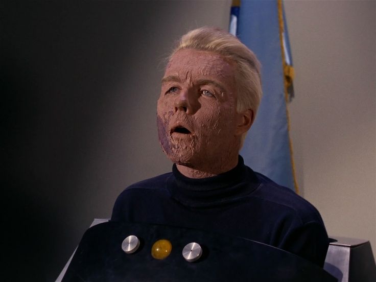
That character is from the initially-unaired pilot ("The Cage"), but that shot is from "The Menagerie" - a 2-part episode from the first season that re-used scenes from The Cage as flashbacks.
They had Pike injured and in the wheelchair so they could use makeup and the "beep" communications to disguise the fact that the actor playing him was different in the newly-filmed scenes versus those from the flashbacks.
Seems like Brazilian currency. We have animals in the notes too and the sea turtle is one of them
"Gimmie a thousand turtles" we'd say, and they'd reply with "I just have a thousand sharks".
Most beautiful of all, so far!
Just wait till big daddy T gets his face on the 1,000 USD bill.
The beauty then will be euge!
/s (also sorry for ruining an otherwise nice post but I couldn’t resist. Feel free to downvote this into oblivion)
Europe: okay hold my beer with my new bills coming out
You could hold up a turd in that picture background and I'd still think it was a good picture
🐢🐢🐢🐢🐢🐢🐢🐢🐢
No argument here.
Curaçao and Sint Maarten's Caribbean guilder, especially the obverse sides, are also beautiful: https://www.global-currency.com/currency-news/cbcs-reveal-of-the-caribbean-guilder-frame-at-1m22ss.jpg
Maldives mentioned


