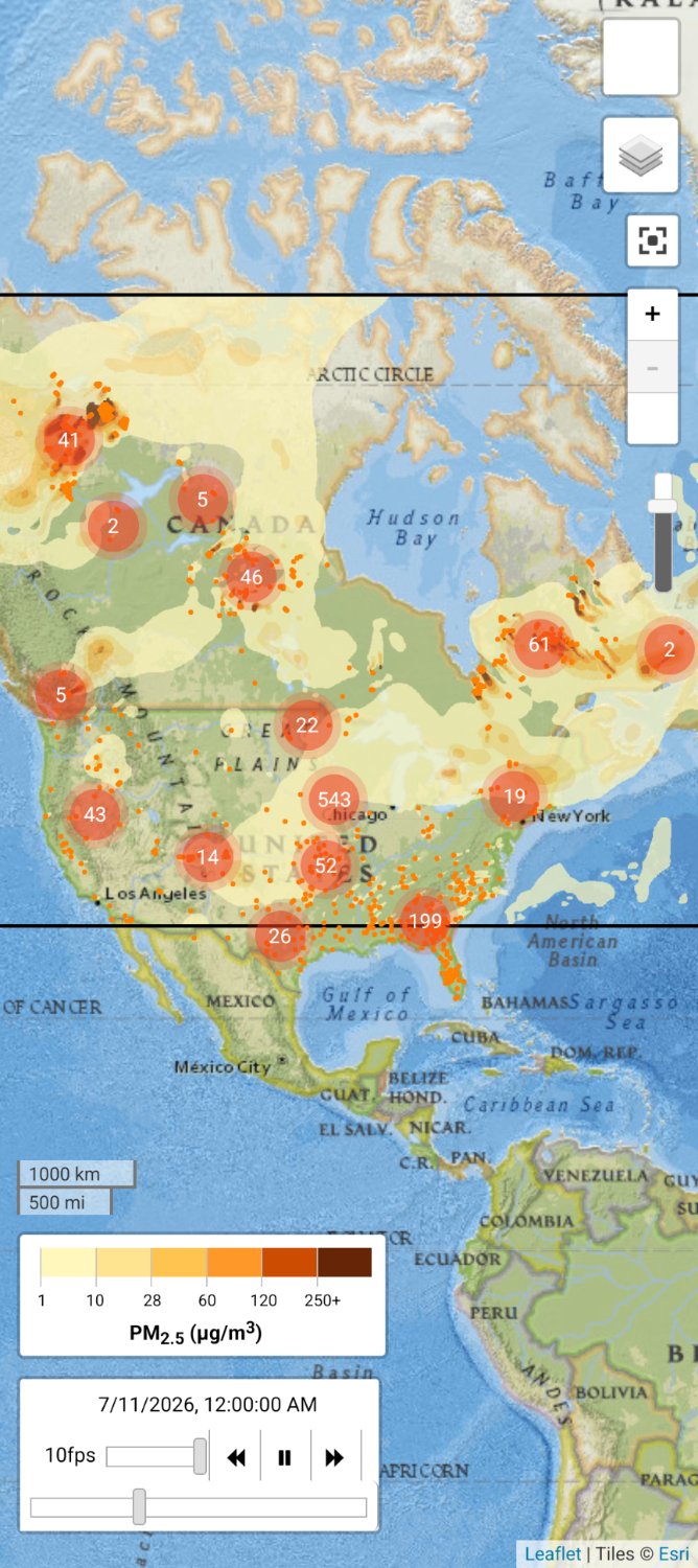
Don't worry we can fix it with AI if we build more datacenters!!!
this post was submitted on 10 Jul 2026
81 points (97.6% liked)
Climate
8957 readers
735 users here now
Discussion of climate, how it is changing, activism around that, the politics, and the energy systems change we need in order to stabilize things.
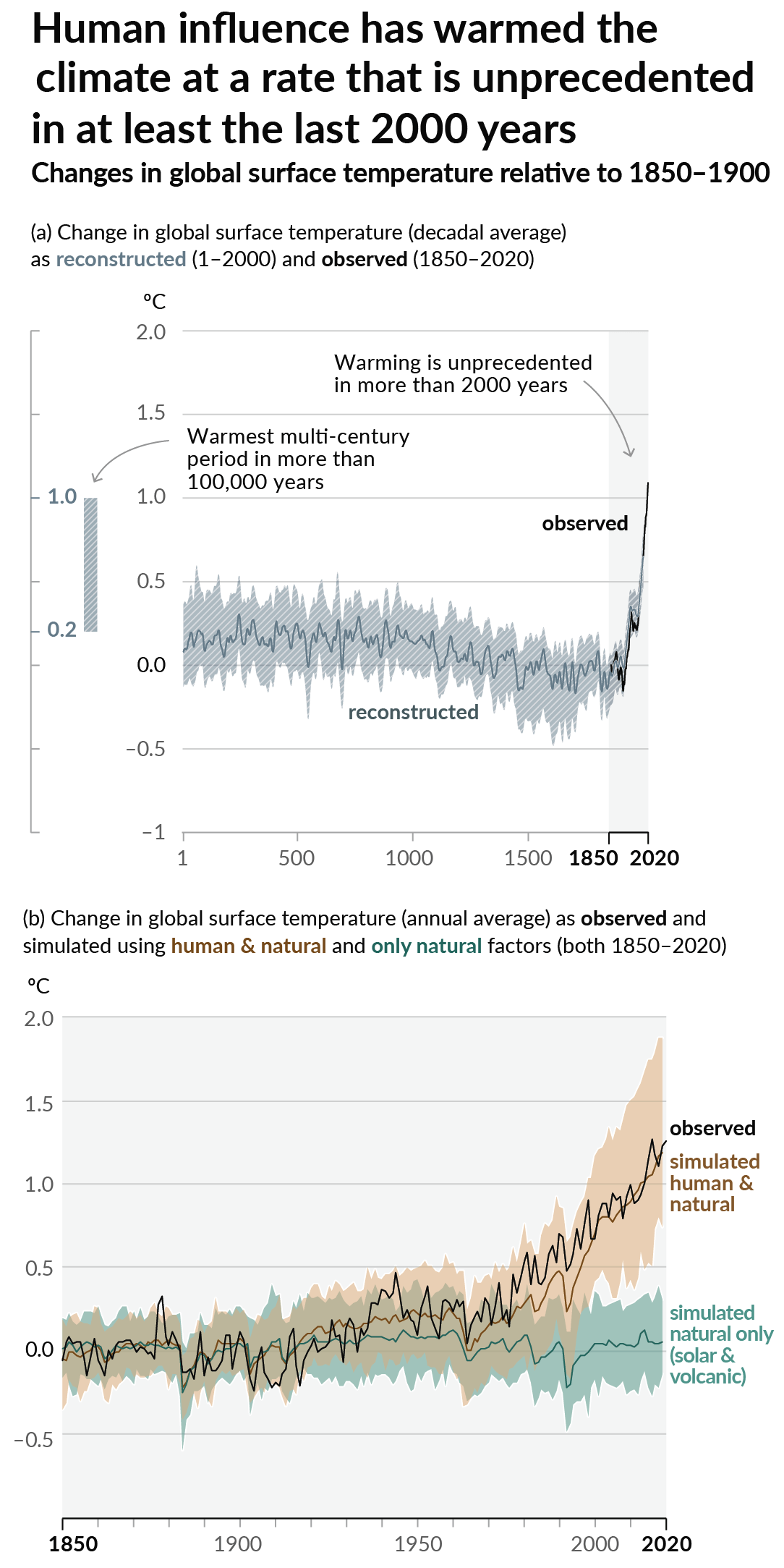
As a starting point, the burning of fossil fuels, and to a lesser extent deforestation and release of methane are responsible for the warming in recent decades:
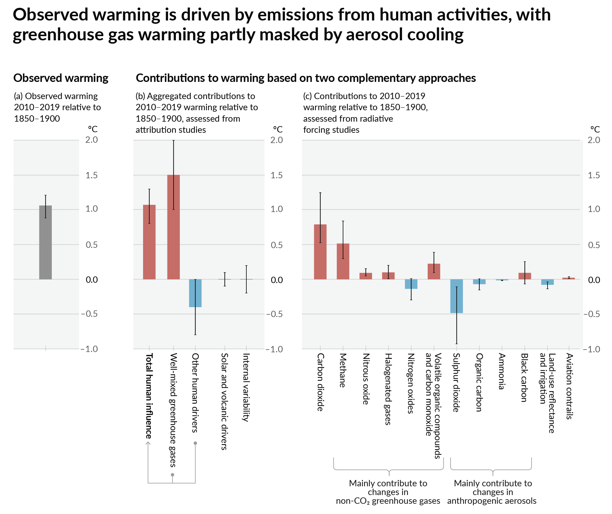
How much each change to the atmosphere has warmed the world:
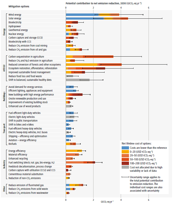
Recommended actions to cut greenhouse gas emissions in the near future:
Anti-science, inactivism, and unsupported conspiracy theories are not ok here.
founded 3 years ago
MODERATORS
Well, if we burn it all then there won’t be anything left to burn.
What is this measuring?
Are the numbers the amount of fires? And the little orange dots are the fires?
I believe they're air quality stations, based on the PM~2.5~ scale in the lower left
No, that's the scale for the colour gradients on the map.
Yes, the dots at this scale are mostly major groups of fires. When you zoom in the dots fan out to give more localized info.
I've zoomed in on Florida in the image attached to this reply so you can see better. You can see the individual fires have the flames icon.

PM2.5 is Particulate Matter that can penetrate into your lungs. It is mostly emitted by combustion engines, but in this case it's from wildfires.
Gently reminding everyone that a well-fitting N95 mask can filter out a lot of particulates. Particularly helpful for people with asthma going outside, but tbh, on days like this I just wear them everywhere. I'm already wearing them in indoor spaces to protect me from covid, why not keep it on outside to protect me from smoke
Important information indeed.
Im near the largest number there and what is scary is this is not the worst it has been. Its kinda funny as we are not located where the wildfires are but the winds or something bring almost all of them to us. North, south, east, and west.