Banned? DM Wmill to appeal.
No anti-nautilism posts. See: Eco-fascism Primer
Slop posts go in c/slop. Don't post low-hanging fruit here.
its so lame
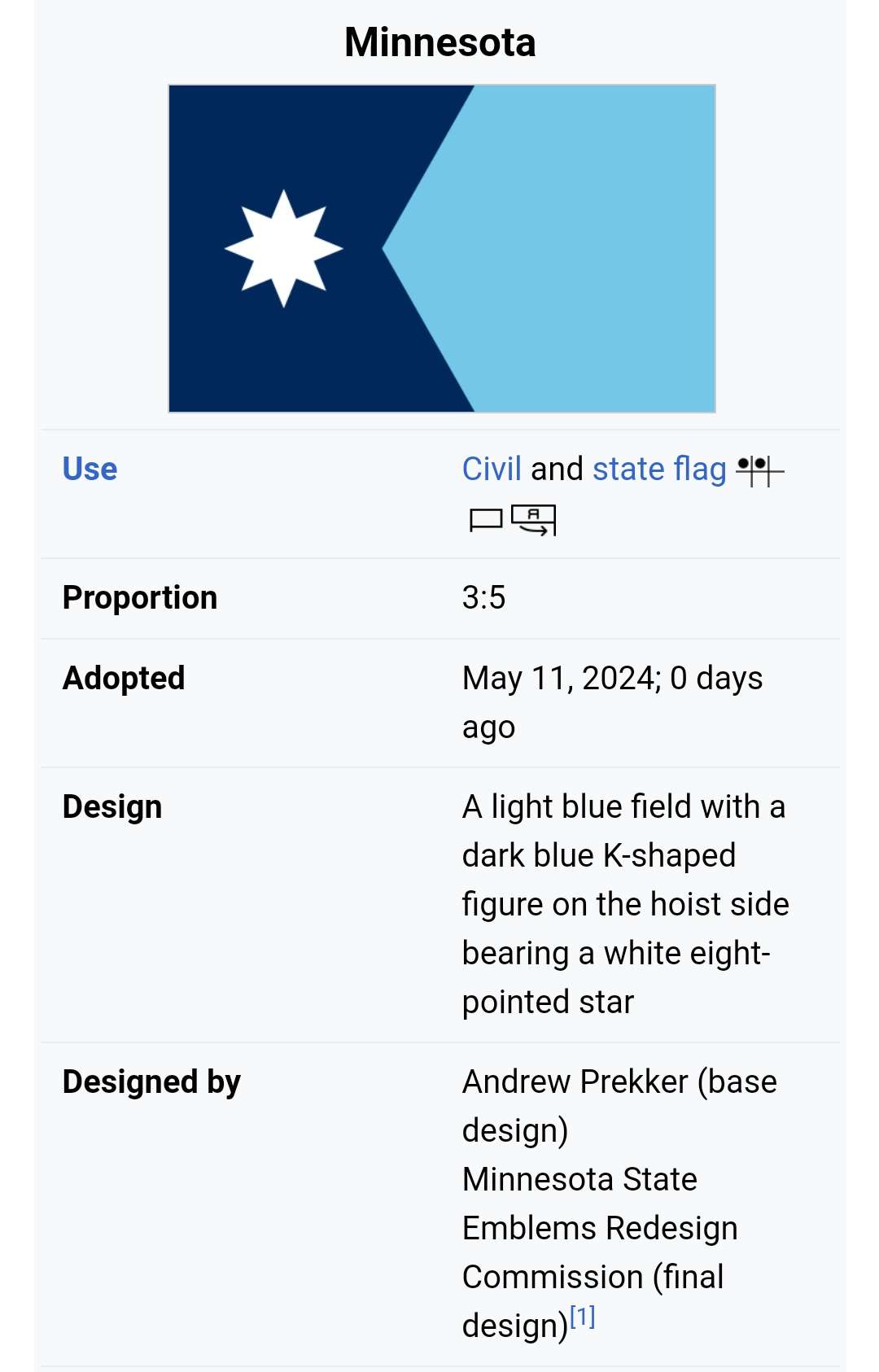
i believe the biggest problem the lack of contrast. leftist flags usually have colors that POP!
it also looks really arbitrary, but this has probably something to do with the fact that its minnesota.
The left side looks like a simplified map of the state, which is kinda fun.
i believe the biggest problem the lack of contrast. leftist flags usually have colors that POP!
it also looks really arbitrary, but this has probably something to do with the fact that its minnesota.
The left side looks like a simplified map of the state, which is kinda fun.