54
you are viewing a single comment's thread
view the rest of the comments
view the rest of the comments
this post was submitted on 14 Mar 2024
54 points (100.0% liked)
technology
23307 readers
101 users here now
On the road to fully automated luxury gay space communism.
Spreading Linux propaganda since 2020
- Ways to run Microsoft/Adobe and more on Linux
- The Ultimate FOSS Guide For Android
- Great libre software on Windows
- Hey you, the lib still using Chrome. Read this post!
Rules:
- 1. Obviously abide by the sitewide code of conduct. Bigotry will be met with an immediate ban
- 2. This community is about technology. Offtopic is permitted as long as it is kept in the comment sections
- 3. Although this is not /c/libre, FOSS related posting is tolerated, and even welcome in the case of effort posts
- 4. We believe technology should be liberating. As such, avoid promoting proprietary and/or bourgeois technology
- 5. Explanatory posts to correct the potential mistakes a comrade made in a post of their own are allowed, as long as they remain respectful
- 6. No crypto (Bitcoin, NFT, etc.) speculation, unless it is purely informative and not too cringe
- 7. Absolutely no tech bro shit. If you have a good opinion of Silicon Valley billionaires please manifest yourself so we can ban you.
founded 4 years ago
MODERATORS

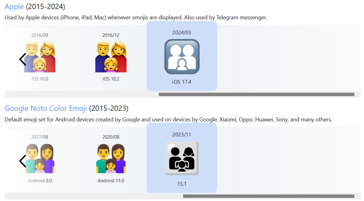
Apple’s 2024 is most accurate. We are all pawns.
We are all faceless newel posts in Tim Apple's grand 5D parcheesi game