ArchLinux's pacman with ILoveCandy option enabled.
Linux
From Wikipedia, the free encyclopedia
Linux is a family of open source Unix-like operating systems based on the Linux kernel, an operating system kernel first released on September 17, 1991 by Linus Torvalds. Linux is typically packaged in a Linux distribution (or distro for short).
Distributions include the Linux kernel and supporting system software and libraries, many of which are provided by the GNU Project. Many Linux distributions use the word "Linux" in their name, but the Free Software Foundation uses the name GNU/Linux to emphasize the importance of GNU software, causing some controversy.
Rules
- Posts must be relevant to operating systems running the Linux kernel. GNU/Linux or otherwise.
- No misinformation
- No NSFW content
- No hate speech, bigotry, etc
Related Communities
Community icon by Alpár-Etele Méder, licensed under CC BY 3.0
Ouu, you have me intrigued! Would you mind sharing a screenshot of what that would look like? Never tried pacman, nor heard of ILoveCandy.

The "C" in the progress bar is alternating between "c" and "C" to give the impression of munching.
How cute and fun! I love it. Thank you for the screenshot and explanation!
TIL EndeavourOS enabled that by default. I always thought it was standard...
Nala (an apt frontend) is the best I've seen so far
I second nala, it's pretty enough, text mode of course.
Dnf is nice, rpm-ostree not so much.
Nala is the best by far.
Cargo is also nice.
Yeah seriously, I was surprised at how plain and illegible rpm-ostree felt in comparison to dnf, I really wish they put a little color or some extra separation just to make it feel less cramped and give people more glanceable info.
I mean someone can create a PR, would likely be highly appreciated.
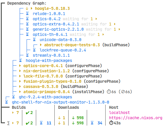
Nix with nix-output-monitor (nom). https://github.com/maralorn/nix-output-monitor

It shows the tree of packages to download and to build. It shortens the tree in realtime when packages have finished downloading/building and lengthens the tree when it finds more packages it needs to handle. Very fun and satisfying.
I haven't seen this in other package managers.
Very neat, thanks for sharing!
I really like emerge/portage, even w/out the "candy" feature enabled. Great color highlighting, and verbose messages about any config change(s) needed.
Portage remains to this day my favorite cli. It's nice to look at and provides all the info I want.
It's the one thing I miss from gentoo...
Ohh it's been a long time since I last used gentoo! I remember I used to love the green/blue (I hope my memory isn't failing me) combination everywhere </3.
I stopped using it because building the updates on multiple machines was becoming a pain and had a couple of drives fail, but those were good times!
Debian made me to only love apt and dpkg.
Omg apt is like the worst UI there is.
Have a look at nala! It needs some depencies but is a huge upgrade
Ah ah i will one day.
I clearly agree, apt is ugly and even synaptic making it better. But like i said, while ago when I used synaptic I did break my packages and I got to use dpkg and apt, to repair.
Since, I guess, I'm on a PTSD about it and now just use apt or dpkg, when using a Debian or Debian based system.
But I will listen to you, and for sure will give it a try
Nala is an apt wrapper, it just displays stuff better, automates updates and automatically chooses the fastest mirror (thats the stuff I know)
Nala
Portage
I really like the simplicity and formatting of stock pacman. It's not super colorful but it's fast and gives you all of the info you need. yay (or paru if you're a hipster) is the icing on top.
Either flatpak or NixOs for me.
Flatpak is just light and doesn't flood the user with 720710 lines just to say "installing Firefox"
NixOs just straight up has nothing to show.
Fair enough, visually pleasing is subjective, after all. Simplicity can be the best sometimes :=)
Package managers don't have visuals. What do apt (dpkg) and rpm look like?
Apologies, I meant via the terminal - have edited the title.
pikaur? I love all the colors, especially the bit where it highlights the differences in major/minor version numbers, so it immediately catches your eye (so you can track major package upgrades). I also like that it should which packages are being pulled in as new dependencies.
pacman with ILoveCandy
Yay
I like xbps and flatpak
Package managers are for chumps. Build everything from source and track where you installed it in a single master text file.
You joke, but you should look up Guix
The key is to do it manually. Reject modernity. Embrace reinvention of not just the wheel.
single master text file
Sounds like something you are using to manage your packages to me...
Nah, the trick is to, at random, leave a package out of the text file so the system isn't truly managed and all is chaos!
If pipx could be called a package manager it would be my most visually pleasing choice. See the video here : https://pipx.pypa.io/stable/
I detest the node ecosystem, but I do love watching NPM build packages
Aptitude
I don't really know how "visually pleasing" you can get with a terminal package manager tbh. I just have colors and ILoveCandy enabled in pacman and that's more than enough for me, looks pretty to me.