265

For exceptionally interesting content
Rules:
This is true proportional/scaled size. I'm sure Russia is bigger than an inch wide as it's displayed on my screen
I'm sure Russia is bigger than an inch wide
That’s just what the US Military Industrial Complex want you to believe!
Hahaha, Russia 🤏
Every few years this comes up again, and every time some nonsense about colonialism or whatever is brought up.
There is no "true" size or "true" shape on a 2D projection of Earth's very 3D surface. We used the one projection for so long because of how coastal shapes don't get bent way out of proportion, but like with any projection, messes with the other aspects.
Rather than making spicy click bait titles every so often about the "true" projection of the Earth, how about we teach kids at school what it takes to project something 3D on a 2D surface?
And just use a fucking globe!
As a neurodivergent map person, I'm over-aware of the difficulties of map projection. And I agree that simply calling this new projection 'accurate' is misleading
But at the same time, the use of the Mercator as the standard default map in situations that have nothing to do with ocean navigation for literally hundreds of years is absolutely a reflection of the relative power of the Global North, and can't be dismissed as 'nonsense about colonialism'
The Mercator projection really seems to be Africa-centric if anything
so coming from you pleasr tell us what would be the best way to project an as accurate as possible world map? I mena both in 3D version and as a 2D version
A 3D version would be a globe. A 2D version is inherently inaccurate because it's 2D and the earth is not. You are free to pick your poison in the manner of your projection but you will always loose something.
Exactly. It's easy to brush off the idea of soft power but it has real consequences.
What better alternative projection they could use at the time for navigation?
You might note that the present is, in fact, not 500 years ago.
Is that the answer to my question?
If you’re asking me to tell you the best way to navigate 500 years ago, I can’t help you because I’m not a historian. The point is that really has absolutely no bearing on how we should use maps today in the present.
And the present doesn't affect the past.
For political uses new projection is better. UN body are not going to use that to navigate.
I'm so sick of this shit. You want an accurate map? Buy a globe. There is no accurate flat map projections. All are wrong. Different projections have different flaws and serve different purposes.
Maps are especially used in education, i see it very hard to include a globe with every book and set up a big ass globe in every classroom but whatever
Lol, good luck "accurately" mapping our irregular oblate spheroid on to a globe (i.e. a regular sphere). You're correct that map projections inherently make concessions and introduce inaccuracies. But a globe would just require a different kind of projection in this context. And that projection hides more subtle inaccuracies. Gloves are not an answer to the problem of map projection distortion.
I cannot disagree with that last sentence…
Also, unless you're using a paper map, you should never have to see a flat map projection.
We all carry around supercomputers in our pockets that can easily do the math to render a globe. If we want to use a bigger screen, they have even more powerful processors.
Does anybody actually use paper maps at all anymore? I guess sometimes people mount them on the wall and point at them, but I mean using a map to calculate distance, find a path, etc.
What's ridiculous is that even though computers should be rendering the world as a globe, some websites (even Google Maps) still sometimes use Mercator. It's especially ridiculous when it's something like a flight-tracking website where the flight is going in a straight line on the globe, but is rendered as a curved path on a stupid map projection.
I mean the good thing about a flat projection is that you can see everything at once. When you're comparing data points of different countries it is nice to see them on a flat map. Neither the actual size nor the angles really matter in that case.
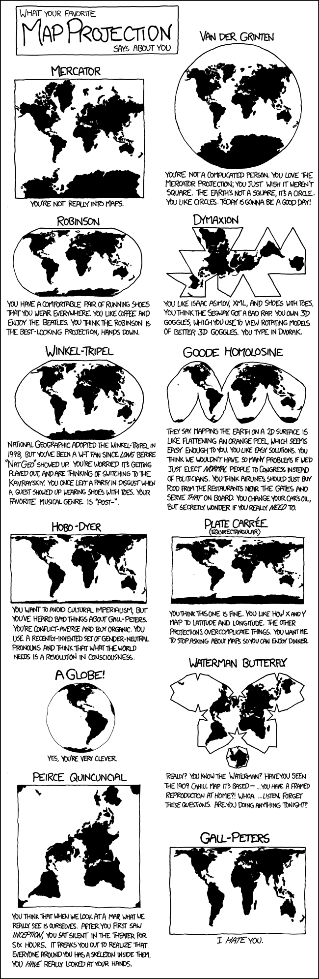
Waterman butterfly looks very striking though, woulf make an awesome background on a UN logo
Really? You know the Waterman? Have you seen the 1909 Cahill map it's based…
Would be nice to see Antarctica
Pfft, you believe in Antarctica? Sure, a wHoLE ConTiNenT cOVeEreD in IcE.
Covered in ice for now.
Don't worry. We're well on schedule to fix that.
The title falsly implies that mercator is "incorrect". Mercator is an angle preserving projection, meaning all angles are true to real life. The "equal earth" map is an area preserving projection, meaning it retains the true area of countries, but in return the angles are all wrong. This makes equal earth unsuitable for navigation for example.
It is also wrong to imply that this is some kind of new development. This was very much known all along, mercator simply became the default because world maps used to be primarily for navigation.
Traditional navigation is so cool, I had to learn the basics of it a few years ago as part of a course I was on. I suspect it'll feel rather less ceremonial in the future if GPS jamming and spoofing continue to become more common.
I feel like showing true sizes is the only thing this does better. I wouldn't want to study a world map where many countries are almost impossible to even see due to how small and skewed they are displayed as.
I think, you just have to buy a bigger map for that. With Mercator, it's Africa's countries that get squished down.
With Mercator, it’s Africa’s countries that get squished down.
But they remain perfectly visible due to how massive they're to begin with. I don't really see what the actual issue is.