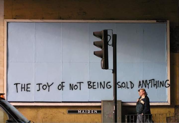
I would rather see graffiti than any public advertisement
internet funeral
ㅤㅤㅤㅤㅤㅤㅤㅤㅤㅤㅤㅤㅤㅤㅤㅤㅤㅤㅤㅤㅤㅤㅤㅤㅤㅤㅤㅤart of the internet
What is this place?
• !hmmm@lemmy.world with text and titles
• post obscure and surreal art with text
• nothing memetic, nothing boring
• unique textural art images
• Post only images or gifs (except for meta posts)
Guidlines
• no video posts are allowed
• No memes. Not even surreal ones. Post your memes on !surrealmemes@sh.itjust.works instead
• If your submission can be posted to !hmmm@lemmy.world (I.e. no text images), It should be posted there instead
This is a curated magazine. Post anything and everything. It will either stay up or be lost into the void.
I am perfectly fine with well done graffiti; things that are actually aesthetically well done. But the taggers that just scribble a dumbass alias similar to how this was done suck and just make things look even uglier.
This particular image is only okay with me because it is artistic with the message and the canvas itself. But if some teenager just came and scribbled "Blorbo" on it, fuck that.
I also dislike scrawled low-effort tags. They're an act of selfishness, making work for others to clean up. They don't show any skill other than sneakiness of getting it done. No one wants to see that junk. They are not good.
That said, I'd still prefer crappy tags rather than ads. I hate the ads and the manipulative power of advertising. So if there was somehow a choice between crappy tags vs high-quality ads, I'd choose the tags. (But obviously, that's all a moot point. Higher quality art / graffiti would be better than both other options. Obviously.)
I would argue that any "tag" is just someone advertising themself. They may not be after money, but they are after brand recognition, and that is the same problem.
They may not have the same power as the corporations that set up billboards all throughout town, but they are still an unwanted sign intruding in our lives.
You post well, Fucker. You post well...
Yeah, thanks a lot, fucker.
Everyone loves this FUCKER.
— this message was brought to you by Chase Bank
The oversprayed G, REALLY!? Come on.
Yo anyone who ever freehanded a cake decoration or an event poster knows the struggle.
To begin with, a big-ass H!
Well it's either that or awkwardly squishing the G. I think the overspray is the lesser of two evils
Or just startig the sentence at the left edge and not leaving about the space you'd need for the G unused on the left
Don't gotta indent graffiti
Foresight is for losers. Smell ya later alligators.
butchers a guitar solo, falls off the skateboard and lands on the tailbone

Or there's always the slightly sloping downward G. Ideally, you'd realize sooner and compensate. But I'd prefer a careful, squished I-N-G.
I like it. Shows the message outside of the confines of the original space. Also shows that even though it’s messier, less prepared and curated, it’s still preferred.
Came here to say this. So close to being all inside the border. So close…
Now I'm being sold the idea that I should feel joy at not being sold anything. WHere does it end?!?
Thank you for your interest in our product.
Add on options available to purchase at this time are, Silence, Solitude, Peacefulness, Rest and Stress Free Moments. Click on the big "D" below to add these options.
D
Now I want to do this on an interstate or nearby highway. Just for a morning or two.
How much did this Banksy sell for though?
Hey! I'm Bob Ross, and I would like to welcome you to the joy of not being sold anything
Bullshit Jobs (2018)
