this post was submitted on 01 Sep 2023
40 points (100.0% liked)

askchapo

22766 readers
186 users here now

Ask Hexbear is the place to ask and answer ~~thought-provoking~~ questions.

Rules:

  1. Posts must ask a question.

  2. If the question asked is serious, answer seriously.

  3. Questions where you want to learn more about socialism are allowed, but questions in bad faith are not.

  4. Try !feedback@hexbear.net if you're having questions about regarding moderation, site policy, the site itself, development, volunteering or the mod team.

founded 4 years ago
MODERATORS
 

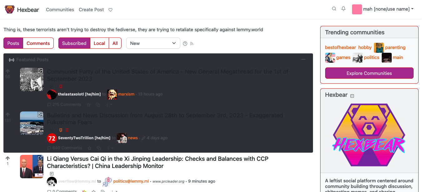
I didn't know where to post this, so I hope it's fine here. I use the 'litely' theme on Hexbear because I need a high-contrast setting that won't strain my eyes due to my low eyesight. Unfortunately, the 'Featured Posts' section is completely unreadable. Could somebody please fix the CSS of the 'litely' and 'litely-red' themes?

That's how it looks like:

Thank you!

top 6 comments
sorted by: hot top controversial new old
[–] ksynwa@lemmygrad.ml 7 points 1 year ago (1 children)

I am a bit of a rube so can't say for sure. I tried looking in hexbear-collectives's lemmy-ui repo but could not find where the colour for it is defined even though it is clearly there in the final CSS.

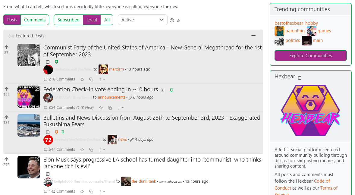
In the meanwhile until it is fixed you can use a browser extension that lets you modify CSS. On Firefox you can use Stylus for this. From there you can define a rule for https://hexbear.net with this CSS:

.featured-posts {
    background: #ebebeb;
}

Then it should look like this:
[–] YearOfTheCommieDesktop@hexbear.net 5 points 1 year ago (1 children)

the color isn't there in the repo cause its loaded in with the theme I imagine?, we can theoretically load in all kinds of custom themes as long as our custom CSS doesn't break them, but we've clearly done something a little screwy and overrode something

[–] ksynwa@lemmygrad.ml 5 points 1 year ago (1 children)
[–] YearOfTheCommieDesktop@hexbear.net 3 points 1 year ago (1 children)

oh yeah, I believe that's the branch where the actual production code lives

what's weird is I think this feature was upstreamed, so idk why we'd have custom CSS for it.

[–] ksynwa@lemmygrad.ml 3 points 1 year ago (1 children)

Current upstream UI does not have a separate div with .featured-posts class. Only the post titles are coloured a bit differently. It's not very intuitive unfortunately.

ah, interesting. Yeah I can see why that was changed, shame upstream didn't take it. I can't be trusted with CSS or really javascript otherwise I'd take a stab at a PR