this post was submitted on 01 Sep 2023
40 points (100.0% liked)
askchapo
23089 readers
218 users here now
Ask Hexbear is the place to ask and answer ~~thought-provoking~~ questions.
Rules:
-
Posts must ask a question.
-
If the question asked is serious, answer seriously.
-
Questions where you want to learn more about socialism are allowed, but questions in bad faith are not.
-
Try !feedback@hexbear.net if you're having questions about regarding moderation, site policy, the site itself, development, volunteering or the mod team.
founded 5 years ago
MODERATORS
you are viewing a single comment's thread
view the rest of the comments
view the rest of the comments

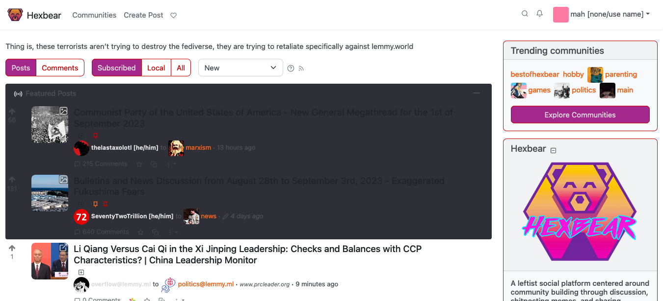
the color isn't there in the repo cause its loaded in with the theme I imagine?, we can theoretically load in all kinds of custom themes as long as our custom CSS doesn't break them, but we've clearly done something a little screwy and overrode something
I found it. It's in a different branch: https://github.com/hexbear-collective/lemmy-ui/blob/hexbear/src/assets/css/hexbear-global.css
oh yeah, I believe that's the branch where the actual production code lives
what's weird is I think this feature was upstreamed, so idk why we'd have custom CSS for it.
Current upstream UI does not have a separate div with .featured-posts class. Only the post titles are coloured a bit differently. It's not very intuitive unfortunately.
ah, interesting. Yeah I can see why that was changed, shame upstream didn't take it. I can't be trusted with CSS or really javascript otherwise I'd take a stab at a PR