this post was submitted on 26 Nov 2023
130 points (97.8% liked)
Doctor Who
2824 readers
1 users here now
A good old fashioned Doctor Who Community
founded 2 years ago
MODERATORS
you are viewing a single comment's thread
view the rest of the comments
view the rest of the comments

New Unit lady is great.
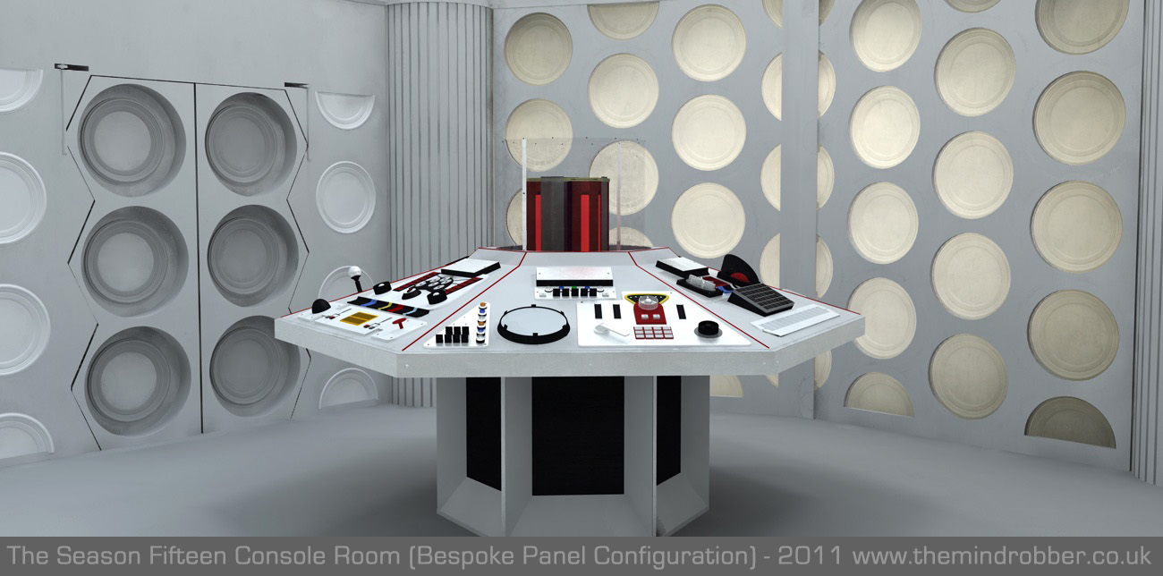
I loved the new TARDIS interior. It has nods to the Pertwee era, which I feel like hasn't gotten much love in NuWho.
The white rubber swoopiness feels like a call back to the 3rd Doctor's flying car. (Hard to see in the photos I've found, though.). , and the rest of the console (and the goofy white wall plates) evokes the feel of the big grey hexagon console
I was a bit confused that there's a new interior at all. Usually there's a crash or an implied long period of the doctor being solo, to explain the desktop theme change. Oh well.
I wish there was a bit more thought put into why the TARDIS interior changed the way it does. It would have been more of a thematic triumph had it evoked the Nobles more directly somehow. It felt a bit too clinical for this Doctor, and I'm hoping that only means it's a blank slate for him to tweak to his liking. I do like the lights, though. They at least at some occasional color.
Agreed. This time felt completely random.
Yeah. I thought the same. As loose as Doctor Who's story beats often are, it felt silly that the story didn't take a quick detour to blow up the console real quick.
That's a great point. In the Pertwee/Baker era, that TARDIS interior helped underscore how the Doctor felt like a prisoner of Unit.
Now, as you said, hopefully it's about a blank slate. I'm excited for the possibilities for growth for a version of the Doctor who habitually shares their feelings and sometimes admits to not knowing something!