this post was submitted on 29 Jun 2023
22 points (100.0% liked)
Technology
42437 readers
299 users here now
A nice place to discuss rumors, happenings, innovations, and challenges in the technology sphere. We also welcome discussions on the intersections of technology and society. If it’s technological news or discussion of technology, it probably belongs here.
Remember the overriding ethos on Beehaw: Be(e) Nice. Each user you encounter here is a person, and should be treated with kindness (even if they’re wrong, or use a Linux distro you don’t like). Personal attacks will not be tolerated.
Subcommunities on Beehaw:
This community's icon was made by Aaron Schneider, under the CC-BY-NC-SA 4.0 license.
founded 4 years ago
MODERATORS
you are viewing a single comment's thread
view the rest of the comments
view the rest of the comments

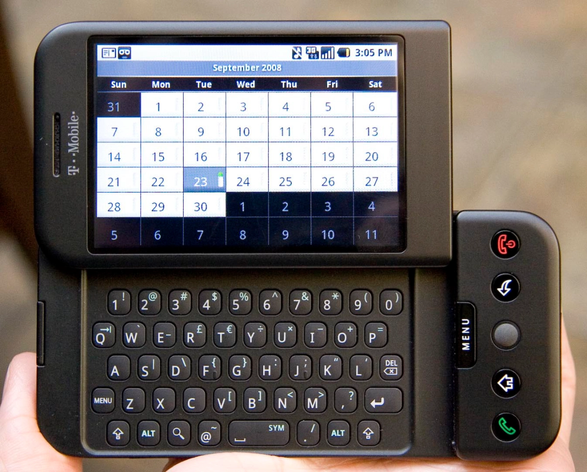
I miss the days of android phones with physical keyboards. They were just better
YES. I turned off all auto-correct and spellcheck and whatever on my Nokia N900, I didn't need it, I just TYPED. It was so easy!
And it had Shift, Ctrl, and arrow keys... I miss it so much.
Same. I'll never stop blaming Steve Jobs' hate of physical keys and practicality in favor of looks. Fuck him, but above all, fuck all the competitors that jumped on the "EVERYTHING ON THE SCREEN" bandwagon.
I do too. Hence I built one. And it's open source, so anyone can: https://github.com/Dakkaron/Fairberry
You're my hero
What surprises me is that no one has made a phone case that integrates a flip or slide keyboard. It would be an easy way to add an aftermarket physical board to a phone, and from these threads it's clear there's at least some demand. I understand it's probably not enough demand for a whole phone line, but surely something like that would be possible.
When I lived in Japan I had a lovely flip phone with a nice big screen (for the time), no thicker than my cased pixel phone now when closed. The only clamshells that are left have comically tiny screens and are thicker than a fully loaded wallet. They're substantially less functional than what I used in 2007. It's bizarre.
I prefer on screen keyboards now with swipe typing being a standard.
And that's fine. I just miss there being choices. I get that the hinges increased costs, but dammit, why can't we just have some expensive phones with hinges and let people choose?
I recall seeing physical keyboards on at least one phone that still let you swipe text.
I think about that! Our mobile technologies have been becoming less and less accessible as they've all settled into the same form factor of big screens with few to no buttons
User studies with people not familiar with existing computer metaphors are always so interesting. It always leads to novel computing experiences completely divergent from the classical desktop metaphor. In many ways, we've outgrown the desktop metaphor and could start coming up with better and more captivating machine interactions if we just divorced ourselves from the concept. I don't really have any good suggestions for what to do about it, but I often think about the hamburger menu icon. That shit doesn't make sense. You see it everywhere because everyone's settled on it, but if you were told “make a website that people who aren't familiar with websites can use and enjoy” you would never use that stupid icon