Oop, forgot to post the symbolism. Just posted that in a separate comment.
ThatOneKirbyMain2568
joined 2 years ago
When I was going through redesigning all of the U.S. state flags, this is one of the first designs I made. Here's the symbolism:
-
The colors are reminiscent of the orange, white, & blue pattern used in many of New York's state flag.
- The blue has been replaced with the purple of the Iroquois flag.
-
The white shape in the center holds several meanings.
- It resembles a crown to represent New York being the Empire State.
- It points upward to represent New York's motto: "Excelsior" ("Higher").
- It looks somewhat like tall skyscrapers because duh.
This is my take on a flag for Kbin, a fediverse thread aggregator like Lemmy (and the one that I use). There isn't that much to the symbolism behind it. There's magneta because there's magenta in the logo, and there's a slash to go with the shape of the logo.
I also used this flag for the icon of this community's Kbin equivalent: @vexillology.
What's that even supposed to be? Even ignoring it's… distinct shape, it seems like it was just a bad idea from the beginning.
Yeah, having posts automatically upvoted by OP would be great. I think that Lemmy automatically starts with an upvote count of 1 regardless of OP's vote, so I think Kbin should do the same. I get that Hot is meant to factor in activity and time, but it just feels super off for the only post in the past month to not appear. Surely a post that was made an hour ago is hotter than a post was made weeks back.
Given that we're so small at the moment, why should a post need an upvote to be at all visible on the default sort? It can the only post of the past two weeks, but if there's no upvote, it doesn't get seen. It's very impractical.
And even if we go with this logic, why should the criterion for a post being seen be whether OP remembers to upvote their own post? It doesn't make sense. If you think that posts should only be seen if someone opts to go through new and give it an upvote (because otherwise it's not a "hot" post), OP shouldn't be able to do that.
Right now, we have a system where a major factor in post visibility is, "Did OP remember to click the upvote button?" It's just not beneficial.
Since I already like Rhode Island's flag a lot, I didn't want to go too far from the original design. I decided to make the following three changes:
- The background was changed from white to blue. I felt yellow on blue popped a lot more due to the higher contrast, and it helps a lot with the nautical vibe.
- The "HOPE" ribbon was removed. It's fine, but I prefer the flag without it.
- The ratio was changed from 29:33 (🤮) to 1:1 to match maritime signal flags.
Oof, that's never fun. When I'm typing a long comment, I always spam copy it so that I can paste it back if I end up losing it. On PC, you can even use Windows+V to pull up a clipboard history, which has come in handy more than once.
Anywho, glad my reply was helpful! There are a lot of ways to interact with the content on the fediverse, and it seems like you're well on your way to finding one that works best for you. Hope you enjoy it here!
This flag was used by the Great Socialist People's Libyan Arab Jamahiriya. As you can see, it has a very intricate design rich with symbolism.
This is a really nice flag! You're right to feel confident about the geometry—it's great. The colors, however, could use some work.
- In general, the shades you've chosen just aren't really vibrant. Look at other flags, and you'll see that they use pretty saturated blues, reds, yellows, greens, etc.
- You want to avoid colors that look really similar being right next to each other. You do this for the most part—for example, you separate the red and green with a white outline, which is great—but the green and blue are a problem. Green and blue are already pretty similar colors, but the shades you've shown make them almost identical. I'd make them much more different (for example, make the blue very dark and the green less teal) or, like another comment suggested, remove one of the colors entirely.
The image icon in the bottom left corner of image posts can be clicked, showing the image at a larger size (i.e., what you'd get if you were to enable "Auto Media Preview" in the sidebar). There are a couple of userstyles that make this more button-like, such as kleanbin and (my own userstyle) idkbin.
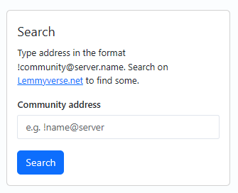
A super helpful feature that PieFed (a new fediverse thread aggregator like Lemmy & Kbin) has is an "Add Remote" button on its communities page. This button allows you to get a community on another instance to appear on your PieFed instance (and thus get the PieFed instance to start getting posts from that community).
Here, for example, I use it to get /m/kbinStyles to appear on piefed.social.
- The "Add Remote" button at the top of the communities page.
- The "Add Remote" interface.
- Typing in "kbinStyles@kbin.social" to add /m/kbinStyles to piefed.social's community list.
A dedicated button & interface like this would be super nice to have on Kbin, as it'd help a ton with scenarios where someone's created a new community on Lemmy and you want it to federate over here. Currently, you can just type the community address in the search bar, but a dedicated UI would make this a lot clearer and more intuitive.

When you're in the All Content view, the arrows on the page select always act as if you're on page 1. I.e., the left arrow never works, and the right arrow always sends you to page 2. Not sure why this is.


…Who exactly is asking for this? AI chatbots are cool and all, but I have no idea why you'd want them in your messages app. What would you even need that for?