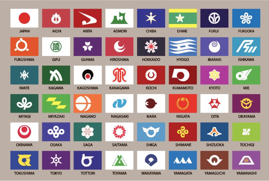
96

Here's an image with the flags and the prefecture names:

top 10 comments
sorted by: hot top controversial new old
[-] elliot_crane@lemmy.world 16 points 8 months ago

I think they all look pretty cool and have their own distinctive aesthetic while being thematically consistent (e.g. they look like they’re part of the same collection). That being said, I do definitely get “logo” vibes from quite a few, like you could have told me they were sports team logos and I’d believe it. Also Akita straight up looks like a Nike swoosh lol.

[-] thedirtyknapkin@lemmy.world 4 points 8 months ago* (last edited 8 months ago)

i love many of these, but a family crest on a field of color isn't necessarily the most creative design, but i really like the consistency and history behind some is these. like some of these were flown during the warring states period. that alone makes them kinda cool.

that said, ishikawa looks like a b2b tech company logo.

[-] root_beer@midwest.social 8 points 8 months ago

I don’t even really like flag maps because they ultimately look chaotic, but as all these flags are consistent and simple, this one looks pretty good. I like the flags, while there is a sense of unity, they are all individual as well. I get where people might complain that they look like logos, but they look very modern.

[-] ChaoticNeutralCzech@feddit.de 2 points 8 months ago

Too bad no shade of blue is left for the sea (even white clashes somewhat)

[-] jet@hackertalks.com 7 points 8 months ago

Very aesthetically pleasing

[-] j4yt33@feddit.de 6 points 7 months ago

They kinda look like Linux OS logos

[-] Rentlar@lemmy.ca 6 points 8 months ago* (last edited 8 months ago)

Neat how a few of them are off centre (Nagano, Mie, Fukushima for example). Some appear to derive their symbols from Japanese family crest symbols. And the prefectures with "Yama" all have some sort of mountain range triangular symbolism.

...on the other hand my brain is in the wrong place when I look at the Kanagawa flag.

[-] root_beer@midwest.social 2 points 8 months ago

Just think of it as a bird’s eye view of Sgt. Chowdown enjoying his favorite lunch, except he got rid of the mustache

[-] magnetosphere@kbin.social 3 points 8 months ago

The Hokkaido flag is my personal favorite. The Nagano flag, meanwhile, looks like the forgettable logo from an off-brand energy drink.

[-] Akasazh@feddit.nl 3 points 8 months ago

I couldn't agree more. Over the whole set it has these qualities, some bangers, some logos for non-existent companies.

Tokushima looks like a logistics company.

this post was submitted on 22 Oct 2023
96 points (99.0% liked)

Vexillology

1994 readers
1 users here now

A community dedicated to flags and discussion about flags.

Other communities:

founded 1 year ago
MODERATORS