this post was submitted on 11 Mar 2026
678 points (98.3% liked)
Climate
8512 readers
447 users here now
Discussion of climate, how it is changing, activism around that, the politics, and the energy systems change we need in order to stabilize things.
As a starting point, the burning of fossil fuels, and to a lesser extent deforestation and release of methane are responsible for the warming in recent decades:

How much each change to the atmosphere has warmed the world:

Recommended actions to cut greenhouse gas emissions in the near future:

Anti-science, inactivism, and unsupported conspiracy theories are not ok here.
founded 2 years ago
MODERATORS
you are viewing a single comment's thread
view the rest of the comments
view the rest of the comments
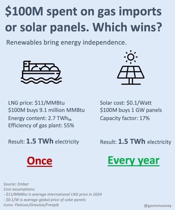
In Yankee places "gas" means "gasoline" so I'd blame the infographic for saying "gas imports" instead of "natural gas imports" if it's supposed to target the country that uses the most natural gas
I don't blame it whatsoever for calling it "gas"; it should be clear to anyone remotely familiar enough with energy infrastructure to understand anything past "solar better", i.e. they should at least pick up on one of the following (in no particular order):
At some point it's incumbent on the reader to have a bare minimum understanding of how the world around them works; I learned some of this in circa sixth grade. Some of this on its own isn't common knowledge; all of this taken together should stop any reasonable reader from defaulting to "gasoline".
If you're just gleaning it in a hurry, you miss the relatively fine print from "LNG" to "55%". Selecting font sizes to emphasize the most important information, and being understandable by an uninformed audience base (think social media), is absolutely fundamental to infographics.
Not necessarily. Quite a lot of solar installation companies like Tesla's popular roof-like tiles push self-sufficiency for some reason. My guess is to sell batteries. Anyways, even without that, your petrol bill's still a useful visualization for how much more economic solar is
https://xkcd.com/2501/
Buddy, I obviously agree for MMBtu, which is why I cited it among other unordered points and explicitly called out that people are liable not to know it. If you do know it, though, it immediately gives it away, which is why I included it to cover bases.
But a crude oil tanker is a common thing plenty of people have seen, and putting "power plant" in there is straight-up a self-own: you are profoundly ignorant about energy infrastructure if you think we're taking gasoline into power plants to convert into electricity. That doesn't make someone bad or stupid; it just means they have zero standing to complain about how an energy infographic misled them by calling methane "gas". They lack the bare minimum foundation to even understand what it's trying to say.
It should also be obvious that when I said "not pure solar", I meant "generally", because at that point the reader would need to be willfully obtuse to construe the graphic to be about electric cars. I almost hedged with "generally", but I (wrongly, naïvely) assumed it wouldn't be subjected to superfluous pedantry.
Edit: I actually forgot another obvious point because there are just so many things that would tell reasonable people this isn't about gasoline: why would a tanker be used as an icon to represent gasoline anyway? A jerrycan, an oil barrel, or a gas pump would clearly be much better, because oil tankers don't represent the final product anyway, aren't a common icon for gasoline (if basically at all), and don't have a distinctive side profile. There are a million reasons it's not the graphic's fault if you look at it and assume it's about gasoline.