this post was submitted on 18 Sep 2023
567 points (97.2% liked)
Voyager
7682 readers
3 users here now
The official lemmy community for Voyager, an open source, mobile-first client for lemmy.
Rules
- Be nice.
- lemmy.world instance policy
Sponsor development! 👇
💙
founded 2 years ago
MODERATORS
you are viewing a single comment's thread
view the rest of the comments
view the rest of the comments


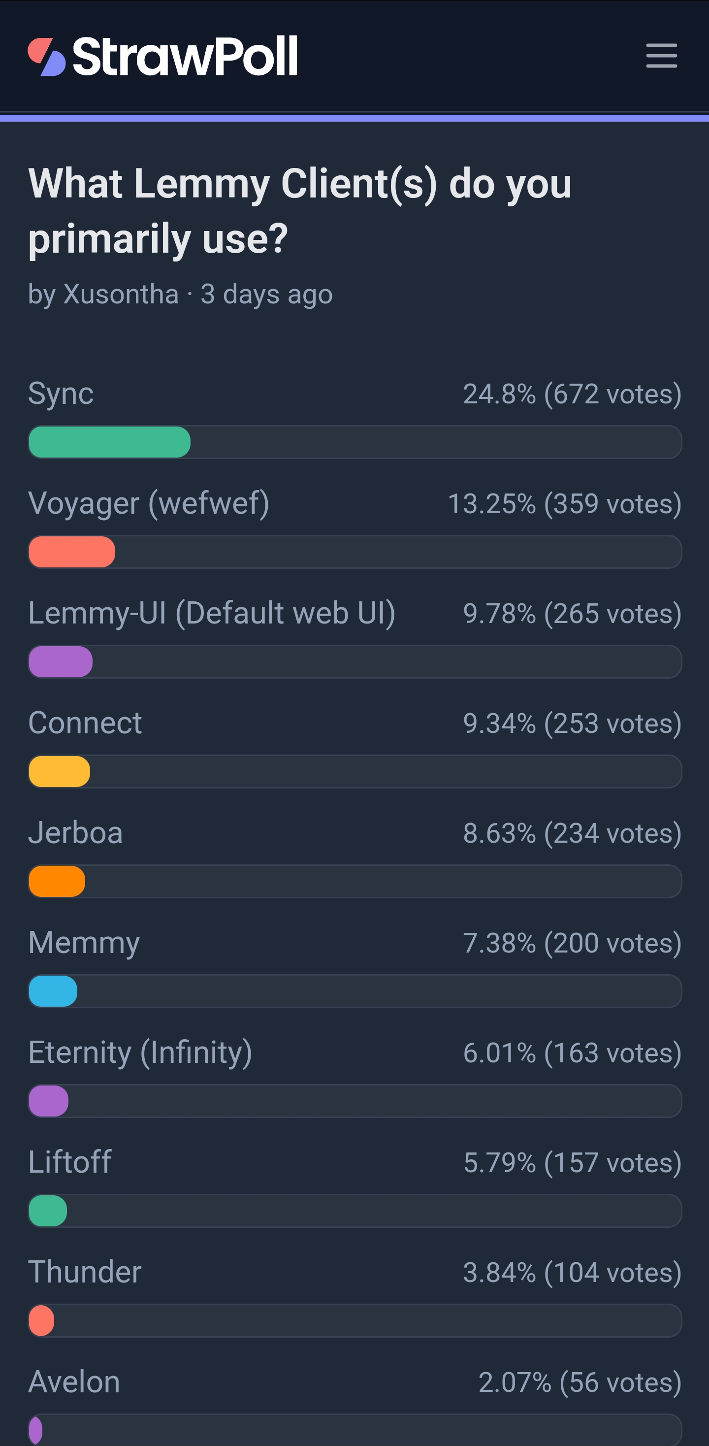
I am surprised that the default UI doesn't have more dominance
Lemmy's default web UI?
It's barebones and not the most readable. Clearly designed for the desktop browser experience, which is never going to be the dominant way of using Lemmy.
But my biggest issue with it is that it defaults to the worst feed and sorting algorithm Lemmy has. Every time I load the page, it is back to the "local" feed, sorted by "active" even if I've changed my account settings.
It actually has, if you scroll down to the bottom there are plenty of users stating default UI plus some plugin.
It shows Lemmy-UI at 9.78%, that seems low to me. But I notice that the poll lets you select multiple options so that probably skews things a bit.