-9
submitted 1 year ago* (last edited 1 year ago) by ashishlotake@mastodon.social to c/firefox@lemmy.ml

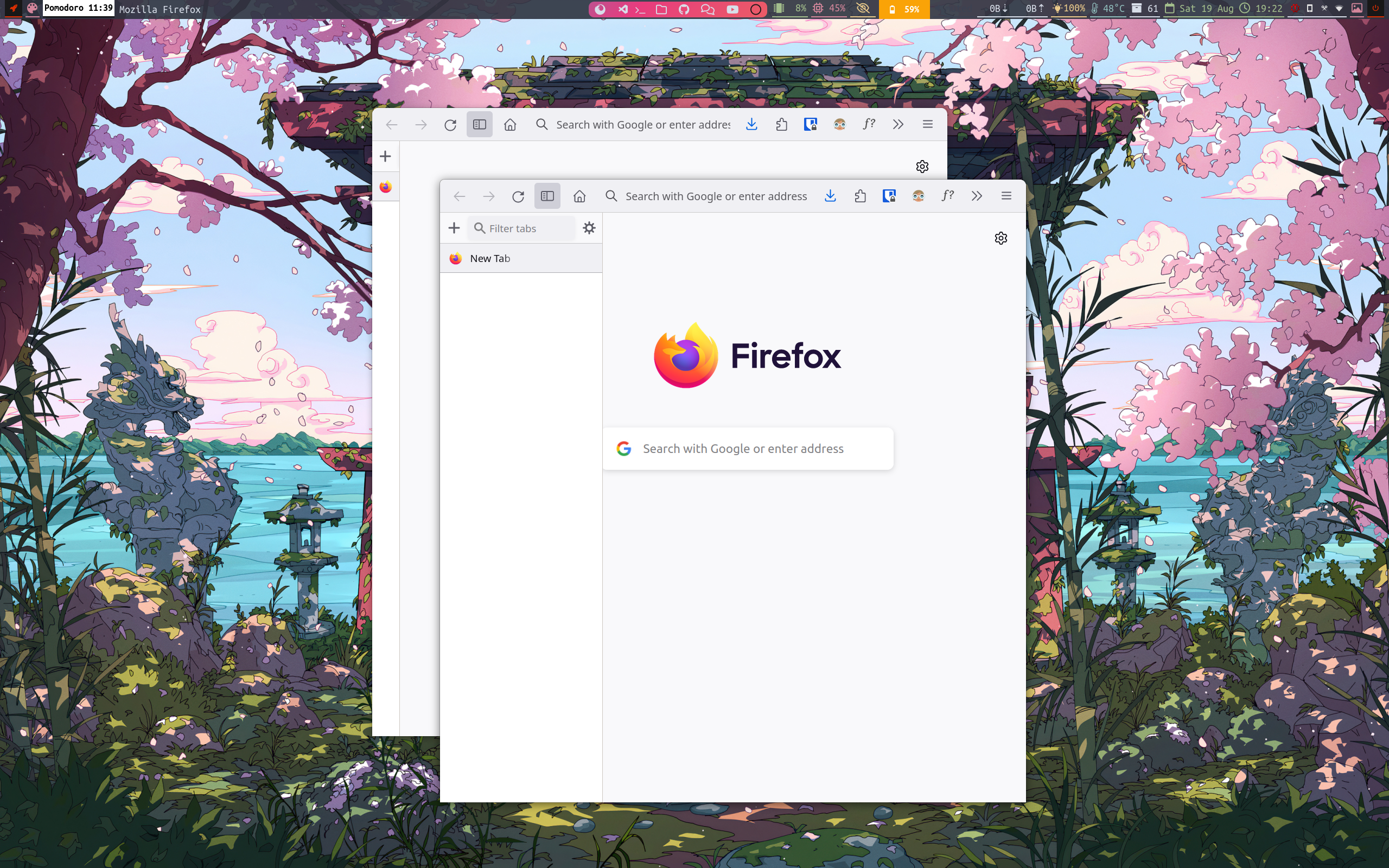
Why @firefox is not implementing this UI by default and why none of the Firefox-derived web browsers implementing this.

I somehow managed to build this, but its not prefect.

@librewolf

At this point the there has been almost no significant improvement.
How Mozilla Ruined Firefox --> https://youtu.be/ugnOM2mzgNU

Hoping @firefox wont forces me to move to brave.

#Linux #foss #privacy #firefox

EDIT:- New UI with Minimize Close Maximize button, giving space which can be used to drag.

you are viewing a single comment's thread
view the rest of the comments
[-] Lucia@eviltoast.org 1 points 1 year ago

maybe that’s why Mozilla stuck with the design that works?

My guess would be they're just afraid to change something at this point, considering the reception of their previous redesign.

They mostly follow Chrome UI nowadays, so I doubt we'll see any innovation from them in the UI field.

[-] jonne@infosec.pub 1 points 1 year ago

They probably don't want to go down the road of having to have a separate UI for every DE. There's DE-specific browsers for people that care about that.

this post was submitted on 19 Aug 2023
-9 points (42.9% liked)

Firefox

17303 readers
68 users here now

A place to discuss the news and latest developments on the open-source browser Firefox

founded 4 years ago
MODERATORS