-9
you are viewing a single comment's thread
view the rest of the comments
view the rest of the comments
this post was submitted on 19 Aug 2023
-9 points (42.9% liked)
Firefox
17303 readers
16 users here now
A place to discuss the news and latest developments on the open-source browser Firefox
founded 4 years ago
MODERATORS

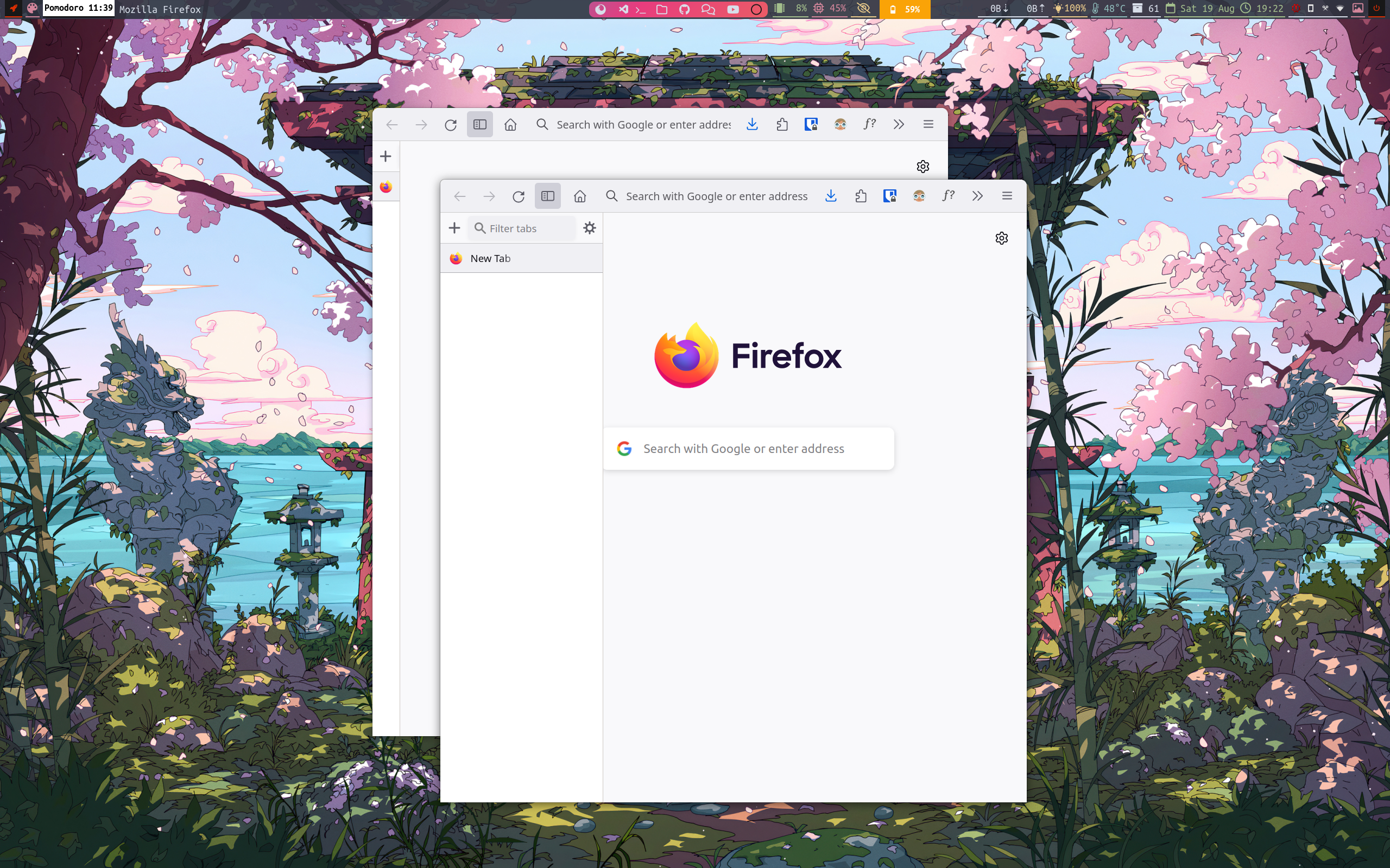
And I've never looked at Firefox's tab bar and thought, this UI element really needs to occupy a lot more screen space.
The chunk of screen space lost to that tabs window wouldn't be as big a deal if the windows were maximised, but there's no button for that now either.
I don't think the missing maximise button is intentional. They seem to be using a minimal (Linux) window manager and it's quite common for those folks to use keyboard shortcuts for maximising, closing etc., so they probably didn't have those window buttons even before starting that redesign...
@Knusper @zurohki
I am using a tiling window manager so keybaord shortcut for every thing.
I can just make it visible just by adding few lines.