this post was submitted on 14 Sep 2024
106 points (99.1% liked)
Ask Android
3154 readers
1 users here now
A place to ask your questions and seek help related to your Android device and the Android ecosystem.
Whether you're looking for app recommendations, phone buying advice, or want to explore rooting and tutorials, this is the place for you!
Rules
- Be descriptive: Help us help you by providing as many details as you can.
- Be patient: You're getting free help from Internet strangers, so you may have to wait for an answer.
- Be helpful: If someone asks you for more information, tell us what you can. If someone asks you for a screenshot, please provide one!
- Be nice: Treat others with respect, even if you don't agree with their advice. Accordingly, you should expect others to be nice to you as well. Report intentionally rude answers.
- No piracy: Sharing or discussing pirated content is strictly prohibited. Do not ask others for a paid app or about how to acquire one.
- No affiliate/marketing links: Posting affiliate links is not allowed.
- No URL shorteners: These can hide the true location of the page and lead people to malicious places.
- No lockscreen bypasses: Please do not comment, link, or assist with bypassing lock screens or factory reset protection.
- No cross-posting: Please take the time to make a proper post instead of cross-posting.
Other Communities
- !android@lemdro.id
- !androidmemes@lemdro.id
- !google@lemdro.id
- !googlepixel@lemdro.id
- !xiaomi@lemdro.id
- !sony@lemdro.id
- !samsung@lemdro.id
- !galaxywatch@lemdro.id
- !oneplus@lemdro.id
- !motorola@lemdro.id
- !meta@lemdro.id
- !apple@lemdro.id
- !microsoft@lemdro.id
- !chatgpt@lemdro.id
- !bing@lemdro.id
- !reddit@lemdro.id
founded 2 years ago
MODERATORS
you are viewing a single comment's thread
view the rest of the comments
view the rest of the comments
When UI/UX was becoming the hot ticket in the late 90s/early 00s, the lesson always beaten into your head was to make navigating simpler, with the fewest clicks possible. Now they bury everything.
YouTube used to let you make playlists on the fly, now you have to click into a small sub menu that is hard to touch without stopping the current video. Even disconnecting from a network is now an extra click than it used to. Google designers have totally lost the point. They are the reason people pay more for less with an apple phone.
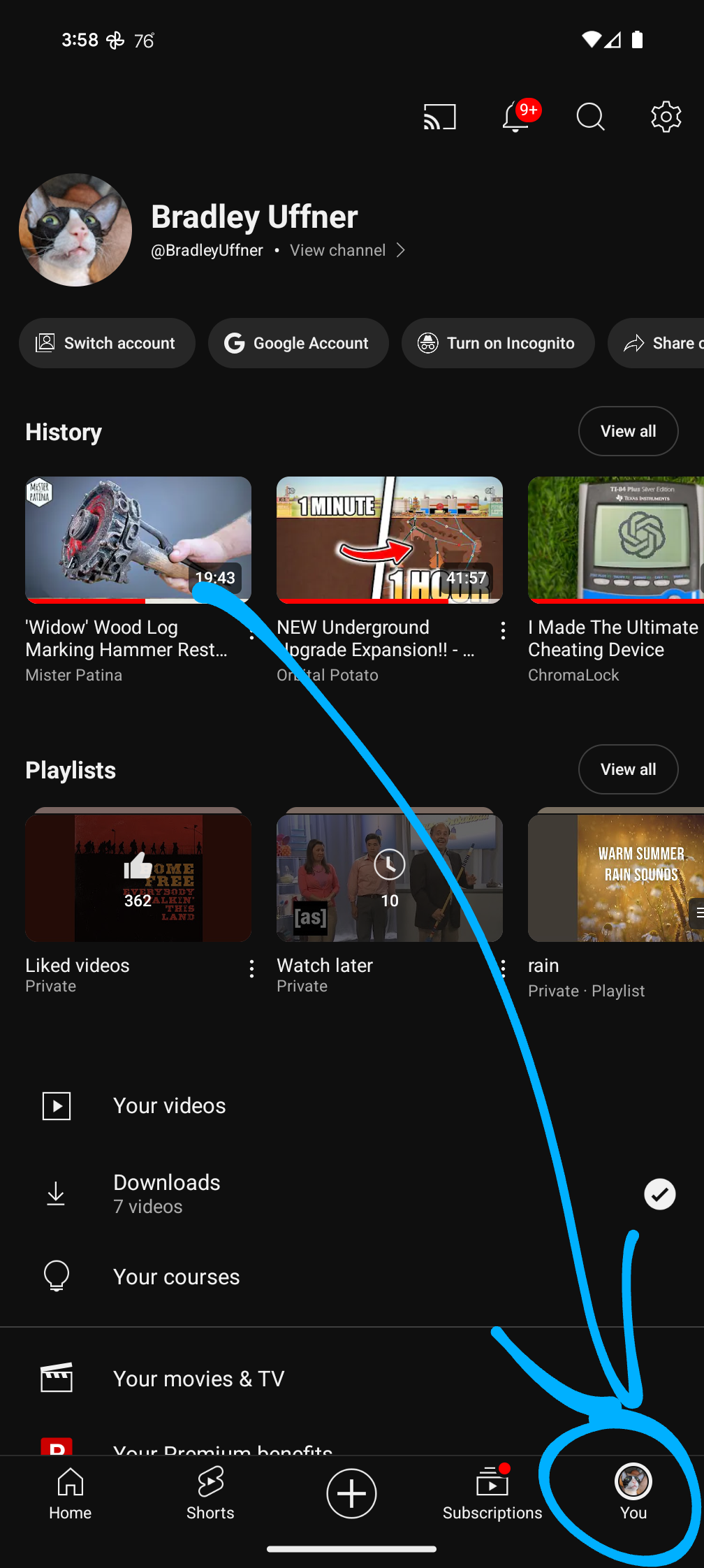
Don't even try to find your YouTube music or video play history in a rational way. It's in your profile! W T F .
It's literally one ~~click~~ tap, and I found it first try...
Break it so they can take credit for fixing it