Oh, I guess it's all good then. Thanks
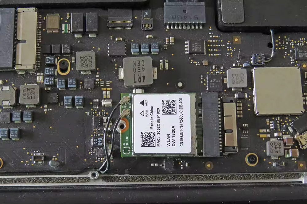
2013 Macbook Air as the post says. It's some i5 board, can't say anything more specific right now.
Anyway, I'm also kind of done with software hassles on this one, and I also prefer linux, so I'd rather keep using it.
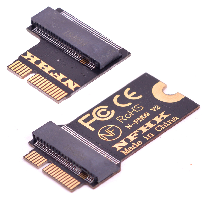
Yeah, these adapters are exactly what I intend to use if there's no mac card that just works.
However, for normal cards I have no clue about antenna compatibility, and macos compatibility. I guess the latter is just a nice to have instead of a requirement, though.
spoiler


Thankfully I also had an old usb dongle on hand. I don't want to leave it like that because it ate 50% of my two available usb ports.
(👀)
(👀) indeed, definitely interested to see that.
On some devices I could not tell.
Feel free to steal.
Seems that there's still some time to be spent fiddling with CSS layouts.

But anyway, this is an awesome update.
I usually dislike this kind of roundness, but I'm not sure I hate it here. It does feel a bit inconsistent with the rest of the ui, though.
Well you gotta start somewhere.
Let's see if we can look back at how far we've come in a year next anniversary.
And on a 27" screen that's a whole lot of mouse movement every time.
Yeah, it's a bit annoying.
Many sites do this even if the logo/title isn't far away from other controls, I guess to have a more "obvious" home button.

I tried to do this before, but it did not work out.
I couldn't make the meta key alone open overview. I also tried to add a dock there, but I can only have a panel when not in overview, which is the opposite of that I wanted. I also liked the notification menu and the quick toggles menu in top right corner.
I have been planning to get into plasma extension development to fix some of these issues.