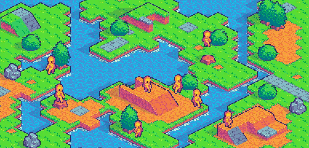
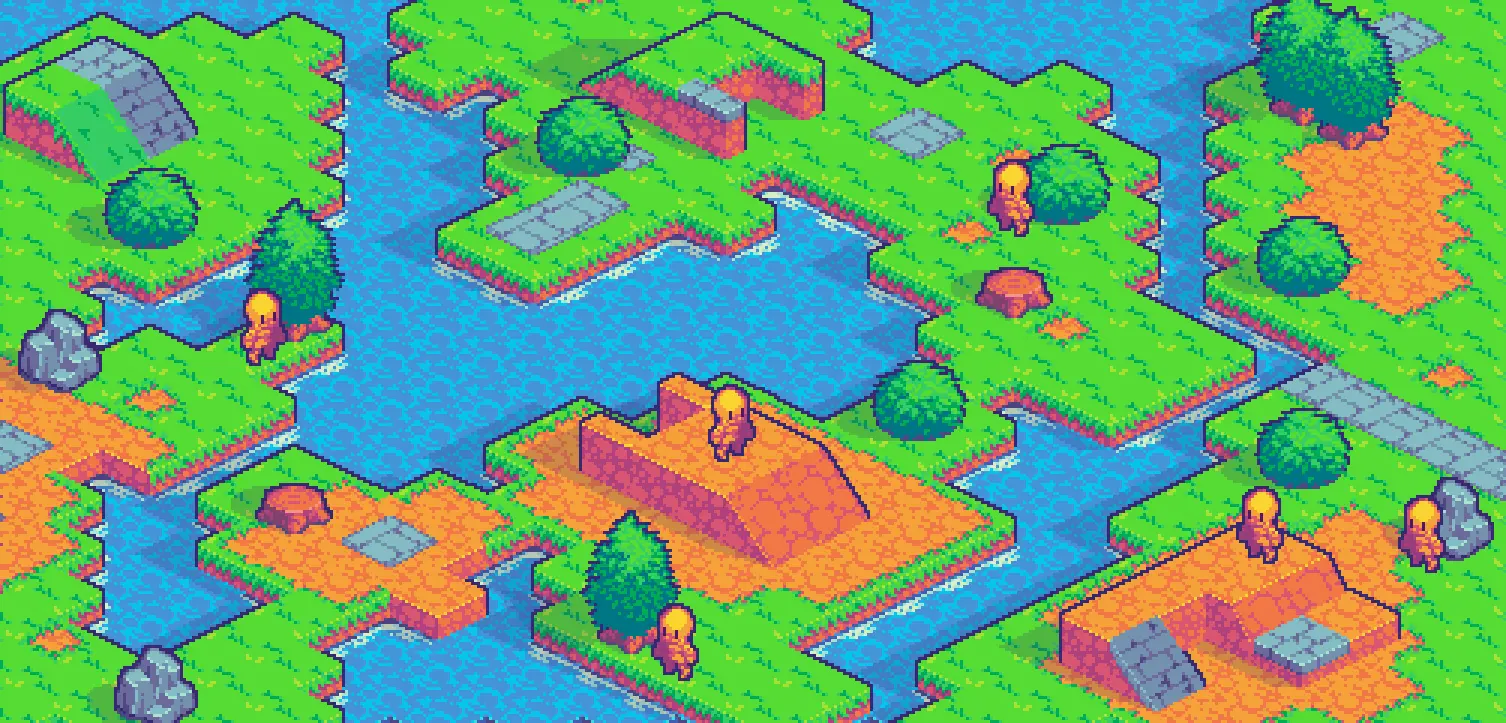
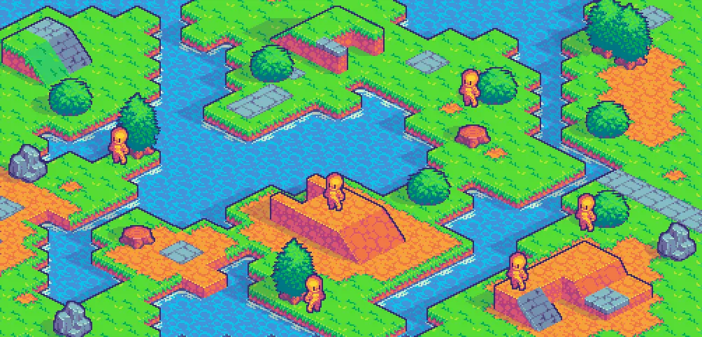
Did you find a specific ration that balanced it well or went to try different size until it worked I'm curious?
First I made an educated guess based on the tree size, which is roughly one and a half block. So I went for like, one and a quarter, this way the character wouldn't look huge while compared to a tree.
It looked decent enough, but felt that the overall vibe of the tileset asked for something a bit more cartoonish/SD, so went down 1/4 of a block. That version looked great already, matching the vibe, but I felt like trying at least one size down.
So I went down roughly 2px on each direction. It gave me a much simpler character that looked adorable and matched it nicely.
Speaking of which:

It does look incredible!
Thank you! Now I am in the process of turning that basic character into an actual character. Lets see how many I can flash out before the jam is done!
Pixel Art - pushing pretty pixels around
This shall be the community where we discuss, share, make and learn from each other how to draw the little pictures and game assets we all love.
Rules
-
To make it easy to identify original content, mark original content with [OC] in the post title.
-
If it is not your art, please credit the creator out of respect for their efforts.
-
Critizise art in a constructive manner and only when asked for.
-
Consider adding a copyright license hint to your post, if you are fine with people sharing your work.
-
This community is about enjoying art and appreciating artists, please do not post generated images here
Resources


