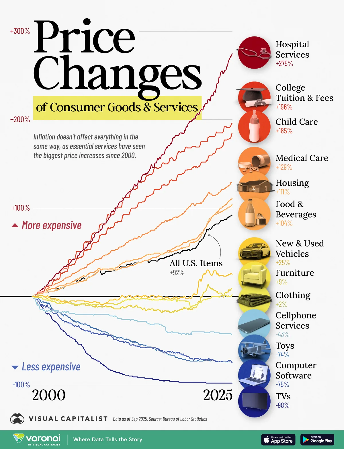
TVs only cost 2% of what they did in 2000?
A place to share and discuss visual representations of data: Graphs, charts, maps, etc.
DataIsBeautiful is for visualizations that effectively convey information. Aesthetics are an important part of information visualization, but pretty pictures are not the sole aim of this subreddit.
A place to share and discuss visual representations of data: Graphs, charts, maps, etc.
  A post must be (or contain) a qualifying data visualization.

  Directly link to the original source article of the visualization
    Original source article doesn't mean the original source image. Link to the full page of the source article as a link-type submission.
    If you made the visualization yourself, tag it as [OC]

  [OC] posts must state the data source(s) and tool(s) used in the first top-level comment on their submission.

  DO NOT claim "[OC]" for diagrams that are not yours.

  All diagrams must have at least one computer generated element.

  No reposts of popular posts within 1 month.

  Post titles must describe the data plainly without using sensationalized headlines. Clickbait posts will be removed.

  Posts involving American Politics, or contentious topics in American media, are permissible only on Thursdays (ET).

  Posts involving Personal Data are permissible only on Mondays (ET).
Please read through our FAQ if you are new to posting on DataIsBeautiful. Commenting Rules
Don't be intentionally rude, ever.

Comments should be constructive and related to the visual presented. Special attention is given to root-level comments.

Short comments and low effort replies are automatically removed.

Hate Speech and dogwhistling are not tolerated and will result in an immediate ban.

Personal attacks and rabble-rousing will be removed.

Moderators reserve discretion when issuing bans for inappropriate comments. Bans are also subject to you forfeiting all of your comments in this community.
Originally r/DataisBeautiful
TVs only cost 2% of what they did in 2000?
Ok. Did some digging and found:
BLS built hedonic models for goods and services in several areas including apparel, electronics, and housing for CPI and for computers and, more recently, broadband services for PPI.
So the "price" includes adjustments to imagine what a 50" flat panel might have cost of it had been possible back then. So a $200 dollar 50" flat TV that a single person can carry is extrapolated to be worth $10,000 back then, which at least in that case I can say sure. The minimum viable TV of 2000 no longer has anyone making that crappy, so you don't see TVs under $10 new.
But it does mean that many of these rates might be "nicer" than presented.
Might only be comparing equal screen sizes, which would mean the better TVs of the 2000s are being compared to what are basically computer monitors today. And yeah, the cost of those now is negligible compared to an actual common mid-sized (let alone large) TV of today.
Even small tvs are not $6. Math is off.
But good luck finding any TV for 300 bucks in 2000. TVs were expensive back then.
Which country is this for? No way this world wide. Wherever this is looks like a hell hole, geez. Necessities become more expensive while luxuries becoming less expensive.
BLS data, meaning it's the US.
Yes, it is an actual hellscape.
Ah somehow missed the "US items" next to the lines.
I hate how US-centric Lemmy is. Why is the US all everyone can talk about on lemmy.world, a general purpose instance. There are country specific instances for a reason.
Don't worry everyone soon all the stuff below that line will be above it as well.
This graph makes sense when you consider the main cost of these goods/services. The ones that have raised in price are very labor dependent and human labor is expensive (as it should be). The ones that got cheaper are items whose manufacturing can include a lot of automation. What this graph shows is that human labor is expensive. That is obviously not the only factor, but I feel it is a good explanation for the trends shown.
Not just labor for the top categories, skilled labor. High costs for education then lead to skilled workers demanding higher salaries, further raising costs of those categories. If only society could somehow mitigate costs for education so there were more skilled laborers...