Thanks for your work on this app, really enjoying it so far. I know alot of people wanted full height image previews back, but I personally hate it. Is there a way to disable it?
We had a lot of discussion about this feature among the devs and full height definitely gets much more approval. If you can give some specific issues that the full height gives you, we can see if there’s a way to solve them.
I think full height images results in less density of posts on each screen and too much scrolling. It's annoying to scroll past extra long images that I wouldn't have clicked on in the first place. Any portrait pictures or phone screenshots take more than a full screen to get past when you factor the header and footer. It just feels like there needs to be a middle ground between compact view (can't see enough of an image) and full view (scrolling past huge images that take up your whole screen). Thanks for coming to my Ted talk.
Yes, there’s still scope for improvement here. Once we’ve got some of the other issues with posts resolved we will be looking at this. In the meantime, keep working that thumb 😀
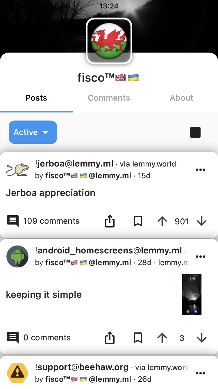
Posts I have made aren't being displayed on profile page... Comments are visible, but posts do not, although the counter for posts, shows the correct number..??
They are visible in other apps... (Show read posts is enabled)
Anyone else have the same issue??
Edit: Uninstalled & reinstalled the app, still not showing Posts I have made...🤷🏻♂️
Here’s what I see when I look at your profile. Do you still not see these posts? 
All I see is a message saying 'there are no posts'... which isn't the case, when viewing comments....I don't have this issue when viewing my user page in other apps...🤷🏻♂️ Thank you for checking, its a strange one..
Edit: Just checked your user page, says you have 10posts, I don't see any though, just the same message as I see when viewing mine... Are you running the playstore version the app? Thanks again 👍🏼
That’s very strange, thanks for letting us know. Could you raise this as an issue in GitHub? You could include a link to this post to give a little more background.
Certainly is a strange one, I'm assuming I'd need a GitHub account to raise an issue?.. Thanks for looking into it👍🏼
Yes, if you’re not comfortable with that, I can raise an issue for you, just let me know.
Well this is odd!....I can now see all of my posts, albeit in reverse order, whilst being sorted by new... I also can see all of your posts now, also not being affected by order preference...I've no idea why this suddenly changed.. I will keep an eye on it, & also if anyone else displays a similar issue, & if it persists, even intermittently I'll setup an account on GitHub, & raise an issue..
I'm sorry if this seems like a waste of your time, I'm at a loss, as to why they are now visible.... happy that they are though... Thanks👍🏼
Ahh, maybe some weird problem with the instance. I hope it’s okay from now on! If not, do let us know.
I did think that, but as this wasn't an issue with any other apps that i tested, I dismissed it...but that must be it...🤷🏻♂️ Thanks again, & so glad you guys picked up Lemmur, & pushed it on, Liftoff is just so good...👍🏻
Liftoff!
A mobile client for Lemmy running on iOS and Android