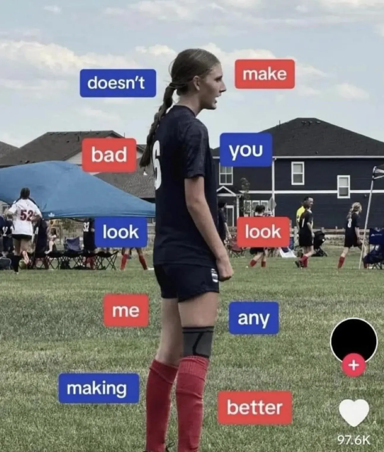
Clockwise from bottom left. Still asinine.
Did I have a fucking stroke?
I'm at a total loss as to what is the correct way to read it
The title of the crosspost (and mentioned in the description here) is the equation y=-x² which has a graph that starts at lower left, goes up to 0, then down to lower right.
This gives the intended reading order.
I was wondering what that was supposed to mean. It's ages ago since I dealt with math graphs
Start from bottom left and go clockwise
My guess is it starts on top left, then moves right, then goes down all the way to bottom right, and comes full circle to the left and back up.
So "doesn't make you look any better making me look bad".
"making me look bad doesn't make you look any better"
oh my it makes even less sense than I figured
Aneurysmposting
Rarely do I see something that makes no sense in ANY direction.
It's a clock that starts at 7.
Oh thank God. Now it makes sense. I should have known. All my clocks start at 7.
Wow, that works!
And here I thought I figured it out going clockwise from the ponytail. lol
holy shit - thank you!
The key to a good graphic is adding alternating colors that have nothing to do with the reading order
God this was terrible. In case you are still racking your brain here is my easy way to see this stupidity. Image they wanted to lay all the text on the bottom of the image and decided to instead wrap the text around the soccer player. Start at the bottom left. Like a word salad roller coaster.
Or you can re-learn how to use a graphing calculator and use the formula provided.
Thanks for this. I was genuinely trying to work out whatever the fuck this was supposed to say for longer than I care to admit.
NoSafetySmokingFirst
Welcome to NoSafetySmokingFirst!
For images where the text reads correctly left to right, but visual cues (like colouration, vertical proximity, or horizontal separation) lead you to try to read it top to bottom.
This is similar to, but distinct from, the more widely known “DontDeadOpenInside” format. In that case, the text reads correctly top to bottom, but visual cues (like colouration, horizontal proximity, or vertical separation) lead you to try to read it left to right.
The post that started it all:
Other related communities:
- !dontdeadopeninside@lemmy.ohaa.xyz
- !yelldowlgyel@sopuli.xyz (letters arranged in any confusing order)
