unixporn
unixporn
Submit screenshots of all your *NIX desktops, themes, and nifty configurations, or submit anything else that will make ricers happy. Maybe a server running on an Amiga, or a Thinkpad signed by Bjarne Stroustrup? Show the world how pretty your computer can be!
Rules
- Post On-Topic
- No Defaults
- Busy Screenshot
- Use High-Quality Images
- Include a Details Comment
- No NSFW
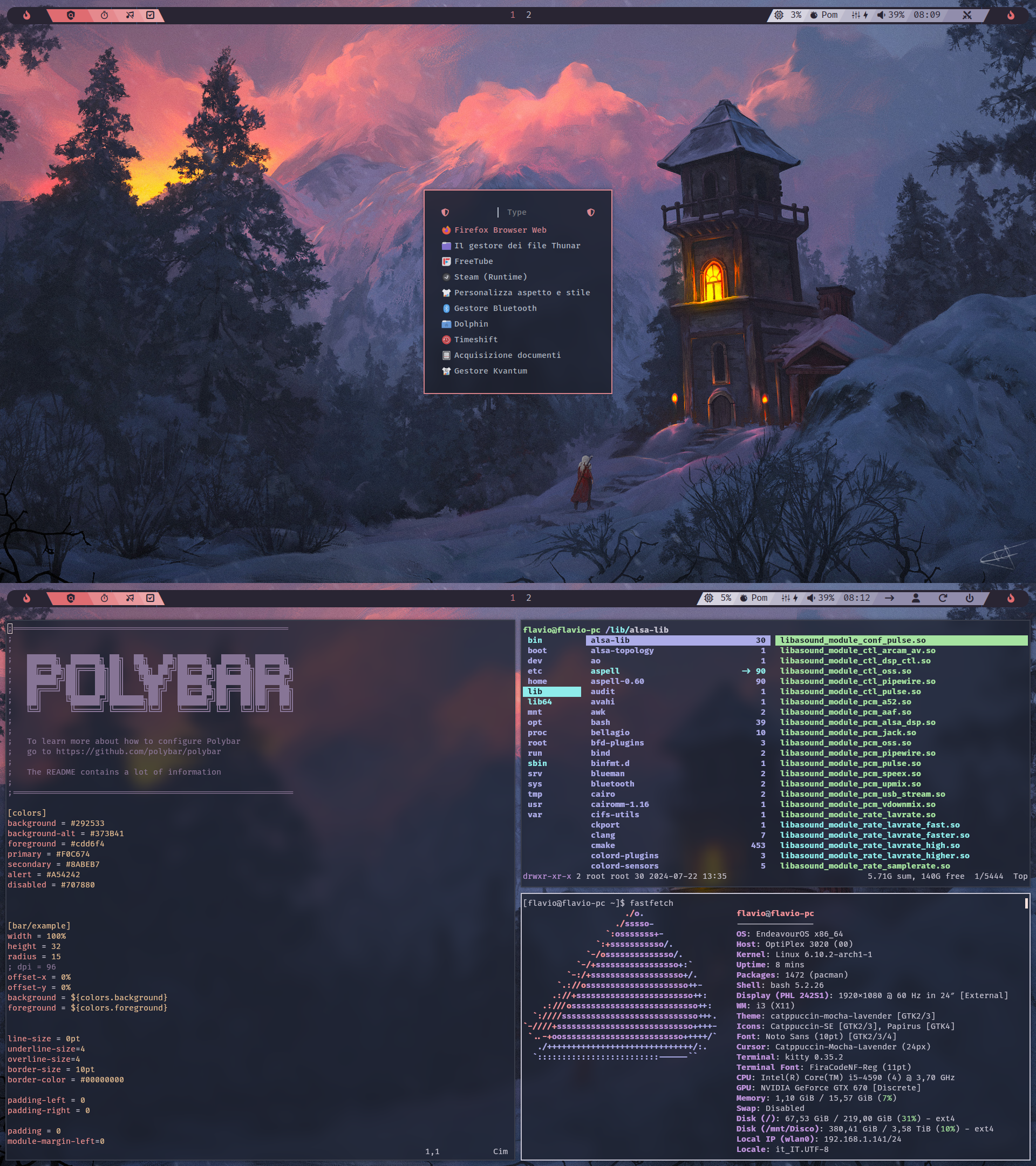
Damn polybar looks much easier to configure than waybar…
I prefer waybar as you can do css. I would say that waybar modules generally have more options. However I like the polybar feature where you can have parts of one module in a different colour. For waybar to achieve the same effect I have to make two different modules and use css to display them together
Can you link the wallpaper too?
Done, under dots
Looks like Catppuccin to me... I like it though.
Thanks, colours are based on the wallpaper. But yes for gtk I used catppuccin for the similarity
