this post was submitted on 07 Jul 2024
382 points (97.3% liked)
Programmer Humor
27545 readers
253 users here now
Welcome to Programmer Humor!
This is a place where you can post jokes, memes, humor, etc. related to programming!
For sharing awful code theres also Programming Horror.
Rules
- Keep content in english
- No advertisements
- Posts must be related to programming or programmer topics
founded 2 years ago
MODERATORS
you are viewing a single comment's thread
view the rest of the comments
view the rest of the comments

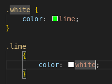
I don't get it, isn't this a pretty normal way of using media queries. Granted you're more likely to see the widths defined in px.
Shhh... The poster doesn't understand CSS and we shouldn't embarrass them in a community with memes
My imposter syndrome kicked in full swing. I was ready to learn a CSS best practice and feel uncomfortable about it for the rest off the day.
Nowadays we do responsive webdesign instead of micromanaging widths.
This is technically responsive, but I think you have a fair criticism. A single rule like this would be much more maintainable:
Obviously, media rules have their place, but not for something that's consistantly a full width container like this seems to be.