this post was submitted on 26 Mar 2024
1304 points (98.4% liked)
Curated Tumblr
7014 readers
8 users here now
For preserving the least toxic and most culturally relevant Tumblr heritage posts.
Here are some OCR tools to assist you in transcribing posts:
-
FOSS Android Recs per u/m_f@discuss.online: 1 , 2
Don't be mean. I promise to do my best to judge that fairly.
founded 2 years ago
MODERATORS
you are viewing a single comment's thread
view the rest of the comments
view the rest of the comments

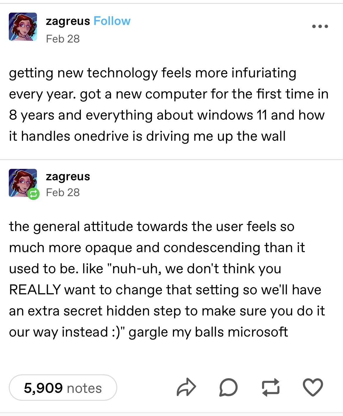
The two right-click menus are just pain. I can't imagine the reasoning. It's a core UX interaction that is used by every user repeatedly throughout the day. There is no excuse for this type of redundant, time-wasting nonsense.
Well the new one is cleaner! But it didnt fit all the options because we forgot how to make dynamic UI elements, so we figured the user would be fine clicking again and just reimplementing the last dynamic UI we had.
But heres a button for our AI product that summons an edge window locked to the side of your screen that provides the same functionality as using it in your browser!
Priorities, I guess!