this post was submitted on 13 Mar 2024
1085 points (93.9% liked)
Technology
80859 readers
3146 users here now
This is a most excellent place for technology news and articles.
Our Rules
- Follow the lemmy.world rules.
- Only tech related news or articles.
- Be excellent to each other!
- Mod approved content bots can post up to 10 articles per day.
- Threads asking for personal tech support may be deleted.
- Politics threads may be removed.
- No memes allowed as posts, OK to post as comments.
- Only approved bots from the list below, this includes using AI responses and summaries. To ask if your bot can be added please contact a mod.
- Check for duplicates before posting, duplicates may be removed
- Accounts 7 days and younger will have their posts automatically removed.
Approved Bots
founded 2 years ago
MODERATORS
you are viewing a single comment's thread
view the rest of the comments
view the rest of the comments
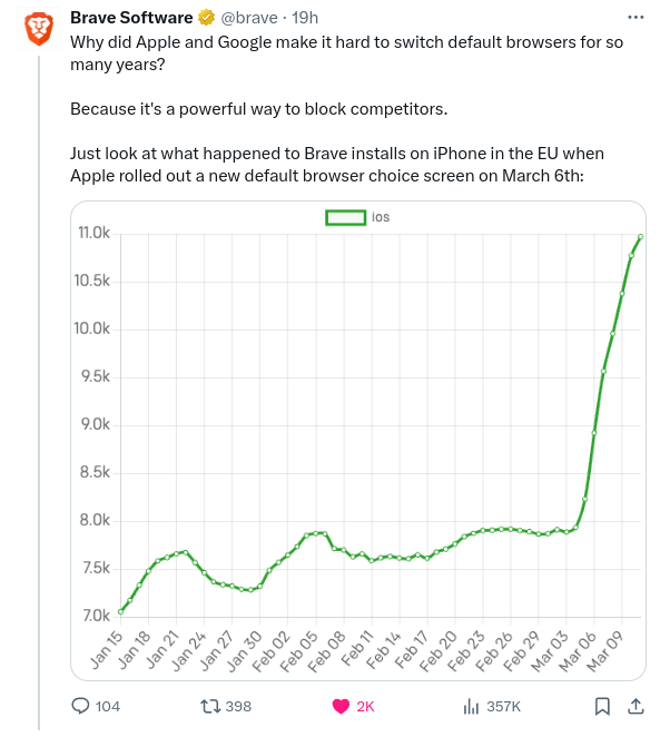
That graph looks exaggerated but this is over a few days which is crazy
It is misleading. In a reputable graph, your y axis would start at zero
Nah. I hear your complaint but look up any stock ticker. Starting at 0 would simply cause too much white space and make it hard to see movements.
The y-axis is clearly labeled allowing us to see that it’s about a 40% jump.
No the axis shows a detailed increase with clearly stated numbers. This is just the first impression.
We are not talking about Apple graph madness
Not really, no. You use a point of reference that's clearly labeled. If you'd start the graph at zero, you would just end up with a lot of dead space.