this post was submitted on 23 Jul 2023
316 points (92.2% liked)
Data Is Beautiful
9754 readers
1 users here now
A place to share and discuss data visualizations. #dataviz
founded 5 years ago
MODERATORS
you are viewing a single comment's thread
view the rest of the comments
view the rest of the comments
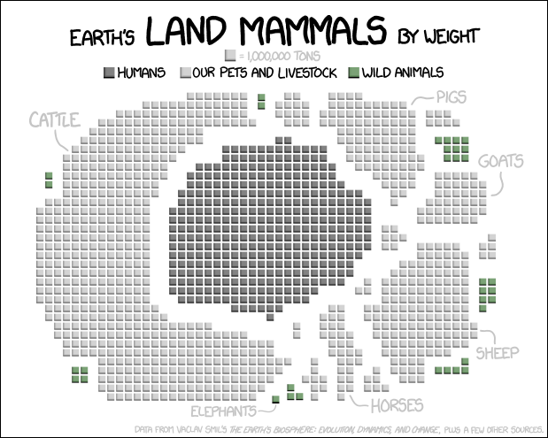
which would have been a lot more clear in a bar chart
It's like yesterdays post https://lemmy.ml/post/2352771 with a map of the US. The circle could represent earth.
This one wasn’t very good either.