315
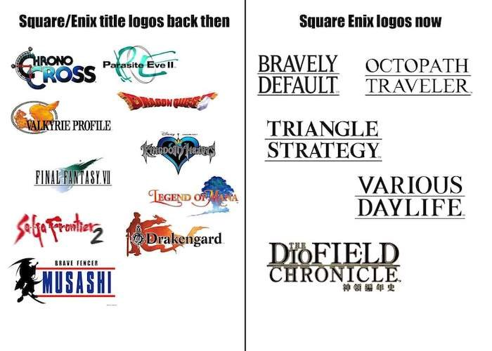
They've lost their soul
(startrek.website)
!gaming is a community for gaming noobs through gaming aficionados. Unlike !games, we don’t take ourselves quite as serious. Shitposts and memes are welcome.
1. Keep it civil.
Attack the argument, not the person. No racism/sexism/bigotry. Good faith argumentation only.
2. No sexism, racism, homophobia, transphobia or any other flavor of bigotry.
I should not need to explain this one.
3. No bots, spam or self-promotion.
Only approved bots, which follow the guidelines for bots set by the instance, are allowed.
4. Try not to repost anything posted within the past month.
Beyond that, go for it. Not everyone is on every site all the time.
Logo uses joystick by liftarn
This happened with a lot of brands. Just look at these brands It’s just a shitty trend.
This image is biased.
All logos here are made artificially monochrome (ebay, Google still remain coloured, etc.). Revolut has broken its R into 2 pieces in 2023. AirBnB and Microsoft logos include now their symbols, not only wordmarks (and they are omitted in this image). Spotify still uses its "beams".
Yes, some brands went (more) bland - especially Pinterest, Google and ebay.
For fashion: Burberry has returned to its knight in 2023. And some fashion brands go against this trend - 2017 Zara wordmark is more complicated than before.
BTW, even on this image I can see, that former Revolut and AirBnB logos look like knock-overs of each other. Both used even shades of blue xd