39
you are viewing a single comment's thread
view the rest of the comments
view the rest of the comments
this post was submitted on 18 Nov 2023
39 points (100.0% liked)
Ukraine
8122 readers
569 users here now
News and discussion related to Ukraine
*Sympathy for enemy combatants in any form is prohibited.
*No content depicting extreme violence or gore.
Donate to support Ukraine's Defense
Donate to support Humanitarian Aid
founded 2 years ago
MODERATORS
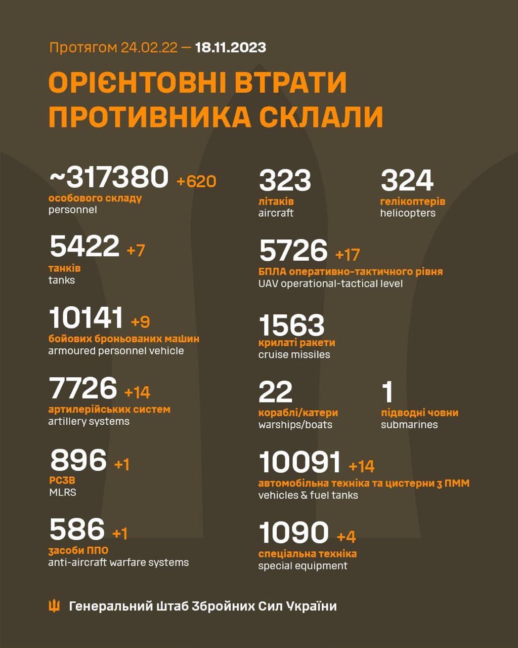
Why post this? Everyone knows that loss reports generated by the opposing military force are inflated, just as their own self-reported losses will be deflated.
That's NOT unique to this conflict, and sure, Russian reports on Ukrainian loses are comically ridiculous, but still, I don't see the value in these infographics - except as copium and/or propaganda.
Not trying to be a dick, but I genuinely don't understand why these data points are used, except as the maximum value for OSINT analysis on loss estimate ranges.
EDIT: NOT unique to this conflict.
IMO they give a data point on the intensity of the battles. It answers questions like it's the front in a lull or is it super intense, and also gives an indication of the type of losses for the enemy: more armor or more logistical assets or more aircraft, etc.