this post was submitted on 15 Oct 2024
270 points (90.4% liked)
Gaming
7480 readers
3 users here now
!gaming is a community for gaming noobs through gaming aficionados. Unlike !games, we don’t take ourselves quite as serious. Shitposts and memes are welcome.
Our Rules:
1. Keep it civil.
Attack the argument, not the person. No racism/sexism/bigotry. Good faith argumentation only.
2. No sexism, racism, homophobia, transphobia or any other flavor of bigotry.
I should not need to explain this one.
3. No bots, spam or self-promotion.
Only approved bots, which follow the guidelines for bots set by the instance, are allowed.
4. Try not to repost anything posted within the past month.
Beyond that, go for it. Not everyone is on every site all the time.
Logo uses joystick by liftarn
founded 2 years ago
MODERATORS
you are viewing a single comment's thread
view the rest of the comments
view the rest of the comments

If you don't like it, don't press that button
As I'm getting older, I'm definitely starting to appreciate that I just can't see shit. If the game's going for an ultra-realistic environment, then there's just so much more visual clutter that I need help picking things out.
In my opinion, it's just an accessibility feature. Those are always nicer to have than to not. But if you're a purist, or you don't have any problem finding things, then I'd also hope you'd be able to disable it.
The problem is that games are designed for it to be used. I hated using Witcher senses in Dying Light 2, but good look finding lootables without it. It’s a cop out solution.
It really depends on the game, you can't put all games under an umbrella and say it's all bad. I love the ones in Starfield, warframe, No Man's Sky, Assassin Creed Origins and Odyssey and many more. As long as it has actual uses more than just highlighting stuff and/or is well designed it's always welcome IMO. Haven't played DL2 yet but I really can't think of any game where it felt like a cop out for otherwise bad design.
💯 Playing through Red Dead Redemption 2 and there is so much detail and it's beautiful.
...but then when I'm trying to pick out herbs and plants and it's all so beautifully rendered I don't know what plants and flowers can be harvested and which are just there to be pretty. Dead Eye is a lifesaver for that.
That desaturated-with-highlighted-items vision is a design choice that does solve a problem even in realistic worlds -- even if it's just to show players something the character can see but is hard for the player to spot.
If you look at old games, the reason they didn't need this was because they couldn't have nearly as many props in a scene. I like to use classic WoW as an example. It didn't have any kind of highlighting for objects to interact with, but you didn't need it because there just weren't that many objects period.
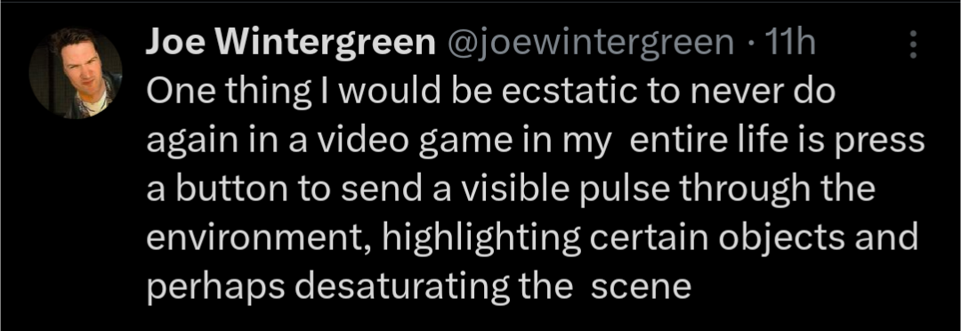
Highlighting interactables, whether it be through a pulse like the meme, or just based on proximity, is a compromise in modern games to make things playable while also having dense, prop-filled environments. The infamous white or yellow paint for climbing surfaces is another example.
I doubt many designers love these solutions, but they're currently the best we've got. It's not an easy problem to solve, but I hope a more immersive solution comes along someday. In the meantime, having it is better than not, I totally agree with you.
You actively choose not to use it but if you didn't know about such a mechanic, sometimes you might end up like this.
When one guy is playing Morrowind and the other is playing Skyrim.
Avatar : Frontiers of Pandora has had me going like Rowan when played in explorer mode. It gives you hints like in other recent Ubisoft games but holy shit some of those were near useless... I wasted entirely too many hours just exploring and circling around the correct answer. I recently switched to the more friendly Guided mode and it has the waypoint only appear in Hunter mode, so that was kinda nice. Hasn't completely spoiled the experience although I still wish it would only activate once you were in the vicinity indicated by the clue (ie, if the clue gives you some corner of the map to explore, then the guided mode would only start helping once you've reached that general area).
But yeah, overall, I disagree with OP. Make it optional, make it diegetic, make it subtle, but the option is a wonderful game design element, in my book.
One thing I think is that the longer time you need to use it, the harder you've failed in you basic design, because I shouldn't have to press the damn button 90% of the time like I used to in Far Cry Primal. That game is still my favourite as a precursor, but I was using the hunter vision way way way too much.