39
you are viewing a single comment's thread
view the rest of the comments
view the rest of the comments
this post was submitted on 02 Sep 2024
39 points (100.0% liked)
cactus
362 readers
1 users here now
A community for the cultivation, photography, and general information about cacti. Growing advice, photos of cactus in cultivation or in the wild, or other cactus-related content is all welcome.
founded 1 year ago
MODERATORS


a small tip from someone that has been at this for a while.
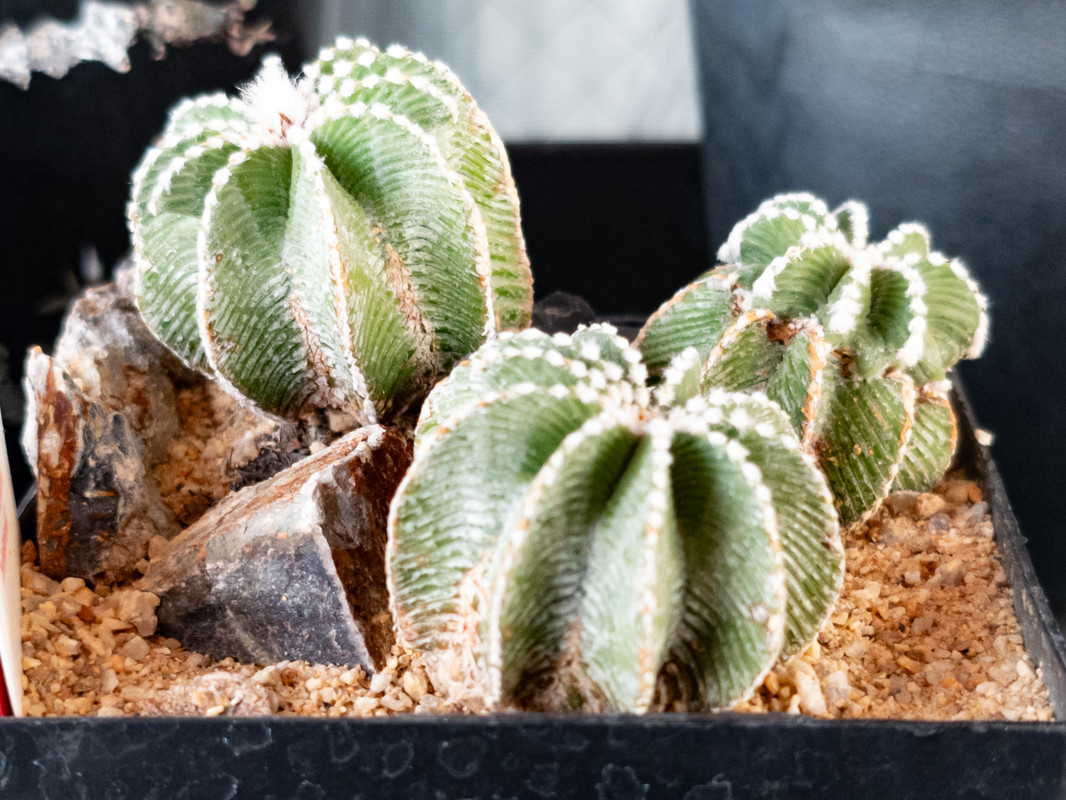
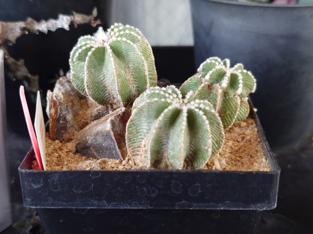
watch your highlights when you're pushing the contrast. you have some very delicate texture and detail in the whites on those plans the you don't want to lose. try pushing your highlights and shadows separately, if you aren't, instead of using the contrast slider. that way you can push the shadows down more than you push the highlights up. creating the same amount of contrast while preserving the highlights.
of course, the same can an be said in reverse for shadows. it's all a balancing act.
Great tip and good point, thank you very much! I'll definitely keep that in mind!