300
this post was submitted on 29 Aug 2024
300 points (97.8% liked)
Data Is Beautiful
8914 readers
11 users here now
A place to share and discuss data visualizations. #dataviz
founded 4 years ago
MODERATORS
you are viewing a single comment's thread
view the rest of the comments
view the rest of the comments
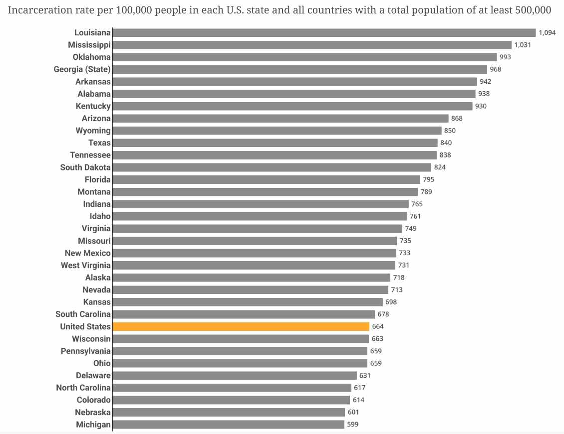
Thats how averages work, unlike eg maximums.
But Im sure reversing that chart would correlate with math test scores.