?referring_host=Reddit
this post was submitted on 04 Sep 2026
109 points (100.0% liked)
World News
2464 readers
705 users here now
Rules:
Be a decent person.
No racism, sexism, ableism, homophobia, transphobia, zionism/nazism, and so on.
Other Great Communities:
Rules
Be excellent to each other
founded 2 years ago
MODERATORS
He's a traitor.
Thansk
Put him in the ticklebox
Sorry, removed that.
I was just busting your balls. lol
Appreciate it, though.
Ew, everything at the equator is so skinny.
IRL Africa is about as wide as it's tall; it's as far from Benghazi to Cape Town as from the mouth of the Gambia to the tip of the Horn of Africa, but on this map it's around a 2:3 ratio.
Ironically, the most natural-looking part of this map is Europe. All other landmasses are either at a latitude that stretches the proportions or at a longitude that skews them.
Thanks I hate it already.
Well there is no way to preserve the scale of all land masses properly since you're projecting a 3D object onto a 2D plane. This projection at least partially addresses the issue of land masses near the poles being away to big than they actually are. I feel geographically Europe is in a position where the distortions are minimized, at least in the case of projections that don't have weird layouts.
Behrmann would make a lot more sense. The average person lives at 30 degrees latitude, and it works at all longitudes.

If you're in the 6% of the population that lives above 45 degrees latitude, I agree the distortion kind of sucks, so please look at the flag of the United Nations until you feel better.
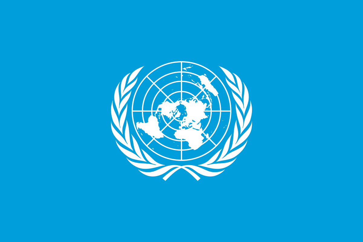
And of course, they voted for it, 164-1, with USA voting against due to "ideological reasons". What a fucking time to be alive. Maps are woke.
Winkel Tripel best projection https://en.wikipedia.org/wiki/Winkel_tripel_projection
Robinson projection prettiest projection https://en.wikipedia.org/wiki/Robinson_projection
Robinson is good, but this one is even better: https://en.wikipedia.org/wiki/Natural_Earth_projection
Compare Alaska. It's still not perfect, but it's closer.
That one makes USA and Europe larger.
But... just hear me out. What if the U.N. just didn't listen to 1 (or 2) of the most frequent dissenters? Especially if they're not "peace loving?" Not everyone is allowed in the U.N.
I don't really like those cylindrical projections. I'm partial to the butterfly :
https://en.wikipedia.org/wiki/Waterman_butterfly_projection
Of course it has the drawback of poorly representing maritime routes. For once NZ is in the top left instead of bottom right, I wonder if they like the change
On standard flat maps, Greenland often appears around the same size as Africa. Africa is about 14 times larger than Greenland. Countries like Canada and Russia also look much larger than they actually are. I didn't realize it for a long time either that many flat maps merely tried to flatten a 3D globe onto a 2D surface.
Not just many. Literally all flat maps of the Earth try to flatten a globe onto a 2d surface. That is the task of making a flat map representing the Earth.
Every projection from a 3d globe to a flat 2d representation will introduce distortion of some kind. You can get accurate directions, or accurate land areas, or a nice rectangular coordinate grid for latitude and longitude, but you can't get them all at once.
The Cartographers for Social Equality will be pleased!