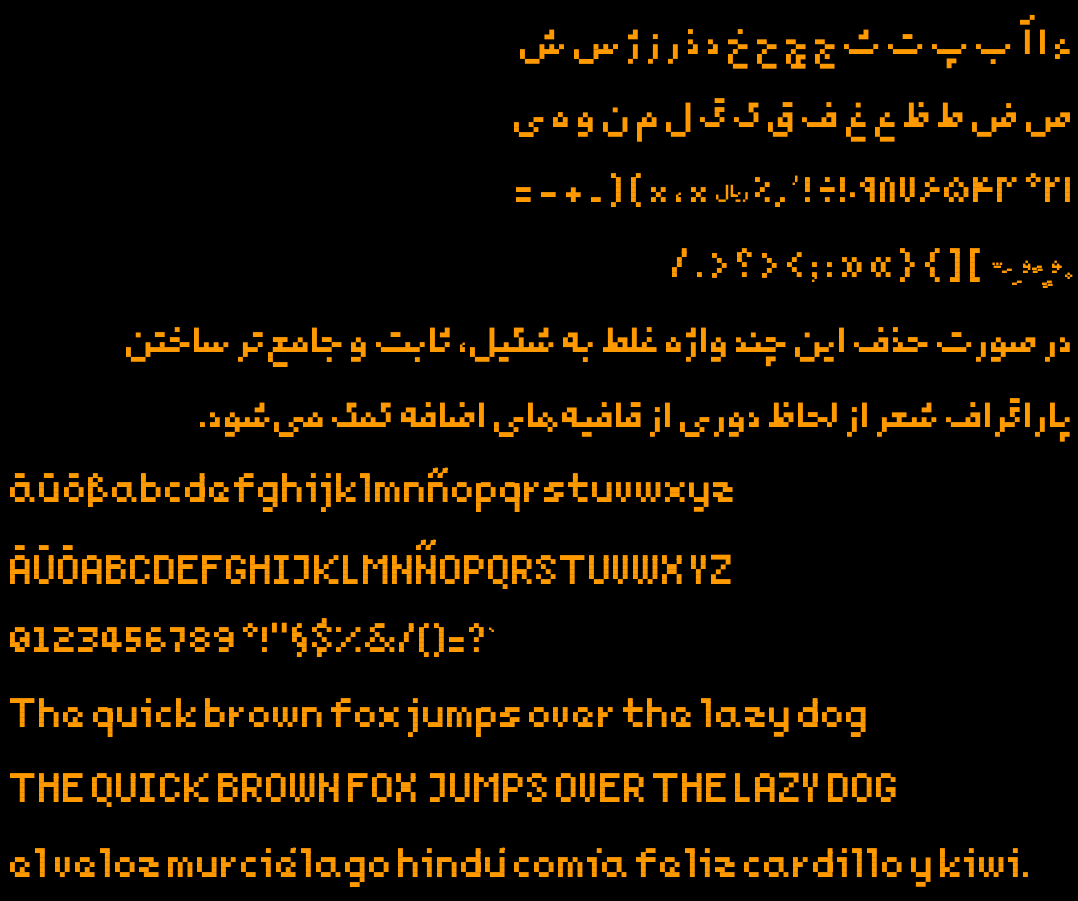
Last year I made a new pixelated free typeface for my 2d game. It has Arabic, Persian, and a subset of Latin glyphs enough for English, German and Spanish texts. Inside the repo you'd find makefile to build the font and generate test outputs.
Since it was my first experience designing a typeface ever, I might have made mistakes not known to me. That's why I post this, hoping someone would point them out. Here is the repo