this post was submitted on 26 Mar 2024
191 points (88.0% liked)
MapPorn
3595 readers
1 users here now
Discover Cartographic Marvels and Navigate New Worlds!
Rules
- Be respectful and inclusive.
- No harassment, hate speech, or trolling.
- Engage in constructive discussions.
- Share relevant content.
- Follow guidelines and moderators' instructions.
- Use appropriate language and tone.
- Report violations.
- Foster a continuous learning environment.
founded 2 years ago
MODERATORS
you are viewing a single comment's thread
view the rest of the comments
view the rest of the comments

Does this prevent you in any way from comprehending the image? It takes more effort to parse out what you just said than it takes to understand the drawing. I still don't understand why it's relevant but that's beyond the point.
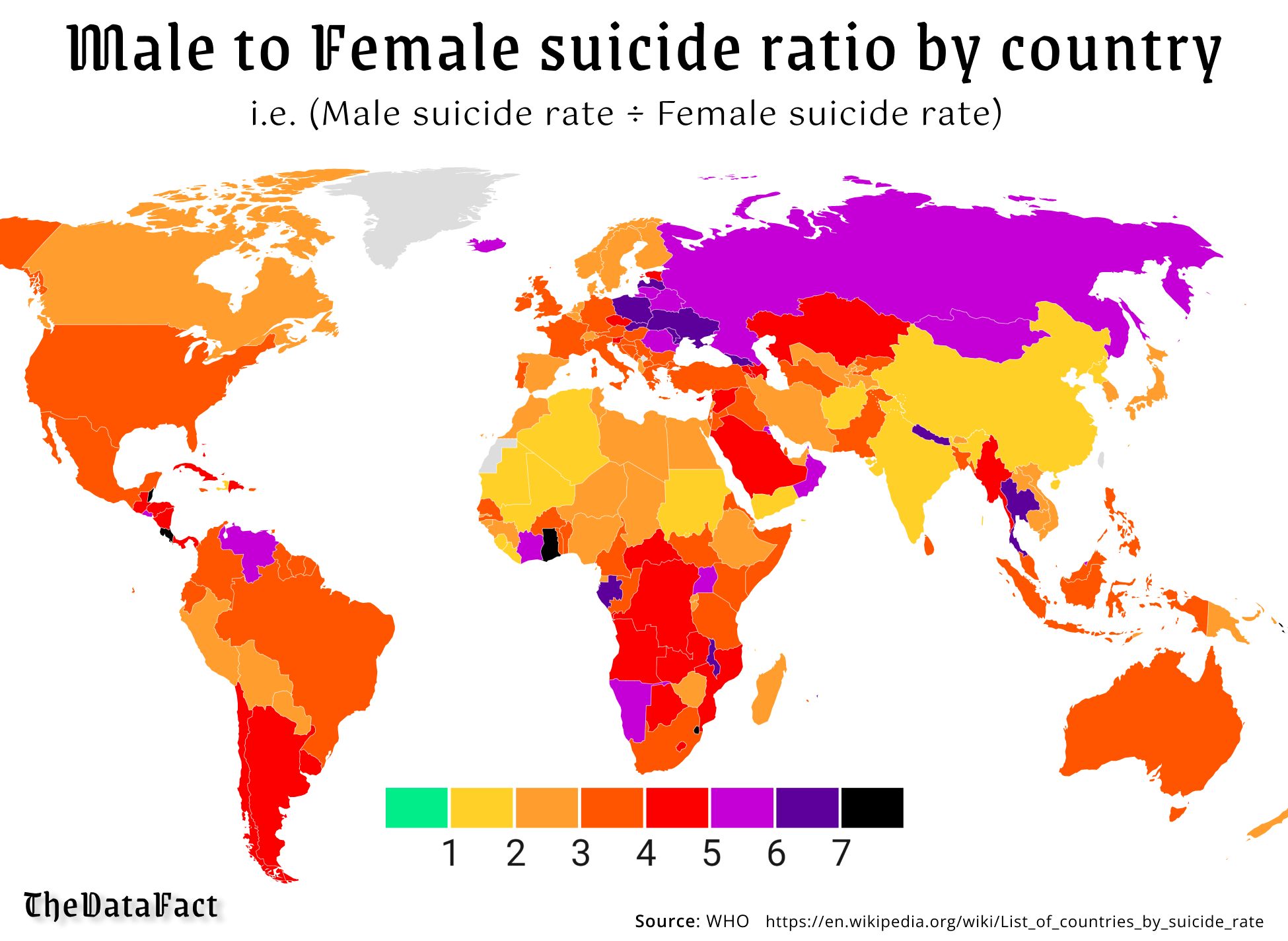
The image title could have said "MALE SUICIDES VS FEMALE SUICIDES (SKABADOO BANANAS WITH PAUL LEMON)" and you should still be able to immediately understand that farther right = more male suicides
Hell you should be able to understand the gist of the image without even having any numbers on the bottom, just "less" on the left and "more" on the right.
seriously, are you deliberately acting like this or do you really not see how the way information is presented is not clear?
I mean you can keep saying that but it doesn't change the fact that you should have paid more attention in school