this post was submitted on 29 Mar 2024
836 points (91.6% liked)
linuxmemes
28010 readers
1990 users here now
Hint: :q!
Sister communities:
Community rules (click to expand)
1. Follow the site-wide rules
- Instance-wide TOS: https://legal.lemmy.world/tos/
- Lemmy code of conduct: https://join-lemmy.org/docs/code_of_conduct.html
2. Be civil
- Understand the difference between a joke and an insult.
- Do not harrass or attack users for any reason. This includes using blanket terms, like "every user of thing".
- Don't get baited into back-and-forth insults. We are not animals.
- Leave remarks of "peasantry" to the PCMR community. If you dislike an OS/service/application, attack the thing you dislike, not the individuals who use it. Some people may not have a choice.
- Bigotry will not be tolerated.
3. Post Linux-related content
- Including Unix and BSD.
- Non-Linux content is acceptable as long as it makes a reference to Linux. For example, the poorly made mockery of
sudoin Windows. - No porn, no politics, no trolling or ragebaiting.
4. No recent reposts
- Everybody uses Arch btw, can't quit Vim, <loves/tolerates/hates> systemd, and wants to interject for a moment. You can stop now.
5. 🇬🇧 Language/язык/Sprache
- This is primarily an English-speaking community. 🇬🇧🇦🇺🇺🇸
- Comments written in other languages are allowed.
- The substance of a post should be comprehensible for people who only speak English.
- Titles and post bodies written in other languages will be allowed, but only as long as the above rule is observed.
6. (NEW!) Regarding public figures
We all have our opinions, and certain public figures can be divisive. Keep in mind that this is a community for memes and light-hearted fun, not for airing grievances or leveling accusations. - Keep discussions polite and free of disparagement.
- We are never in possession of all of the facts. Defamatory comments will not be tolerated.
- Discussions that get too heated will be locked and offending comments removed.
Please report posts and comments that break these rules!
Important: never execute code or follow advice that you don't understand or can't verify, especially here. The word of the day is credibility. This is a meme community -- even the most helpful comments might just be shitposts that can damage your system. Be aware, be smart, don't remove France.
founded 2 years ago
MODERATORS
you are viewing a single comment's thread
view the rest of the comments
view the rest of the comments

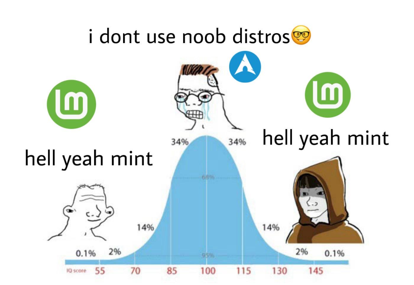
Hell yeah Linux Mint Debian Edition
At that point, what are you using Mint for? The Cinammon DE?
IMHO, KDE feels much more modern, while Cinammon kind of feels like it's stuck in 2003. It reminds me of the stock gray boxy Windows 9x/NT/2000 interface.
I love cinnamon it's the main reason I use mint I tried debian with mint but the theming was ugly but the cinnamon on mint mmm beautiful I find it very comfortable and familiar like all the good parts of windows 7 just with a tad bit more modern design
I think Cinnamon is version 6 on Mint while Debian is stuck on a v5 build.
I stuck an Arc theme on it and that modernized it a lot.
To me, Cinnamon sits somewhere between the extremes of Gnome and KDE.
Gnome is an Android launcher with a concussion. Every major update is a list of things it can't do anymore. Hopefully by Gnome 52 the system won't even POST let alone boot. Every utility is a blank window with an empty menu up in the top bar that does as little of its job as it can, apparently in service to some "blank is beautiful" aesthetic.
KDE feels like the control panel of a nuclear power plant, LOADS of crap everywhere. Widgets and wodgets and panels and sidebars where does it end? Every utility is an incorrectly sized window completely crammed full of drop downs, radio buttons and text fields with several tabs and sub-menus with lots of options, because what if esoteric use case?
Cinnamon is a middle ground in between; they have a "most users, most of the time" approach so that UIs are understandable and digestible, and usually let you do what you want to do, without being uselessly blank or obsessively crowded.
Cinnamon doesn't need therapy, Gnome and KDE do.