this post was submitted on 29 Sep 2026
98 points (100.0% liked)
Memes of Production
1717 readers
609 users here now
Seize the Memes of Production
An international (English speaking) socialist Lemmy community free of the “ML” influence of instances like lemmy.ml and lemmygrad. This is a place for undogmatic shitposting and memes from a progressive, anti-capitalist and truly anti-imperialist perspective, regardless of specific ideology.
Rules:
Be a decent person.
No racism, sexism, ableism, homophobia, transphobia, zionism/nazism, and so on.
Other Great Communities:
founded 8 months ago
MODERATORS
you are viewing a single comment's thread
view the rest of the comments
view the rest of the comments
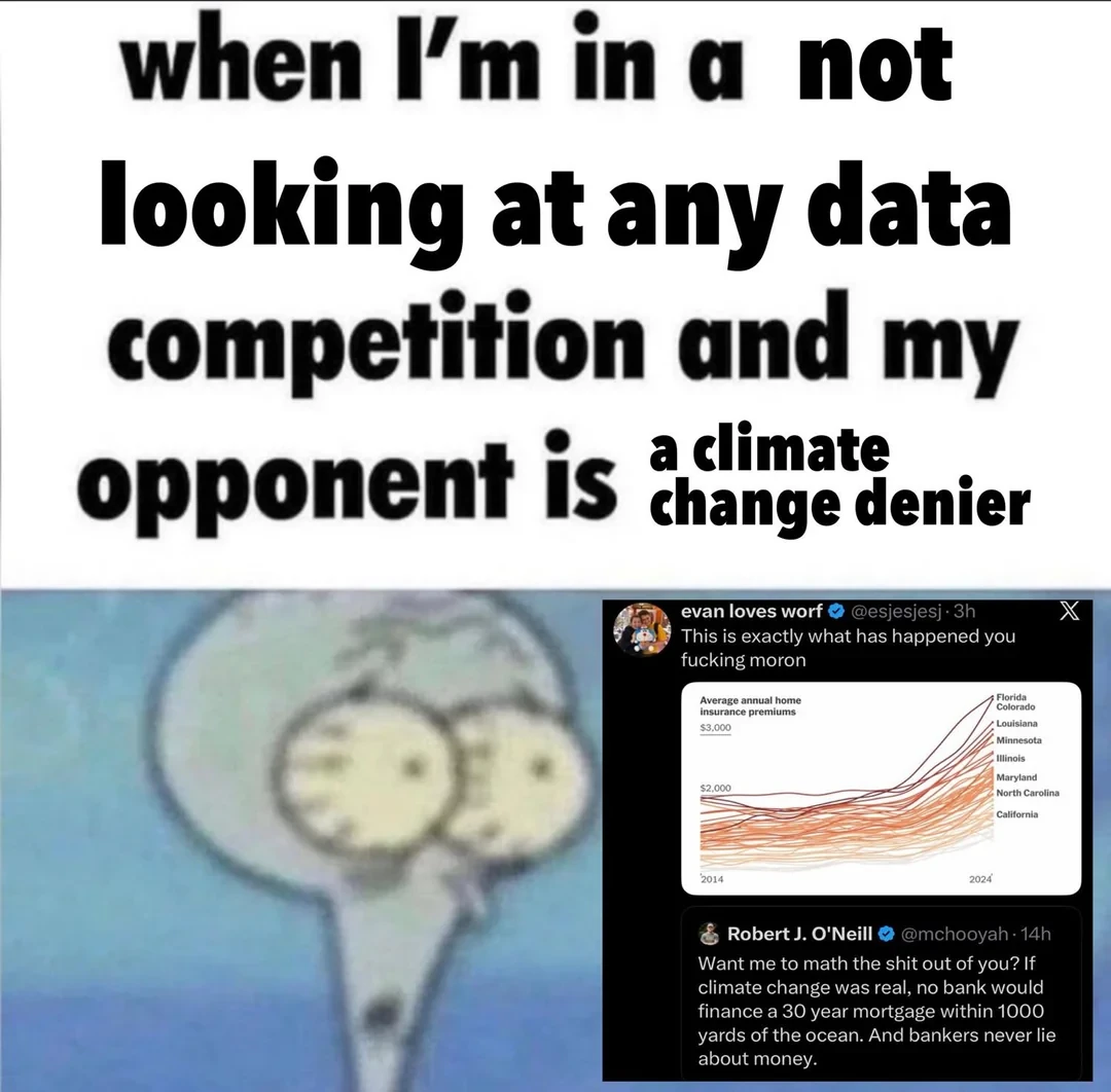
Ok but that chart is about insurance premiums, not home loans, and also shows landlocked states rising just as much....
and also California is somehow lowest, kinda agreeing with the climate change denier
Proving the "Not looking at any data" point of the meme in a single sentence
https://www.landmark.co.uk/news-insights/blog/understanding-the-impact-of-climate-change-on-mortgage-lending/
https://www.usnews.com/insurance/homeowners-insurance/climate-change-and-rates
https://uber-finance.com/green-finance/the-impact-of-climate-change-on-mortgage-lending/
https://www.housing.info/blog/when-the-weather-hits-your-wallet-how-climate-risk-is-quietly-rewriting-the-rules-of-homeownership
Here's a couple of things I found in 30s of searching
Yea im not a climate change denier and i know what the data says. I was just pointing out that the guy in the pic had a shit response by showing an unrelated chart that doesnt even correlate with rising sea levels.
Also,to the original denier in the pic, banks probably dont care because they know that the fed will just bail them out if all their housing collateral gets flooded.
I was just critiquing that one chart, please don’t kill me
Alright, no death for you, but can I pet that dawg?
yes