this post was submitted on 19 Aug 2023
90 points (94.1% liked)
Unixporn
18114 readers
1 users here now
Unixporn
Submit screenshots of all your *NIX desktops, themes, and nifty configurations, or submit anything else that will make themers happy. Maybe a server running on an Amiga, or a Thinkpad signed by Bjarne Stroustrup? Show the world how pretty your computer can be!
Rules
- Post On-Topic
- No Defaults
- Busy Screenshots
- Use High-Quality Images
- Include a Details Comment
- No NSFW
- No Racism or use of racist terms
founded 6 years ago
MODERATORS
you are viewing a single comment's thread
view the rest of the comments
view the rest of the comments

Icons are already a big part of it!
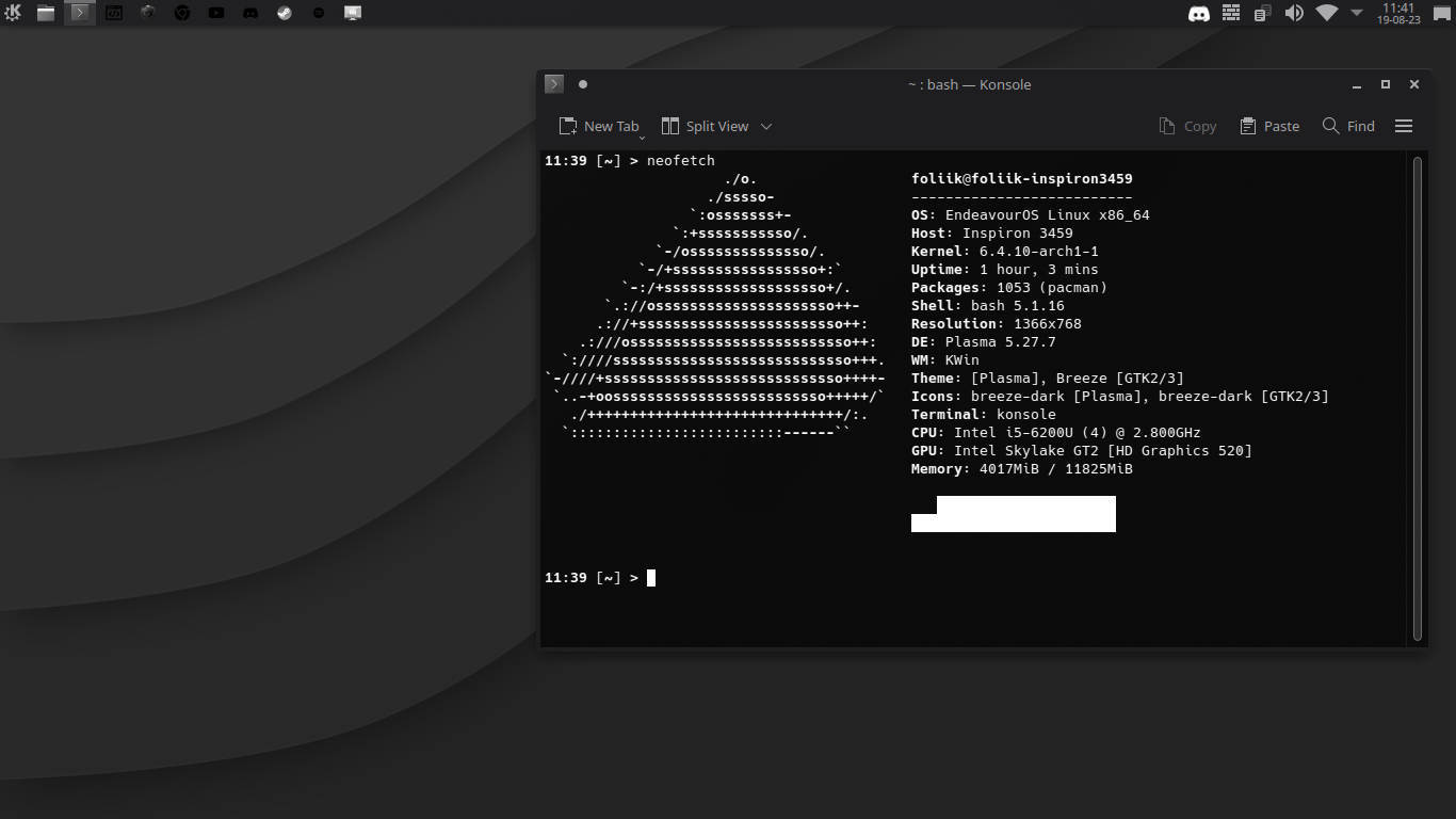
The core thought that you need to keep in mind is that without colour in your setup, you want your icons (as well as everything else) to be recognizable by shape. There should be a couple good icon sets out there, and judging by how late I am with my reply you've likely already found something decent.
You may also want to maximize the value that you can get out of the different shades of grey that are available to you. One step in that direction would be swapping out the wallpaper. Your current one is kind of heavy on gradients, which can get in the way of your other UI elements and takes away some range that you could utilize elsewhere. I recommend something more flat, or some suitable nature photography with the saturation turned all the way down if you're not too religious about the mono look.
For the theme, look for something that relies more on outlines than colours or gradients to distinguish UI elements. Ideally something that matches with the icons.
Also a little disclaimer that I don't rice much and am half talking out of my ass here. All the above is stuff I've seen or read about elsewhere, but haven't tried myself. Your mileage may vary, and happy ricing!