I happened across a QR code outside of Vancouver, Washington's City Hall about the current progress of selecting a new flag for the city. The thumbnail of this post is the current flag. There are six finalists under current consideration.
I personally like...
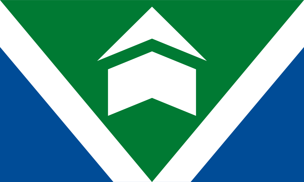
 Finalist flag #3 by Nathan Hunter. It is geometrically simple yet depicts the history as a fort along the river. If this were a map, a simple square would indicate a fortification or building, so this makes sense to me. The creator also notes of the subtle letter V, although I'm not sure I would have seen that.
Also, I like that the colors are unconventional yet meaningful. The natural inclination for coloring a river would be blue, but white makes more sense here as the river also forms the border between the US States of Washington and Oregon, precisely where Vancouver is located. That the top half uses the green from Washington's flag, and the bottom half using blue (almost) from Oregon's (bizarrely two-sided) flag, is icing on the cake.
Do I think this flag also looks like the square-root symbol from mathematics? Yes, but that's why it would be a good flag: many ways to depict and ways to riff on any perceived similarities. Much like the UK's Union Jack, the more that a design can be remixed yet still recognizable, that should make for a better flag. That's why I personally prefer fewer squiggly lines on flags that depict rivers, because ultimately, most people don't orient their mental picture of a city based on squiggly lines, but rather with straight lines. See how the London Tube map was created.
For a smaller town like Vancouver -- overshadowed by the major Canadian city of the same name, and by adjacent Portland south of the river -- depicting the geographical position is more relatable than describing the abysmal Pacific Northwest weather, flannel, or whatever else stereotypes may exist but aren't Vancouver, WA-specific. So I think a geographic flag makes sense in this context.