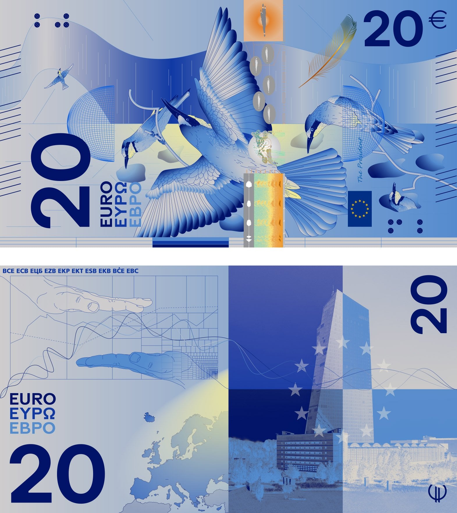
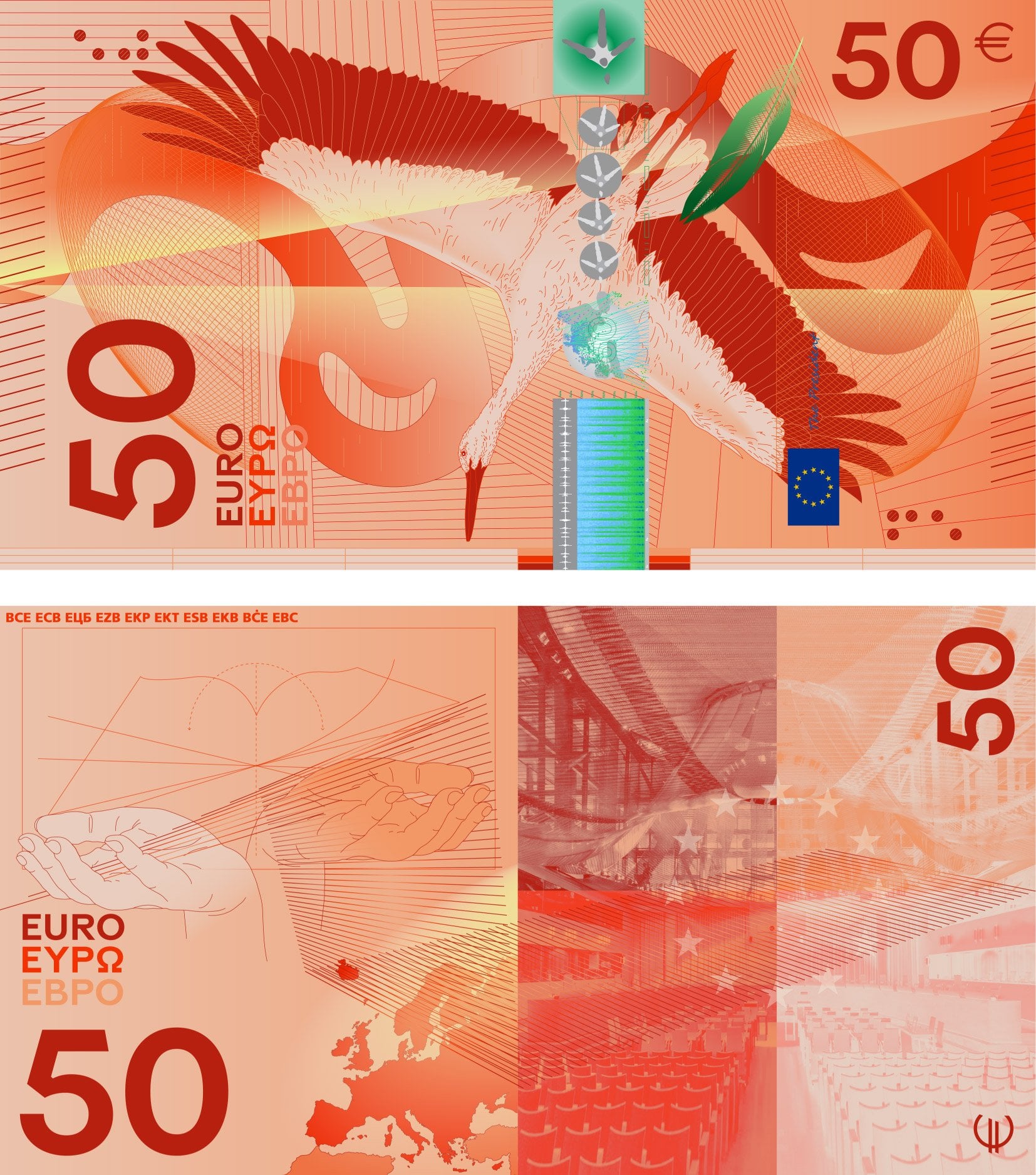
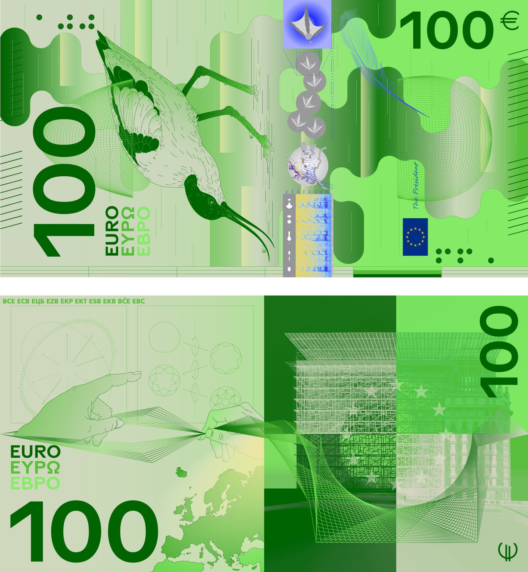
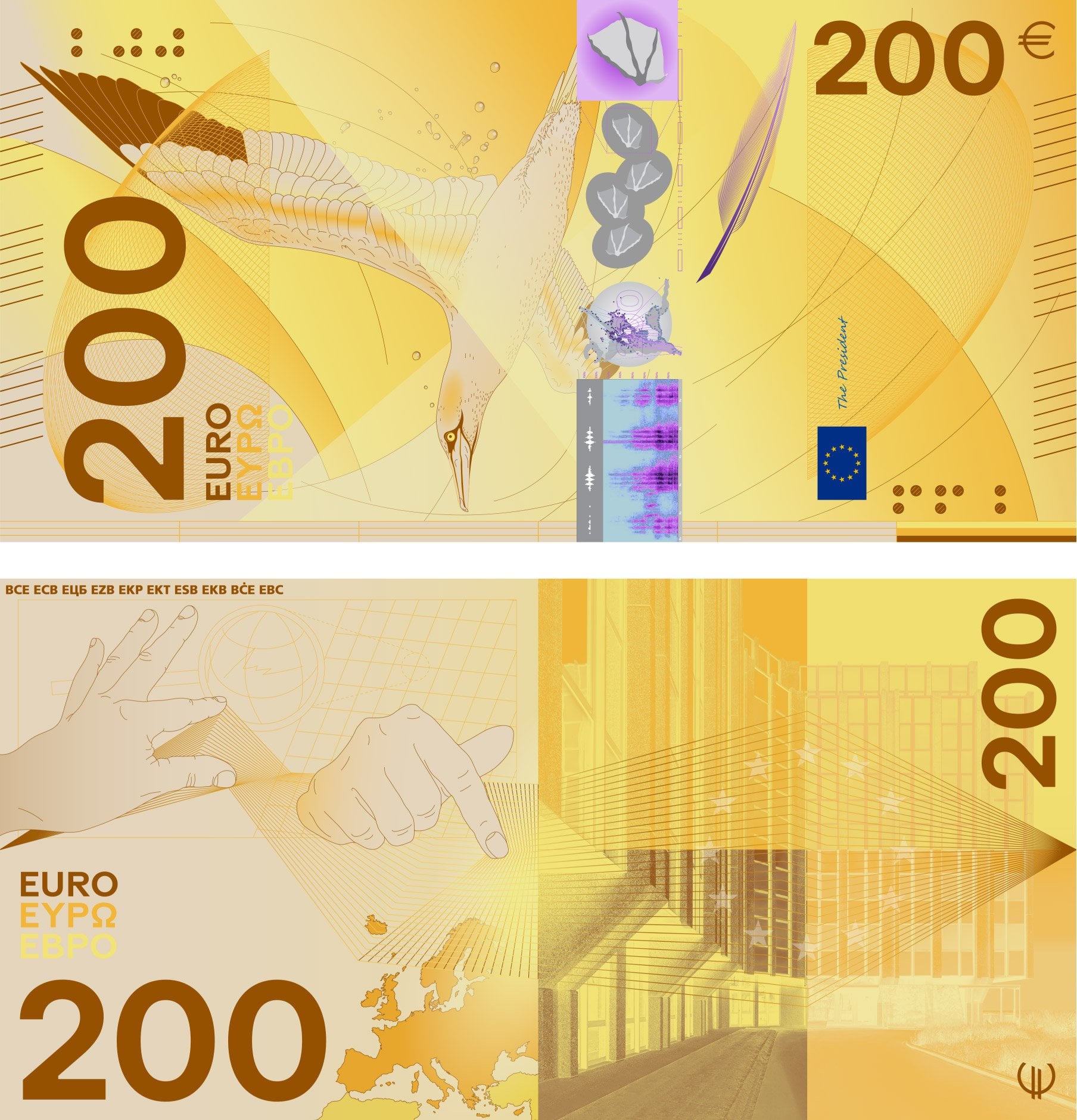
Keep it abstract! I love the windows and bridges current theme. Couldn't we make a new design with the same colors and prompt?
Europe
News and information from Europe πͺπΊ
(Current banner: La Mancha, Spain. Feel free to post submissions for banner images.)
Rules (2024-08-30)
- This is an English-language community. Comments should be in English. Posts can link to non-English news sources when providing a full-text translation in the post description. Automated translations are fine, as long as they don't overly distort the content.
- No links to misinformation or commercial advertising. When you post outdated/historic articles, add the year of publication to the post title. Infographics must include a source and a year of creation; if possible, also provide a link to the source.
- Be kind to each other, and argue in good faith. Don't post direct insults nor disrespectful and condescending comments. Don't troll nor incite hatred. Don't look for novel argumentation strategies at Wikipedia's List of fallacies.
- No bigotry, sexism, racism, antisemitism, islamophobia, dehumanization of minorities, or glorification of National Socialism. We follow German law; don't question the statehood of Israel.
- Be the signal, not the noise: Strive to post insightful comments. Add "/s" when you're being sarcastic (and don't use it to break rule no. 3).
- If you link to paywalled information, please provide also a link to a freely available archived version. Alternatively, try to find a different source.
- Light-hearted content, memes, and posts about your European everyday belong in other communities.
- Don't evade bans. If we notice ban evasion, that will result in a permanent ban for all the accounts we can associate with you.
- No posts linking to speculative reporting about ongoing events with unclear backgrounds. Please wait at least 12 hours. (E.g., do not post breathless reporting on an ongoing terror attack.)
- Always provide context with posts: Don't post uncontextualized images or videos, and don't start discussions without giving some context first.
(This list may get expanded as necessary.)
Posts that link to the following sources will be removed
- on any topic: Al Mayadeen, brusselssignal:eu, citjourno:com, europesays:com, Breitbart, Daily Caller, Fox, GB News, geo-trends:eu, news-pravda:com, OAN, RT, sociable:co, any AI slop sites (when in doubt please look for a credible imprint/about page), change:org (for privacy reasons), archive:is,ph,today (their JS DDoS websites)
- on Middle-East topics: Al Jazeera
- on Hungary: Euronews
Unless they're the only sources, please also avoid The Sun, Daily Mail, any "thinktank" type organization, and non-Lemmy social media (incl. Substack). Don't link to Twitter directly, instead use xcancel.com. For Reddit, use old:reddit:com
(Lists may get expanded as necessary.)
Ban lengths, etc.
We will use some leeway to decide whether to remove a comment.
If need be, there are also bans: 3 days for lighter offenses, 7 or 14 days for bigger offenses, and permanent bans for people who don't show any willingness to participate productively. If we think the ban reason is obvious, we may not specifically write to you.
If you want to protest a removal or ban, feel free to write privately to the admin that applied the rule (check modlog first to find who was it.)
Abstract doesn't mean anything. It doesn't evoke any feeling or being European or make it stand out as a European bank note. It could be money from some children's game set.
50 guilders note would like a word
I find the backsides with the EU buildings too self-praising. I think the European people have more things that unite, than the buerocratic institutions.
The backsides of the people bills are also too general, I would like to see more of the people's work or achievements.
Generally I like the current design with fictional bridges and buildings, so no country is preferred.
I also think most of the back sides are just generally uninspired - bland, almost AI-like look, no interesting (or even aesthetic) themes. Many of the front sides I liked, so this is disappointing.
I would completely remove people and would add fish, plants and monuments.
Uff, there are some ... daring ... design proposals included.
I'm more worried that none of then appeared to have been created with color blind people in mind. Like at least don't mix green and red. Like 1 in 12 males are color blind and the most common is the red and green one. Source: Wikipedia
Yes, but that I actually really like. They have always been pretty bold in colour already, but some of the new designs match that boldness. Some are unlike any notes I have ever seen which I just think is cool.
I love Weird Europe, some of these banknotes perfectly fit the bill (semi-pun).
Done, some are imo really ugly, strange opaque colours at times too.
Would be cool to put food on the bills. Imagine a bowl of spaghetti on the 200β¬ bill.
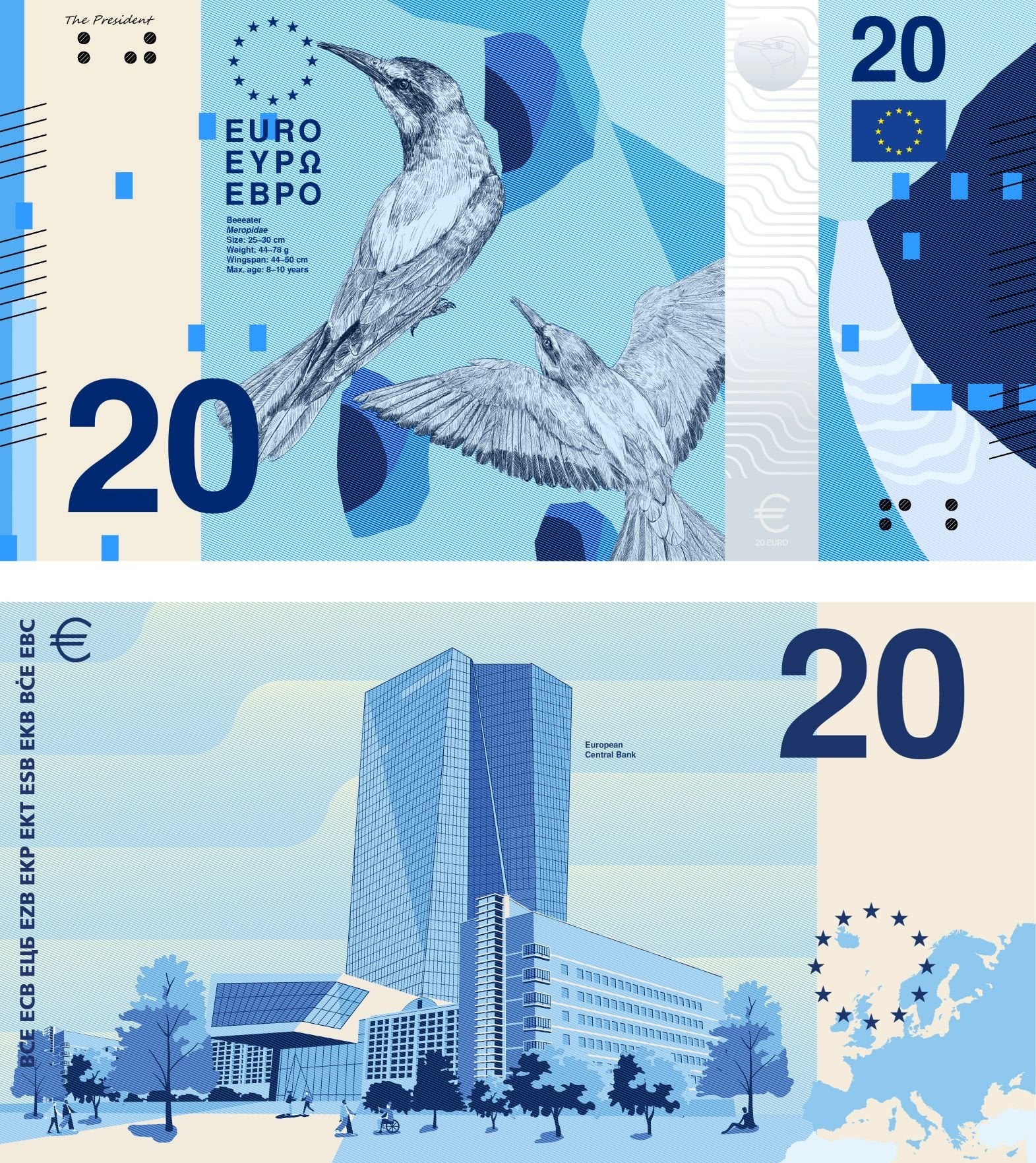
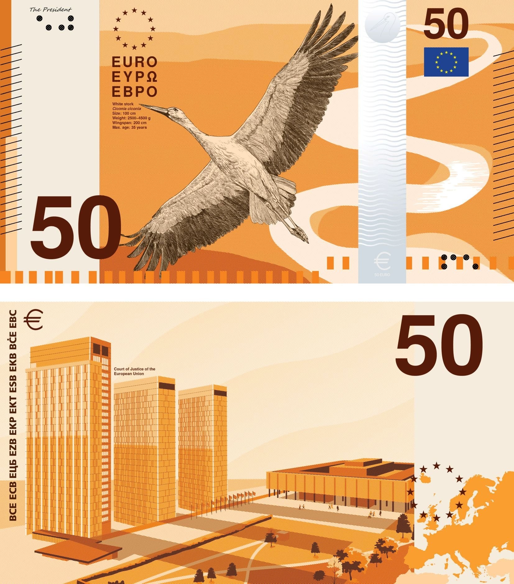
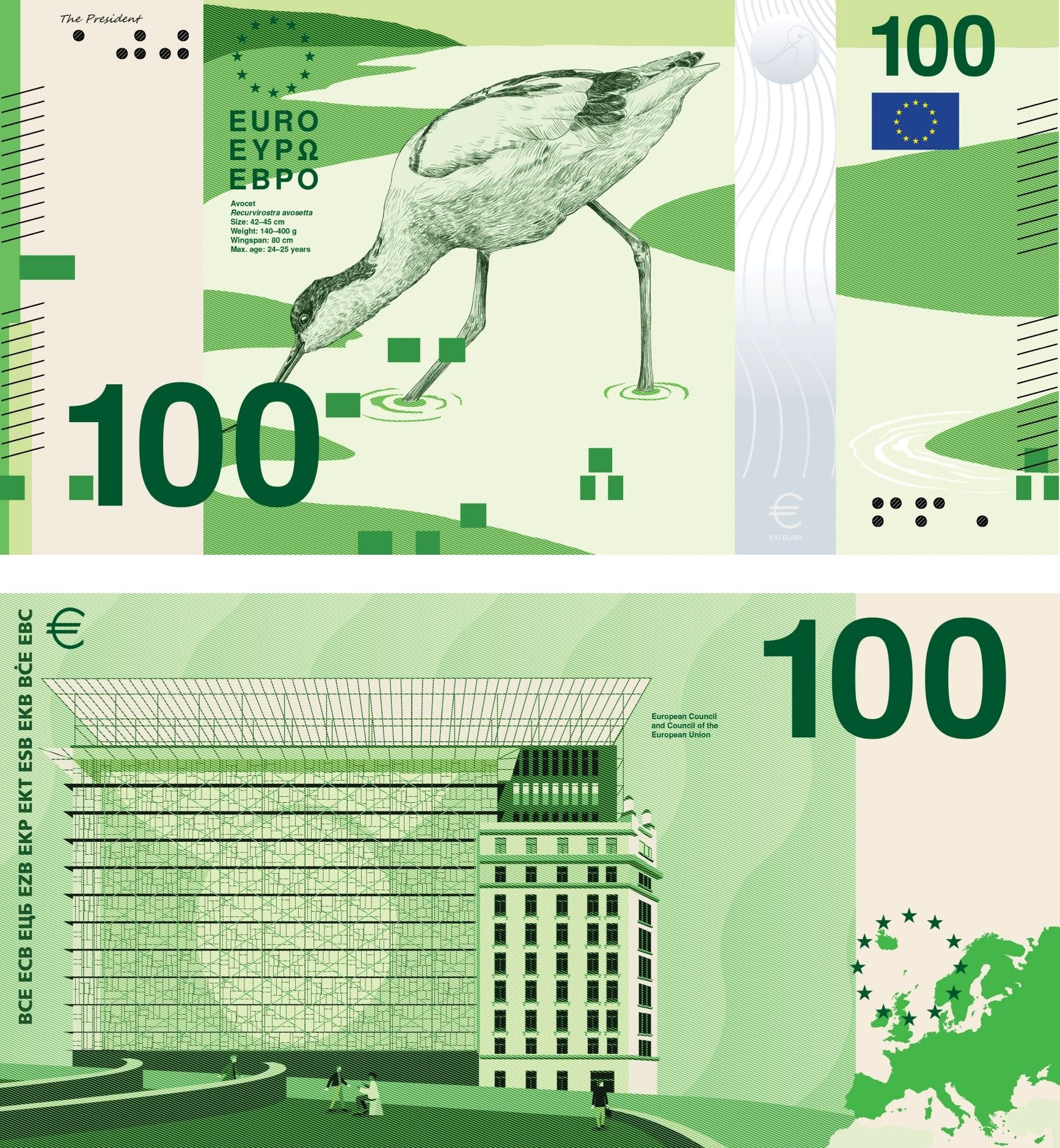
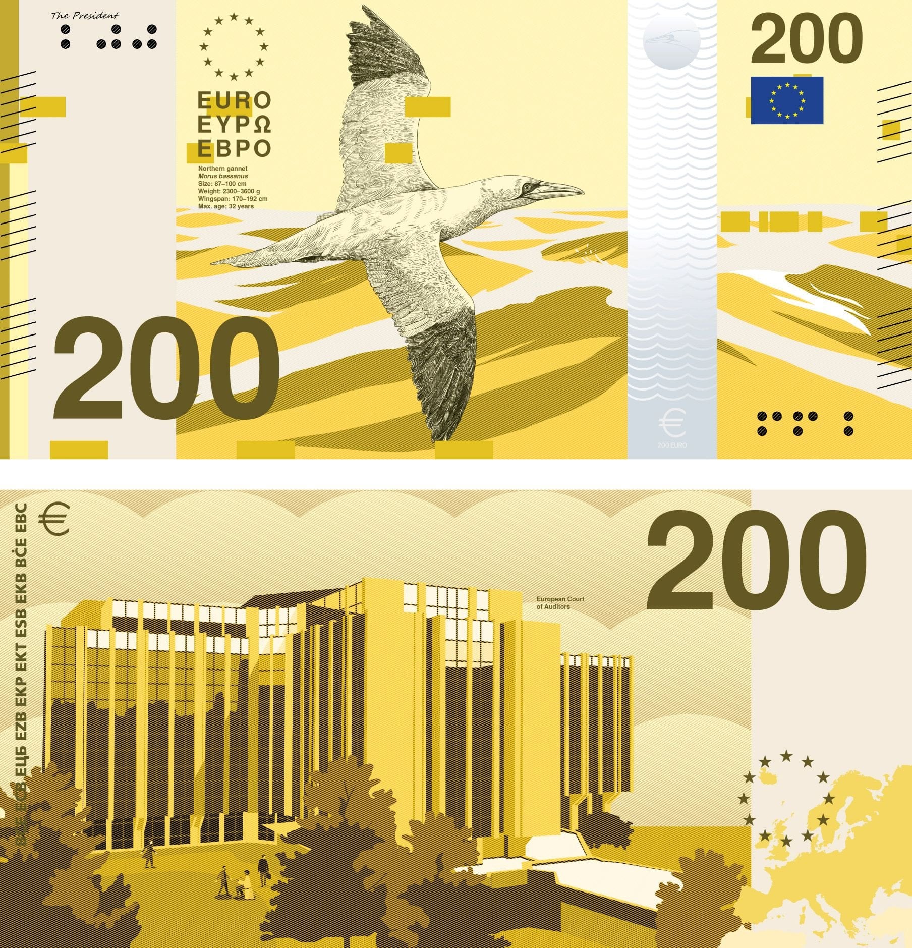
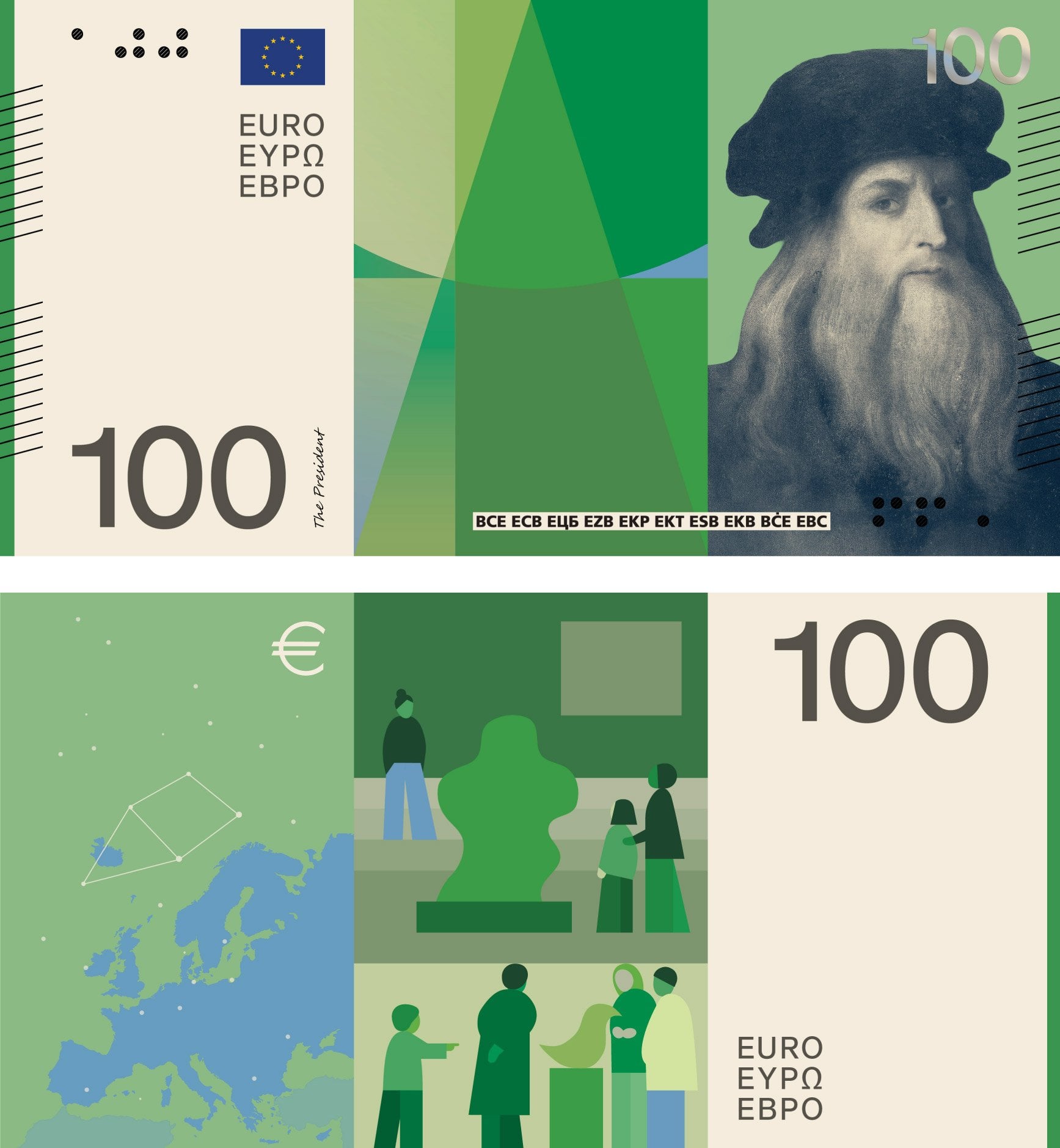
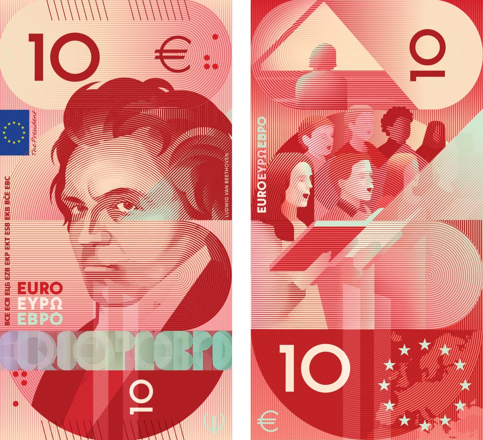
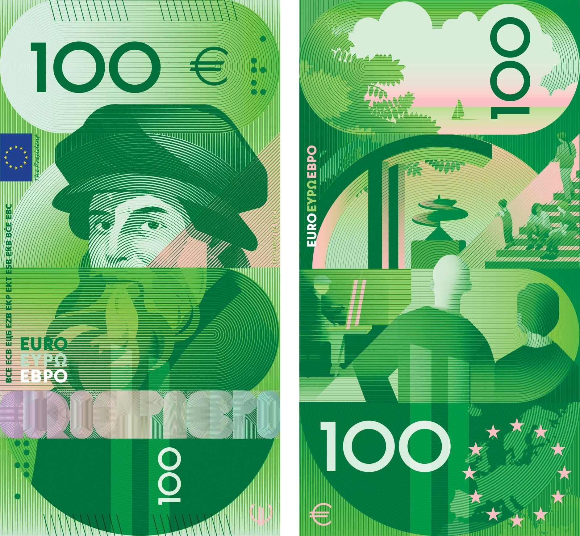
One of the stated design goals with the existing design is to make them as generic as possible so as not to show favouritism towards a particular country. If you asked me for famous European figures to put on the notes, I'd probably name Beethoven, Curie and Da Vinci, but by including them you're highlighting a Germany, France/Poland and Italy. The building designs are boring but that's not necessarily a bad thing. The birds are cute, but I'd like to have seen broader nature themes: birds, fish, mammals and biomes would have been nice.
Bridges were a great idea and maybe other infrastructure like railroads and tunnels as a symbol of connecting countries.
I would have loved a fauna / flower note. Fauna being bird, fish, butterfly (palatable insect), reptile, whale, land mammal.
Some designs are quite decent, but I'm not sure the individuals, birds, activities and buildings depicted, resonate with most Europeans. The individuals are of select member states, the birds might go completely unrecognized, the activities are rather academic, and the buildings of EU institutions? WAY too much self-praise. I would rather see subjects that are more broadly applicable, over ones focused on specific individuals, birds, activities and buildings, like: cultural achievements, landmarks spanning multiple member states (seas, mountains, rivers), infrastructure connecting member states, cultural diversity, cultural values, etc.
It would also be neat if these flashy new notes were actually accepted in physical transactions...
Birds help people get started on their birding journey
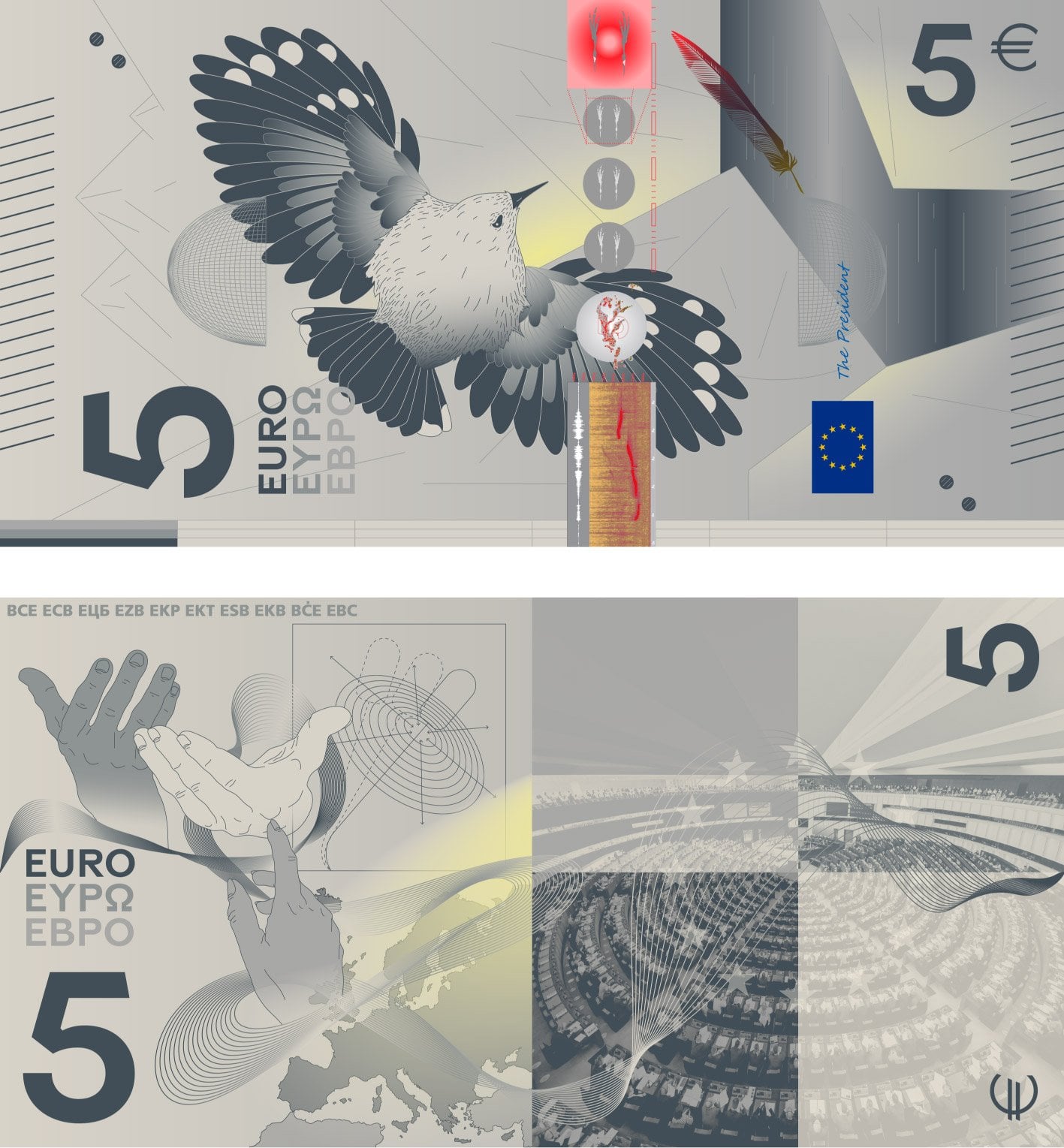
Team birds checking in. There are a couple of people designs I like but birds have a much higher hit rate.
We used to have birds on our money in Canada. Now it's mostly monuments and buildings. The fiver has the Canadarm on it though, so that one's cool.
The current designs are boring but good. Nature and birds would be good, people not so much.
~~The survey isn't good. They should've at least written a comment about each note. I don't recognise most of the people on there. ~~
~~Maybe y'all can help out.~~
Here are all the proposals until G. H and I are here.
| Design | Image |
|---|---|
| A | ![]() |
| A | ![]() |
| A | ![]() |
| A | ![]() |
| A | ![]() |
| A | ![]() |
| B | ![]() |
| B | ![]() |
| B | ![]() |
| B | ![]() |
| B | ![]() |
| B | ![]() |
| C | ![]() |
| C | ![]() |
| C | ![]() |
| C | ![]() |
| C | ![]() |
| C | ![]() |
| D | ![]() |
| D | ![]() |
| D | ![]() |
| D | ![]() |
| D | ![]() |
| D | ![]() |
| E | ![]() |
| E | ![]() |
| E | ![]() |
| E | ![]() |
| E | ![]() |
| E | ![]() |
| F | ![]() |
| F | ![]() |
| F | ![]() |
| F | ![]() |
| F | ![]() |
| F | ![]() |
| G | ![]() |
| G | ![]() |
| G | ![]() |
| G | ![]() |
| G | ![]() |
| G | ![]() |
Never mind, the ECB announced who they are
| Front | Reverse | |||
|---|---|---|---|---|
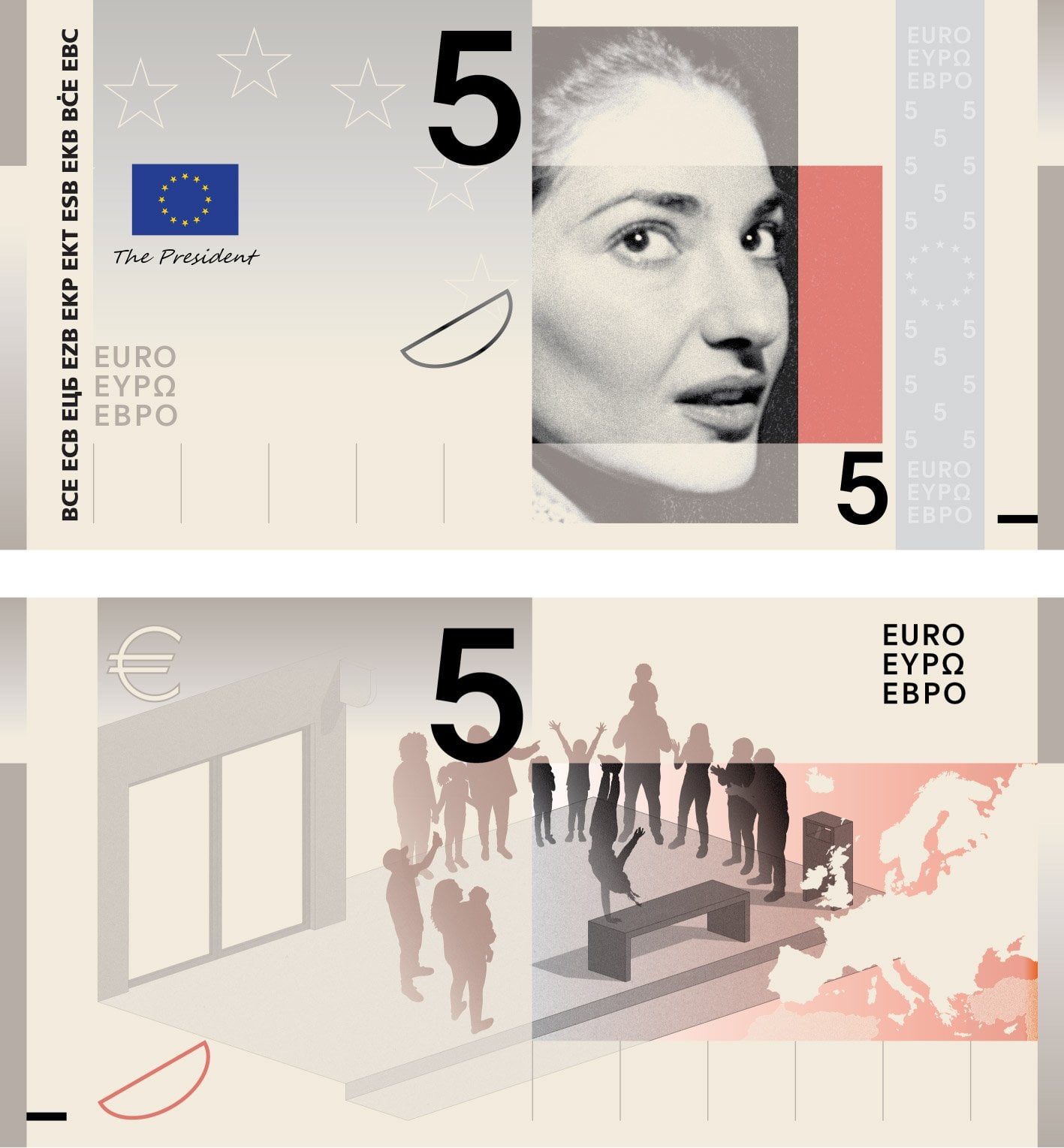
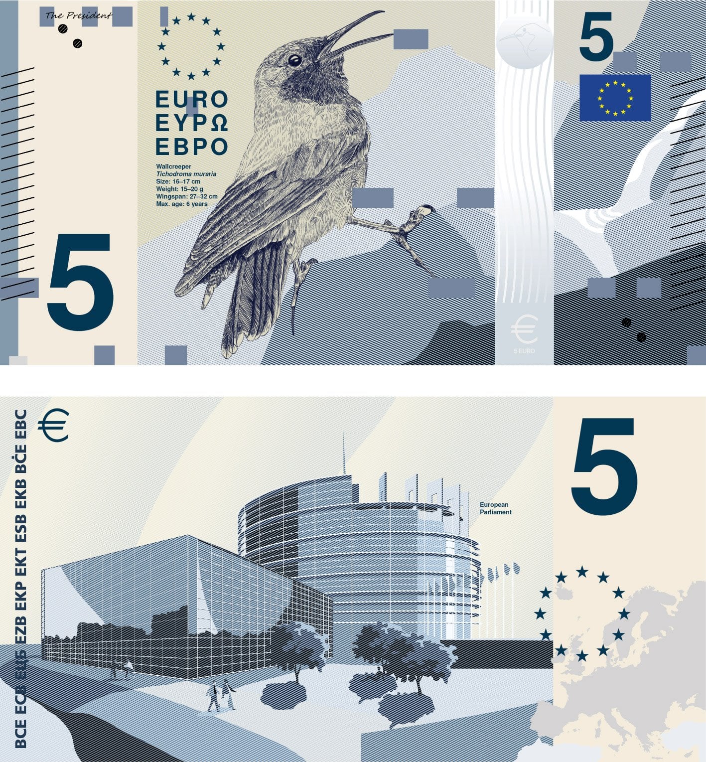
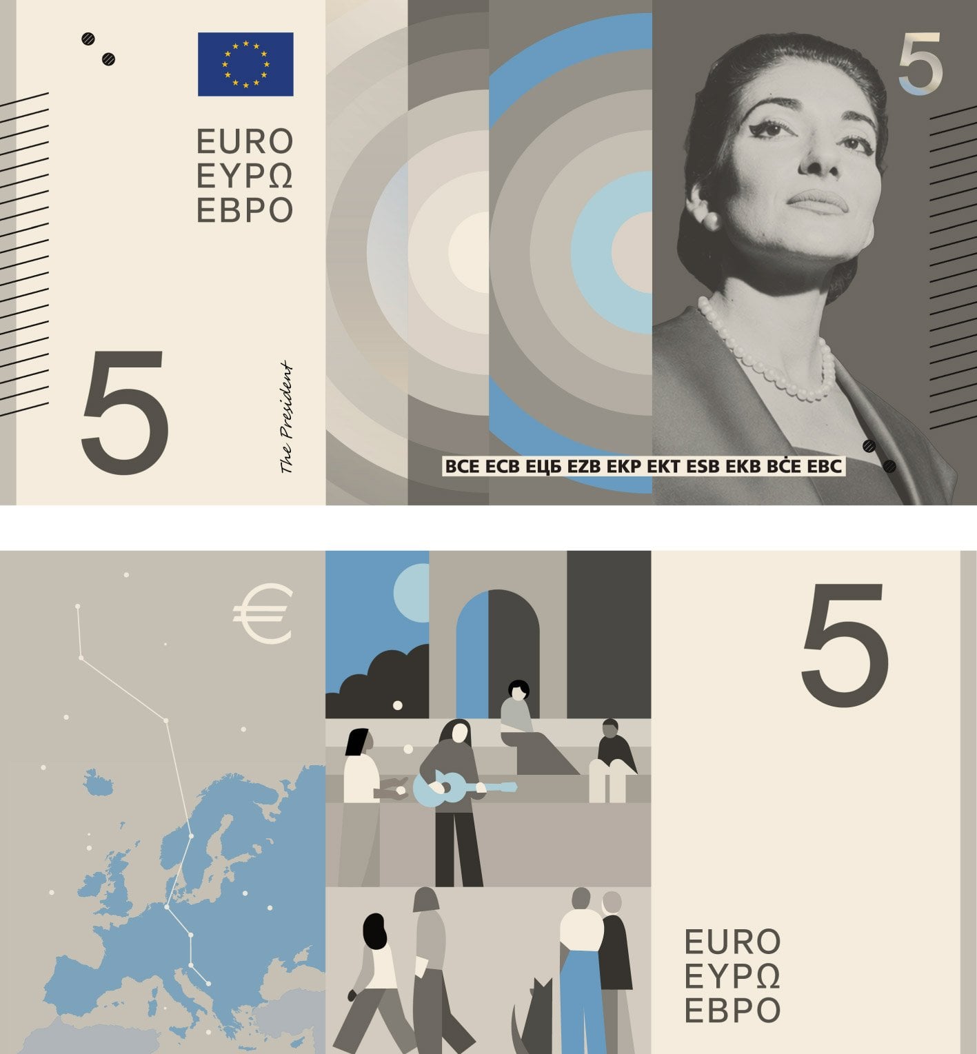
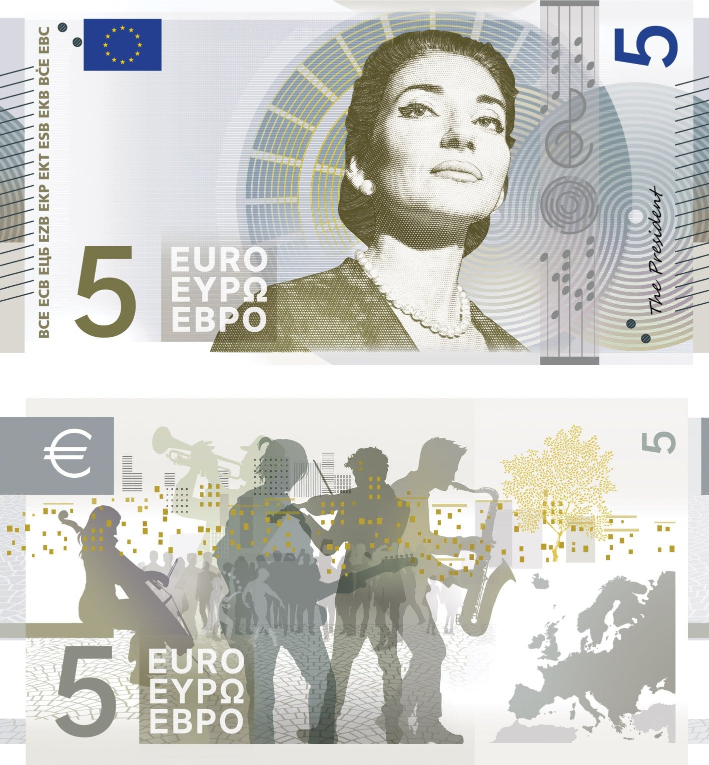
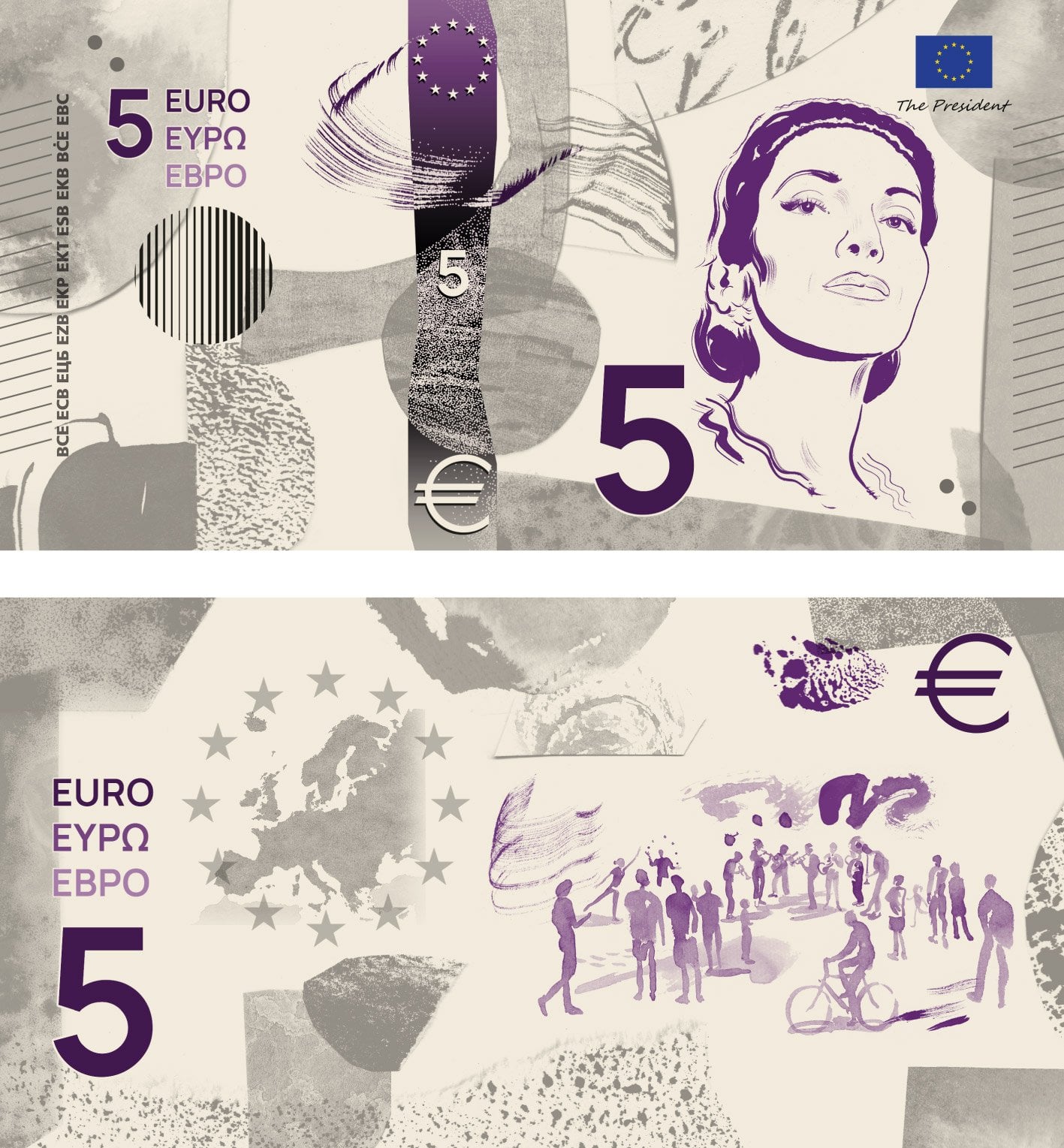
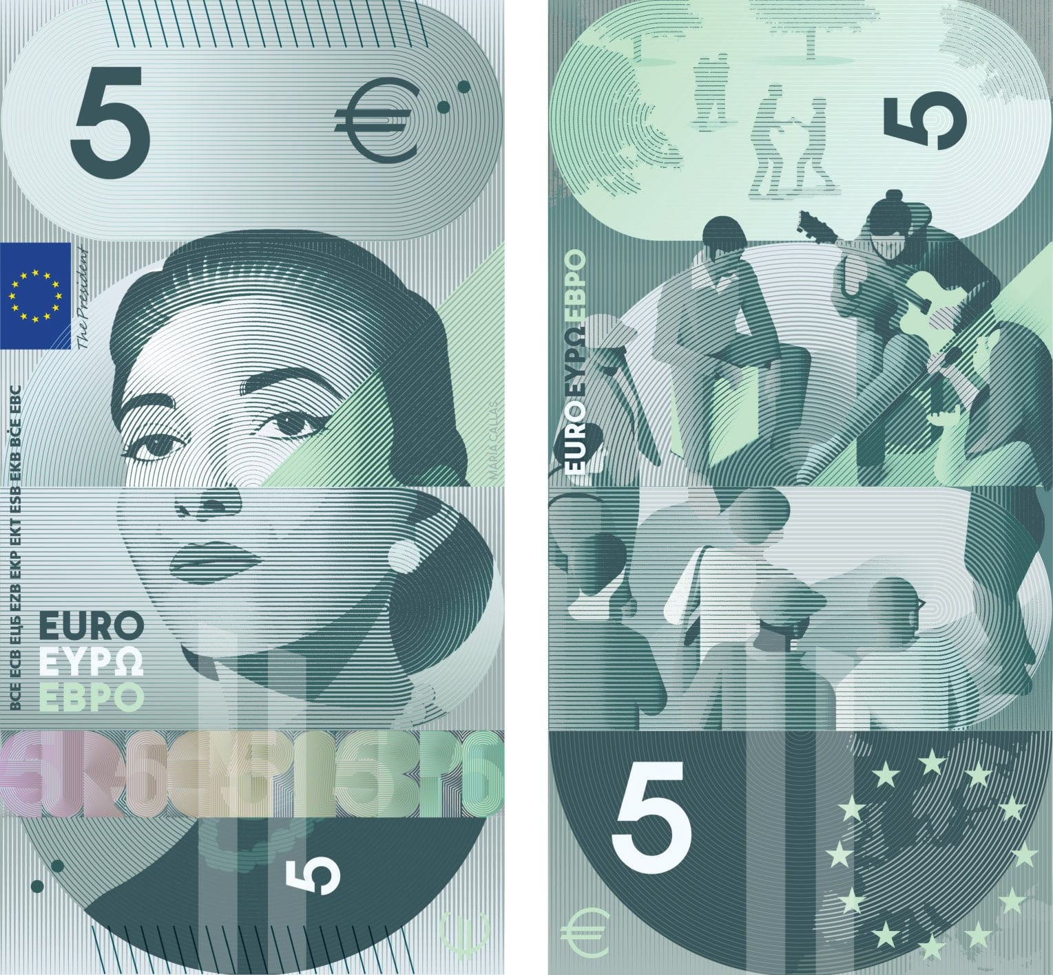
| β¬5 Performing arts | Maria Callas | Street performers (music/dance/theatre) entertaining passersby | ||
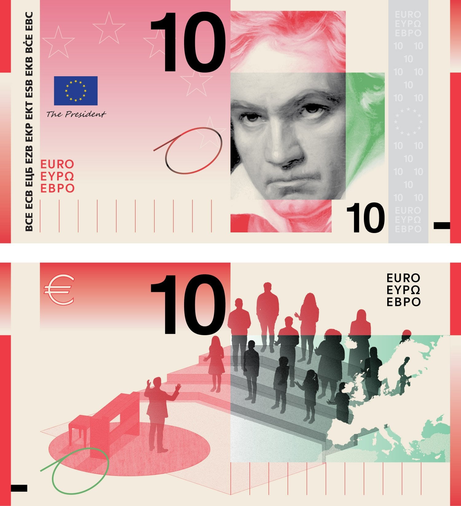
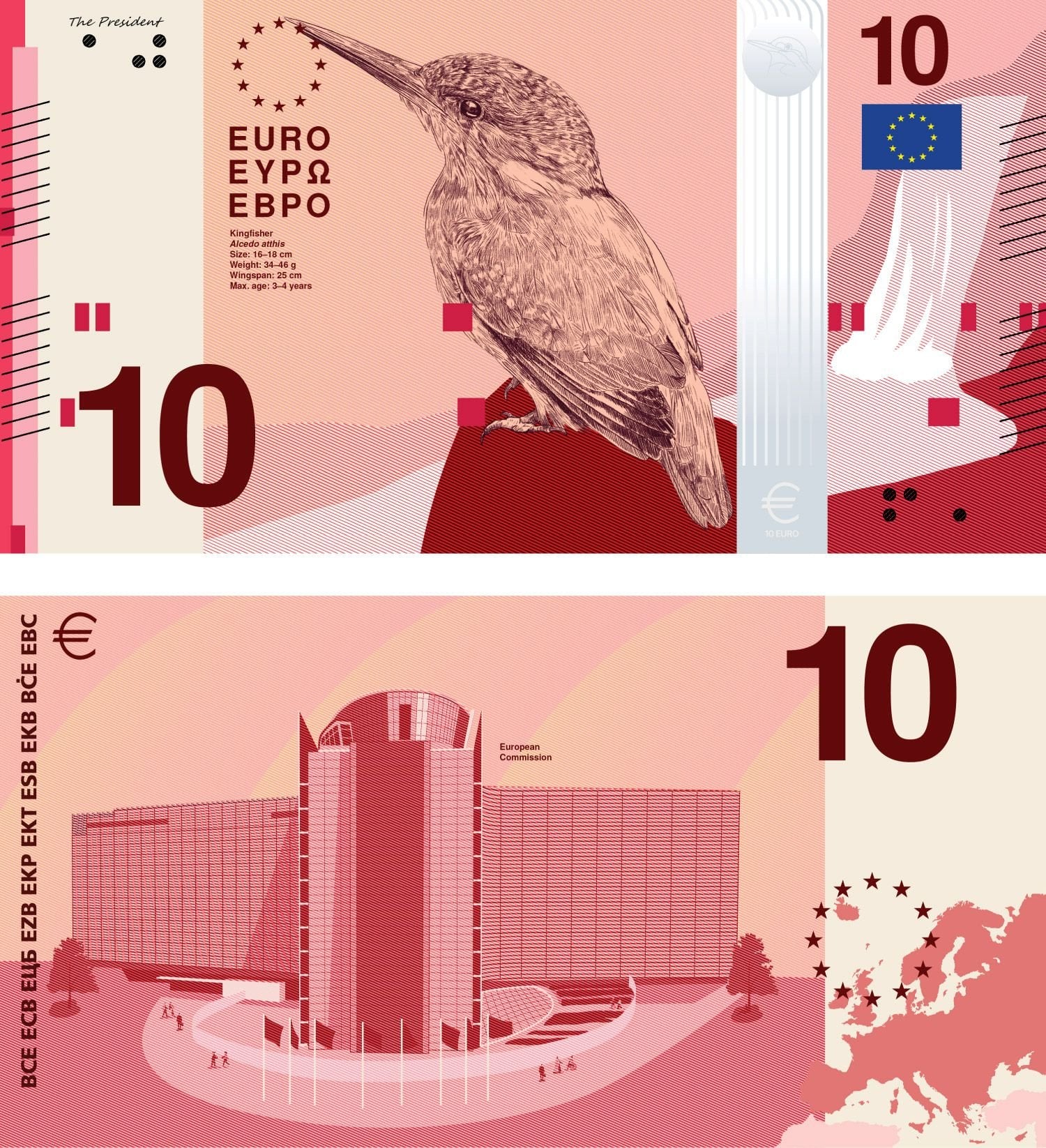
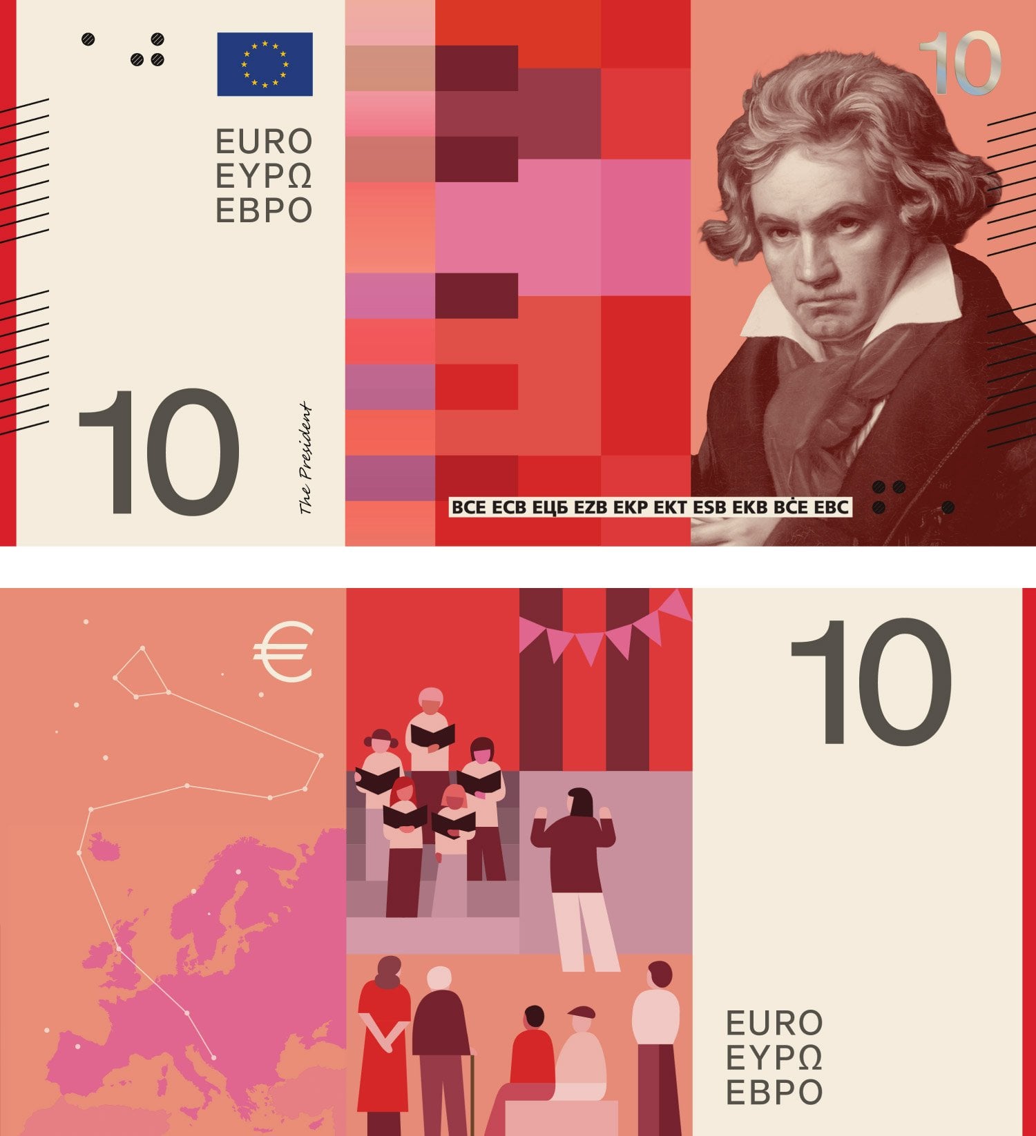
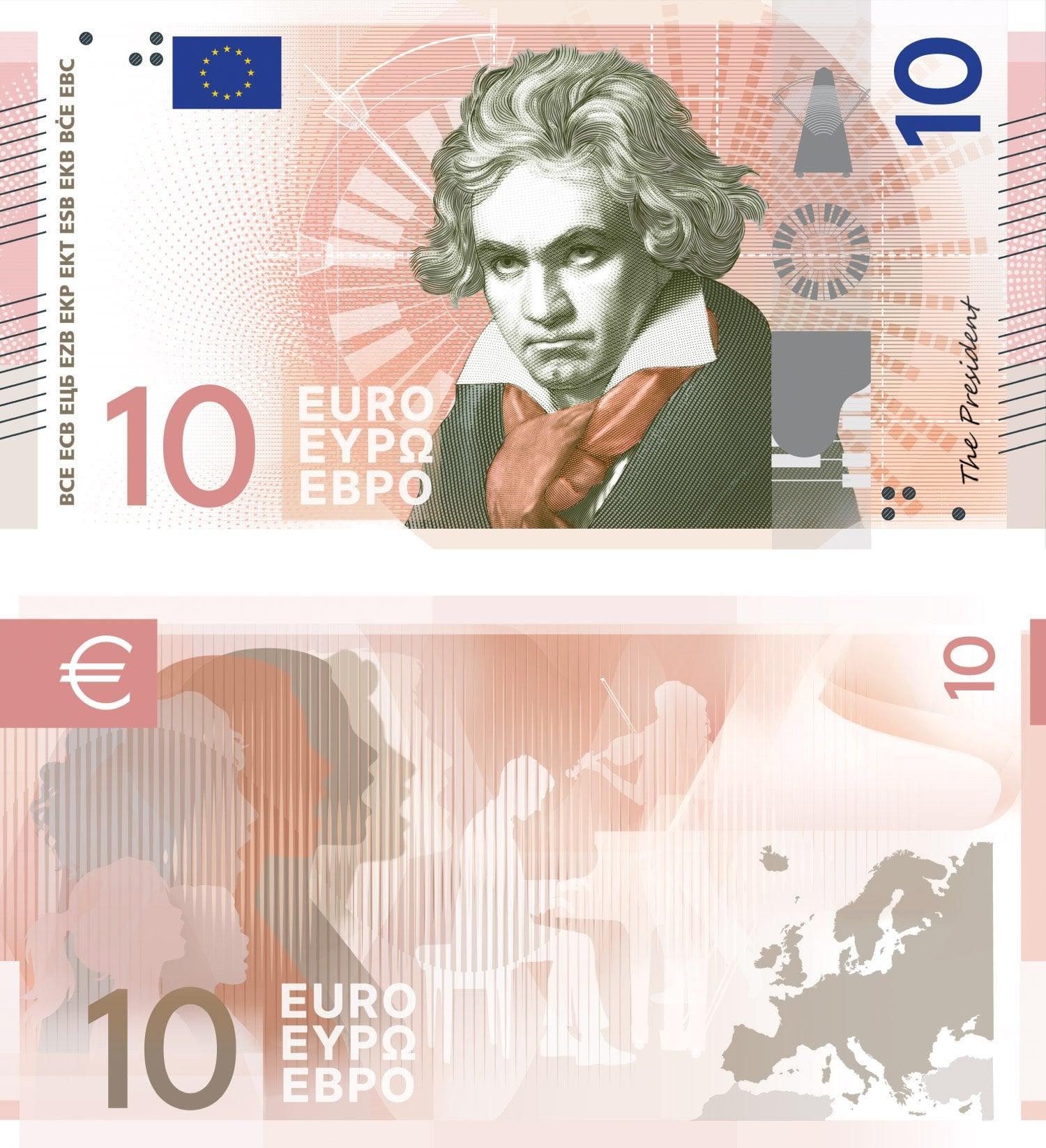
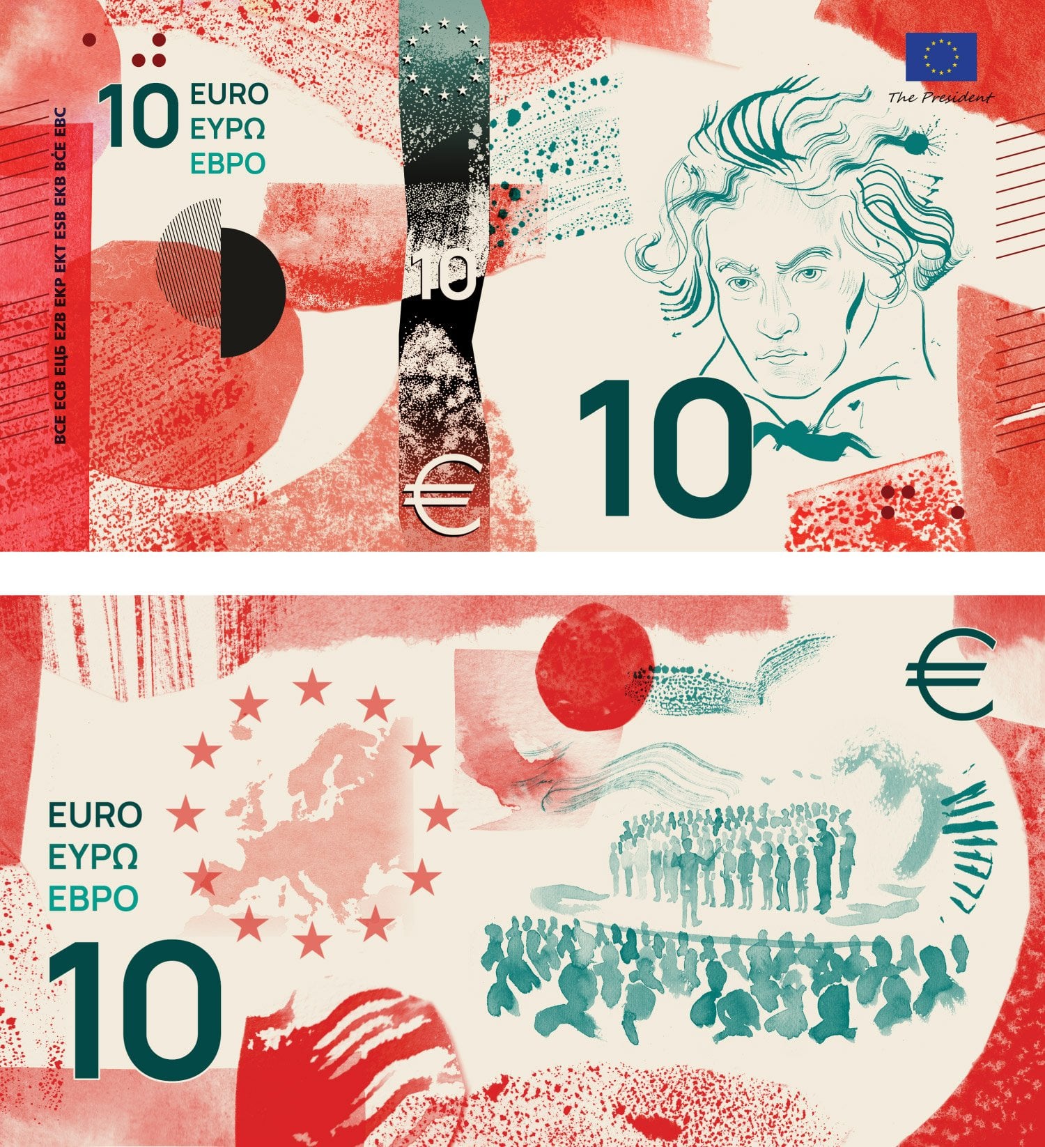
| β¬10 Music | Ludwig van Beethoven | A song festival with a choir of children and young adults singing | ||
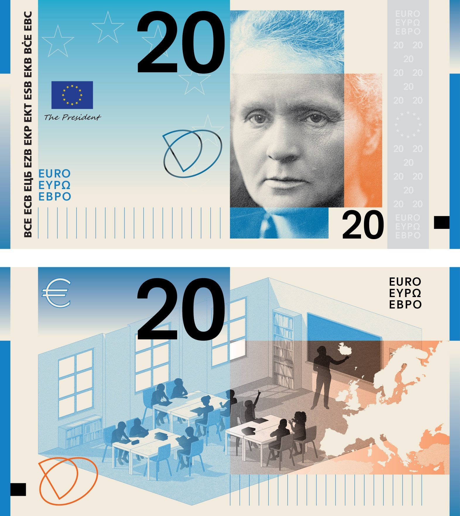
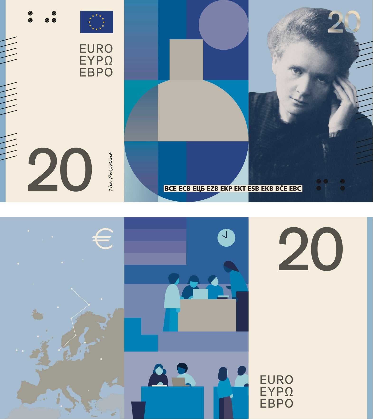
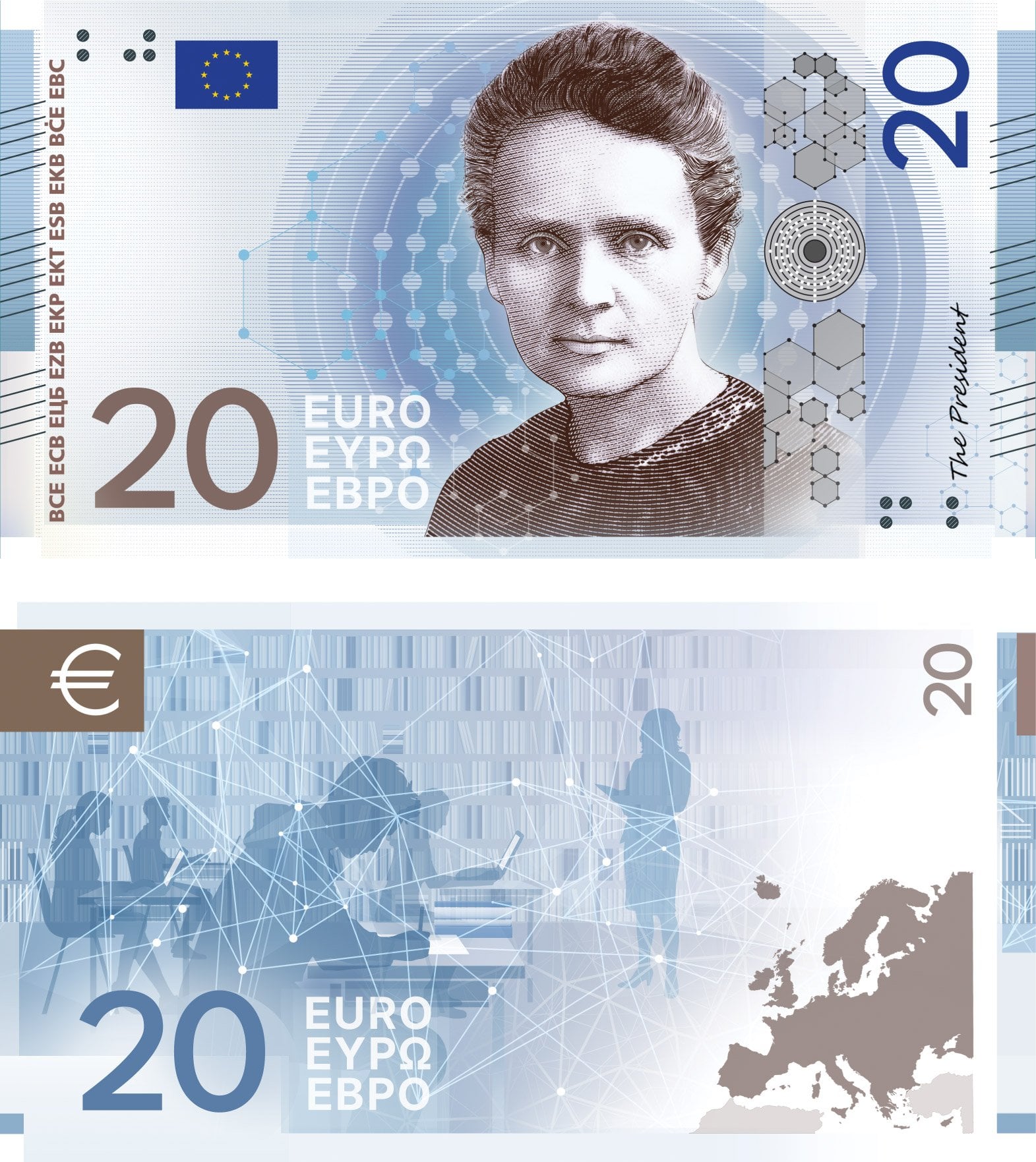
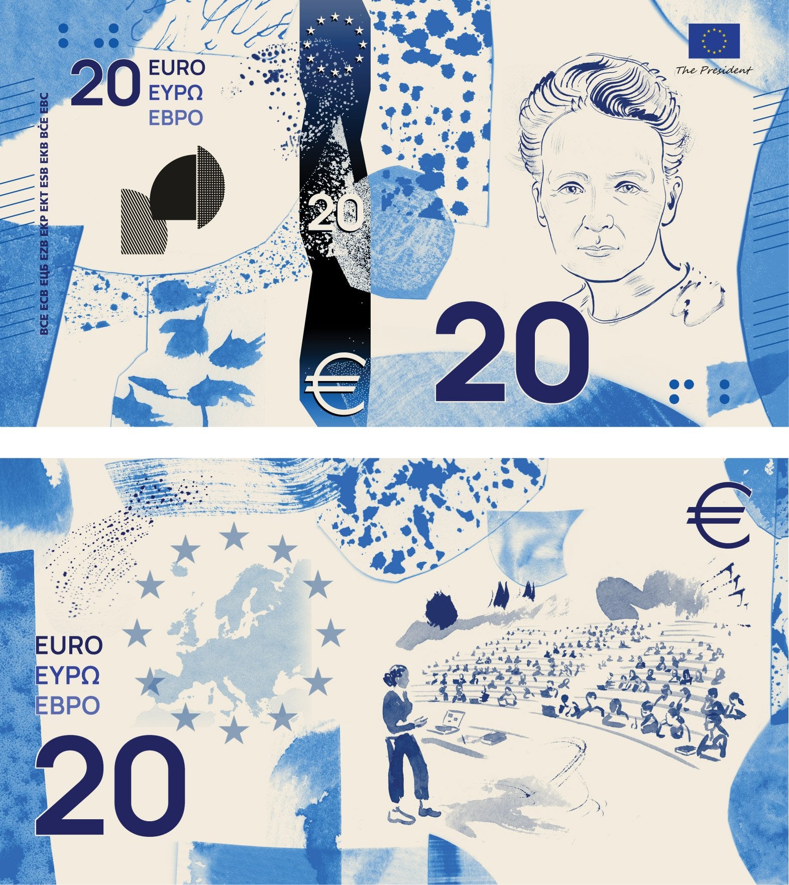
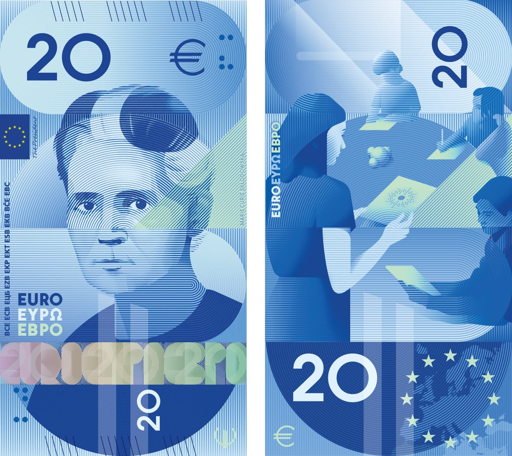
| β¬20 Universities and schools | Marie Curie SkΕodowska | A school or university with a female teacher with young students. There are notebooks and books on the tables | ||
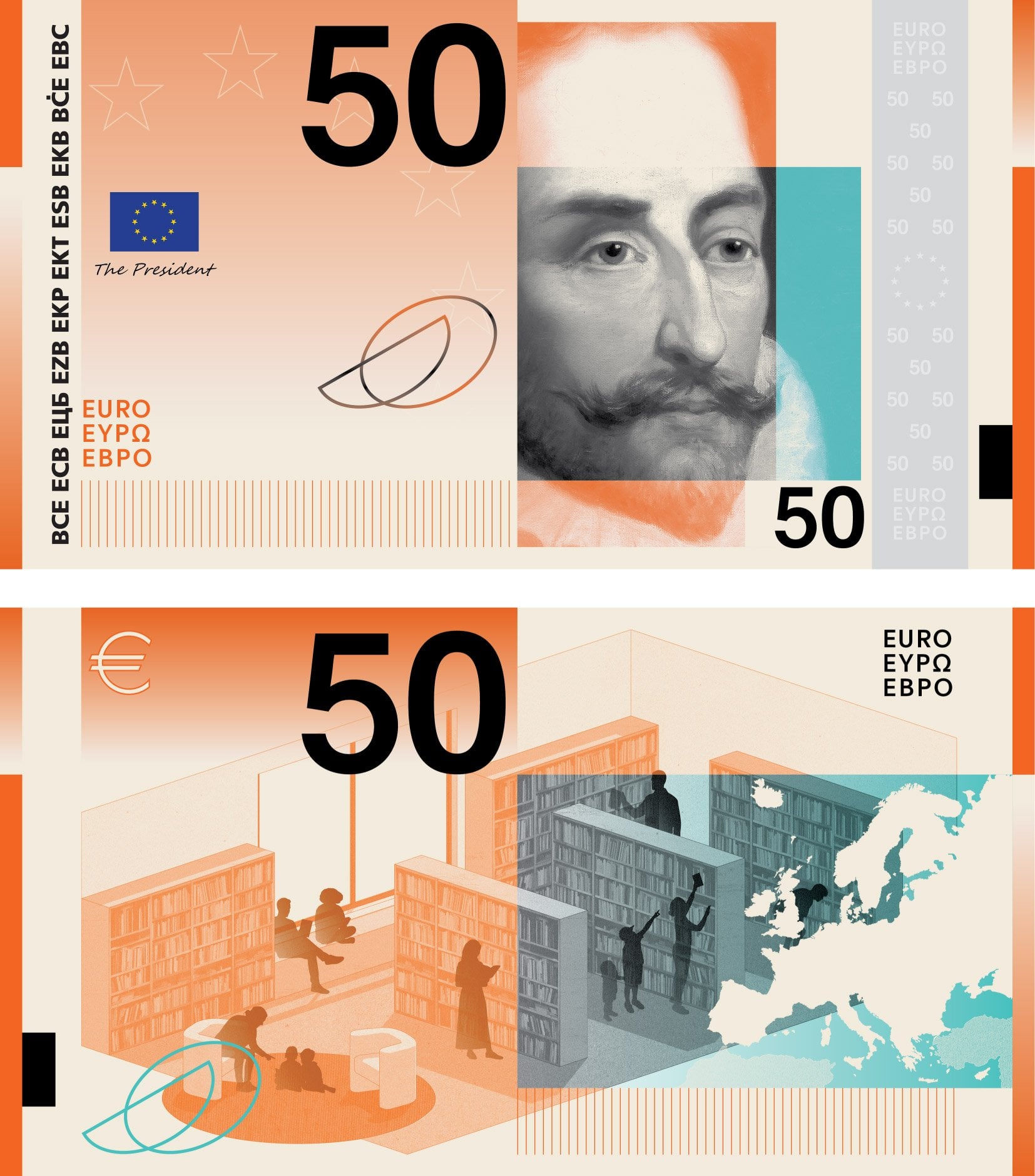
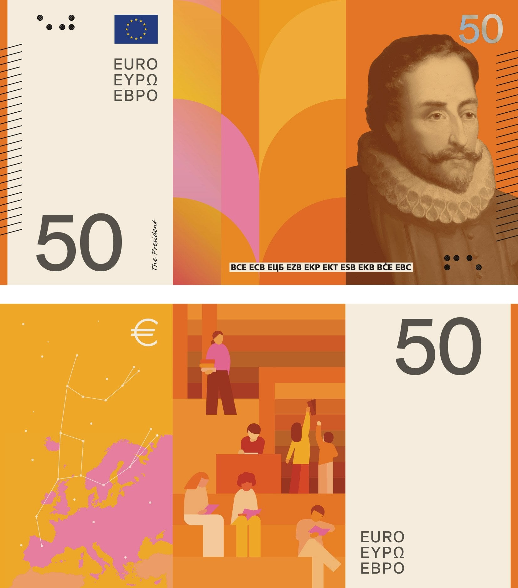
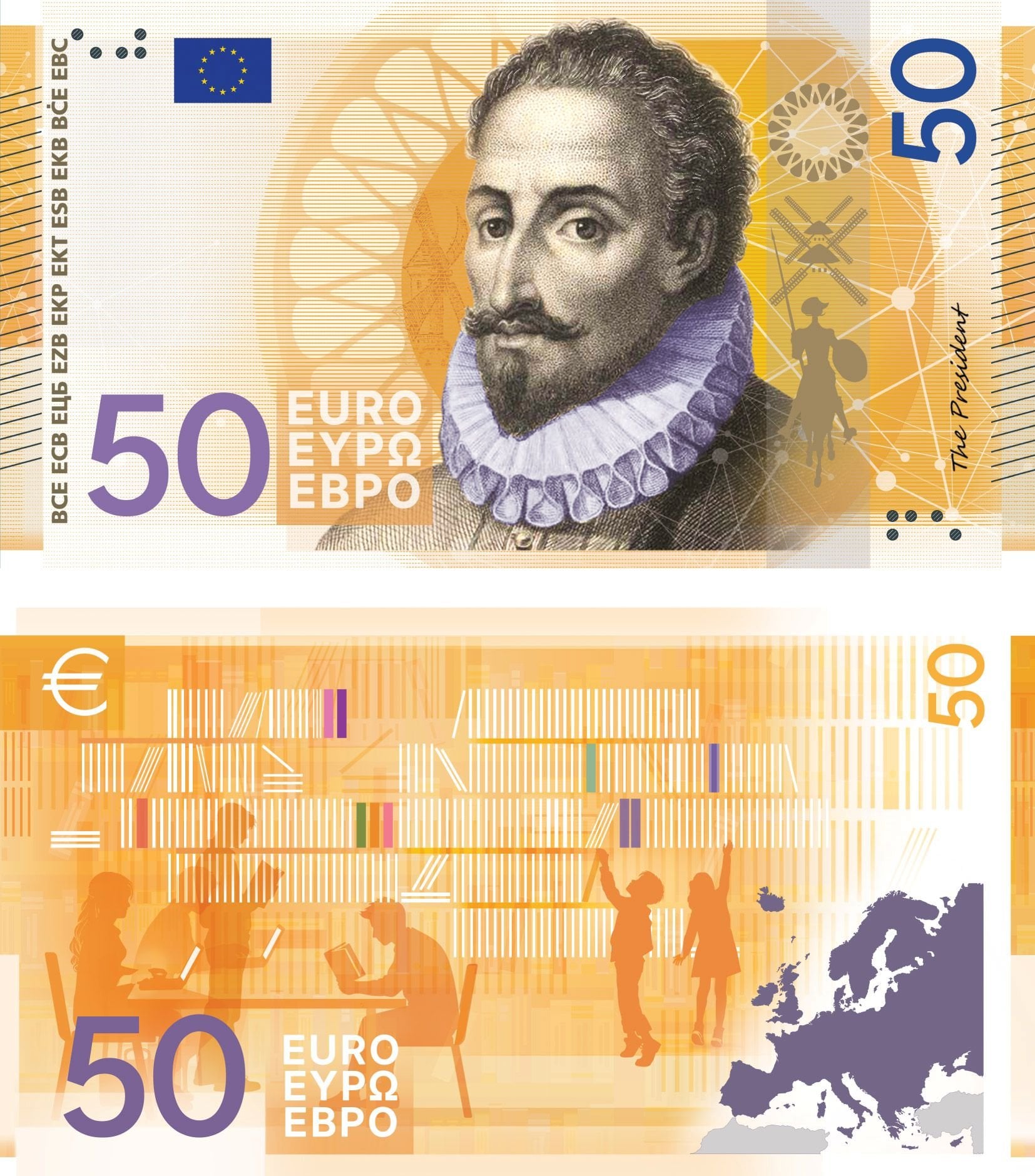
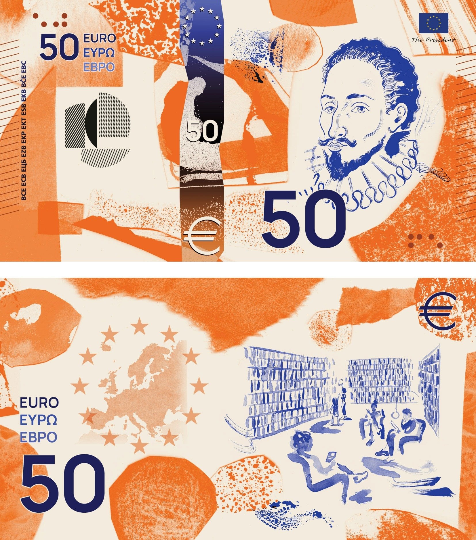
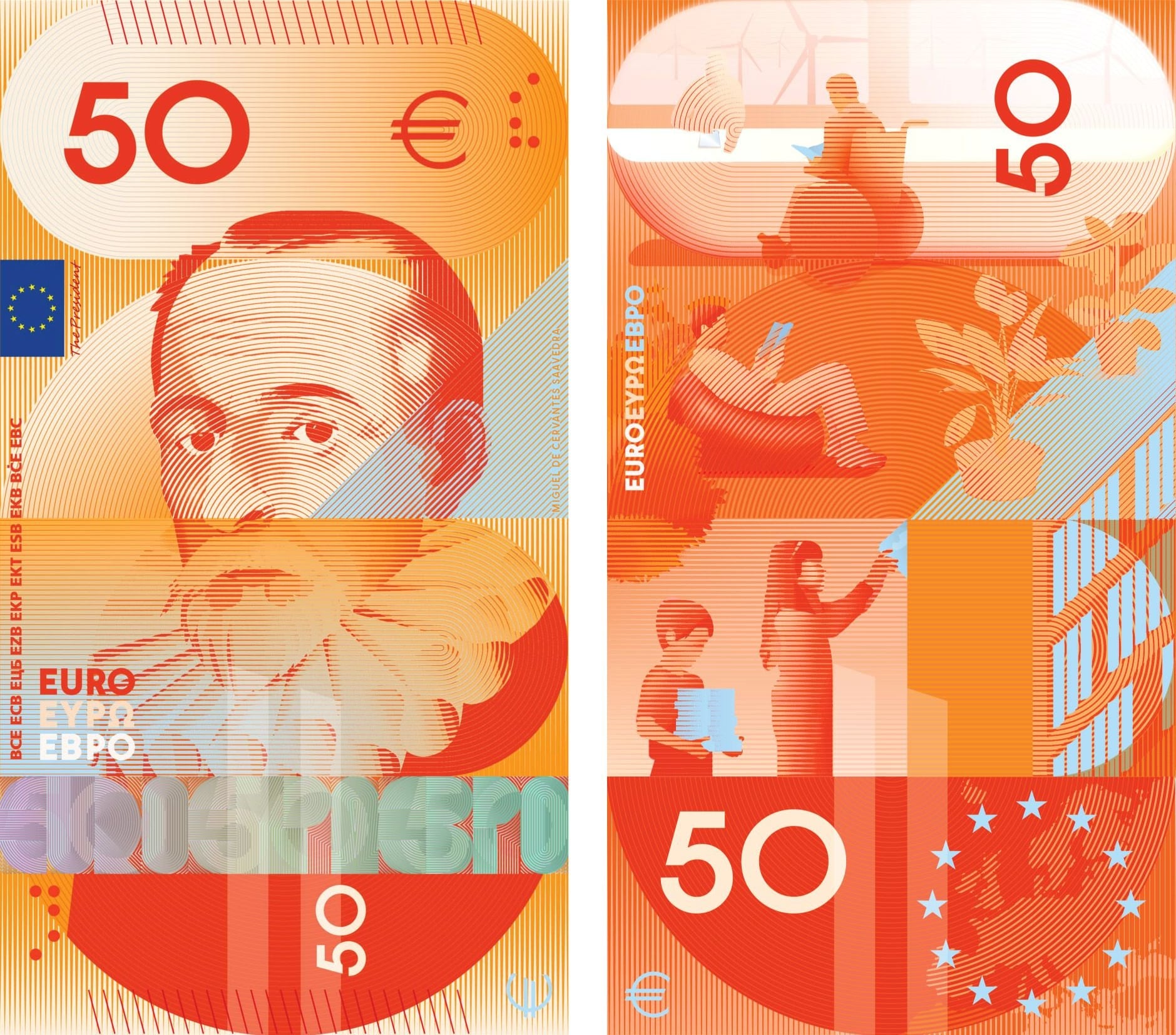
| β¬50 Libraries | Miguel de Cervantes Saavedra | A library with some adults reading paper and digital books. A little boy and girl in front of a bookcase trying to get a book | ||
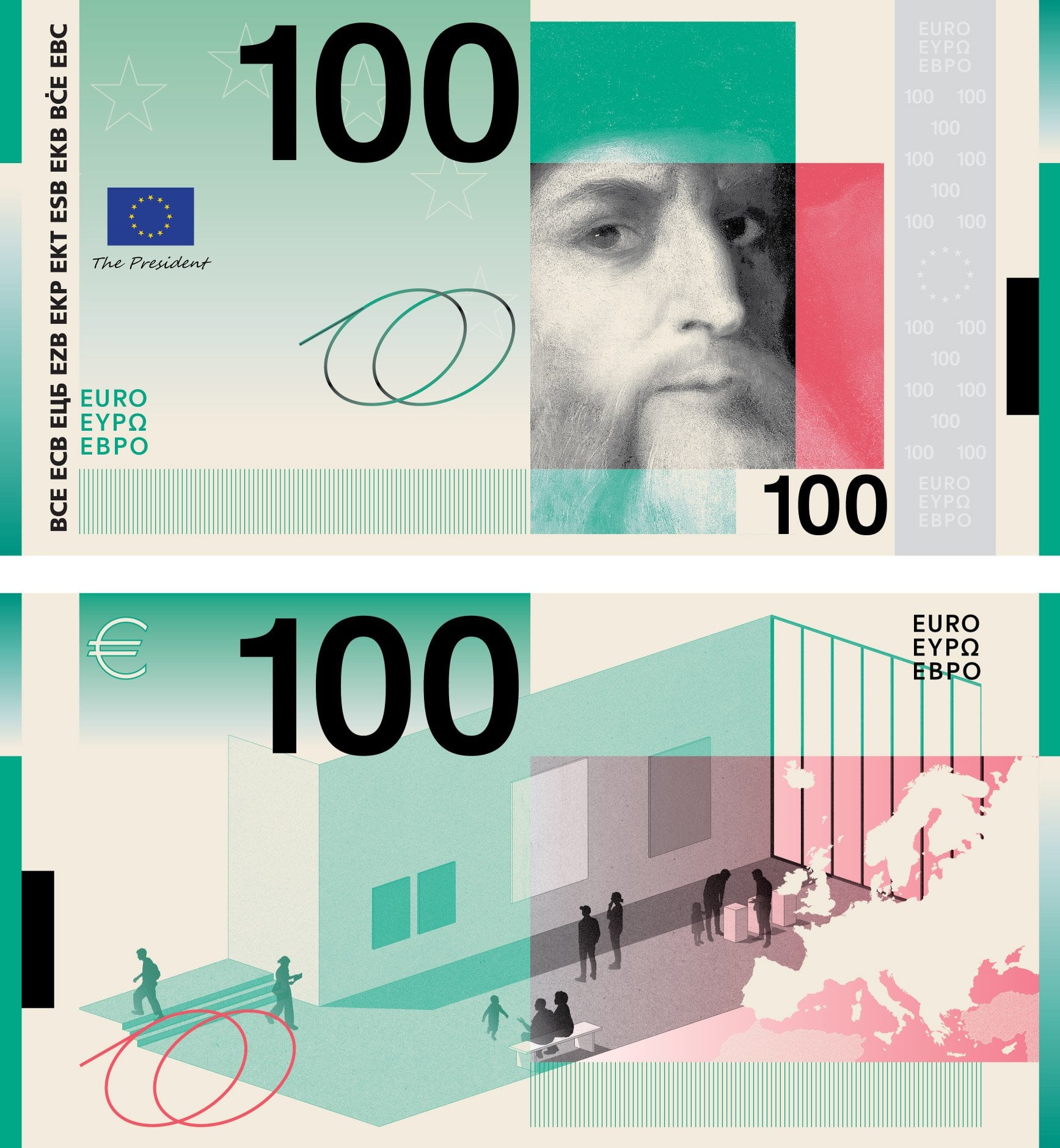
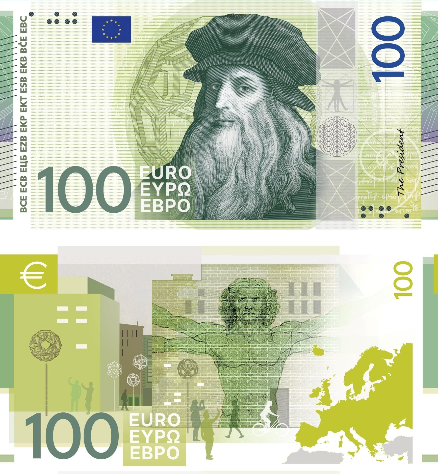
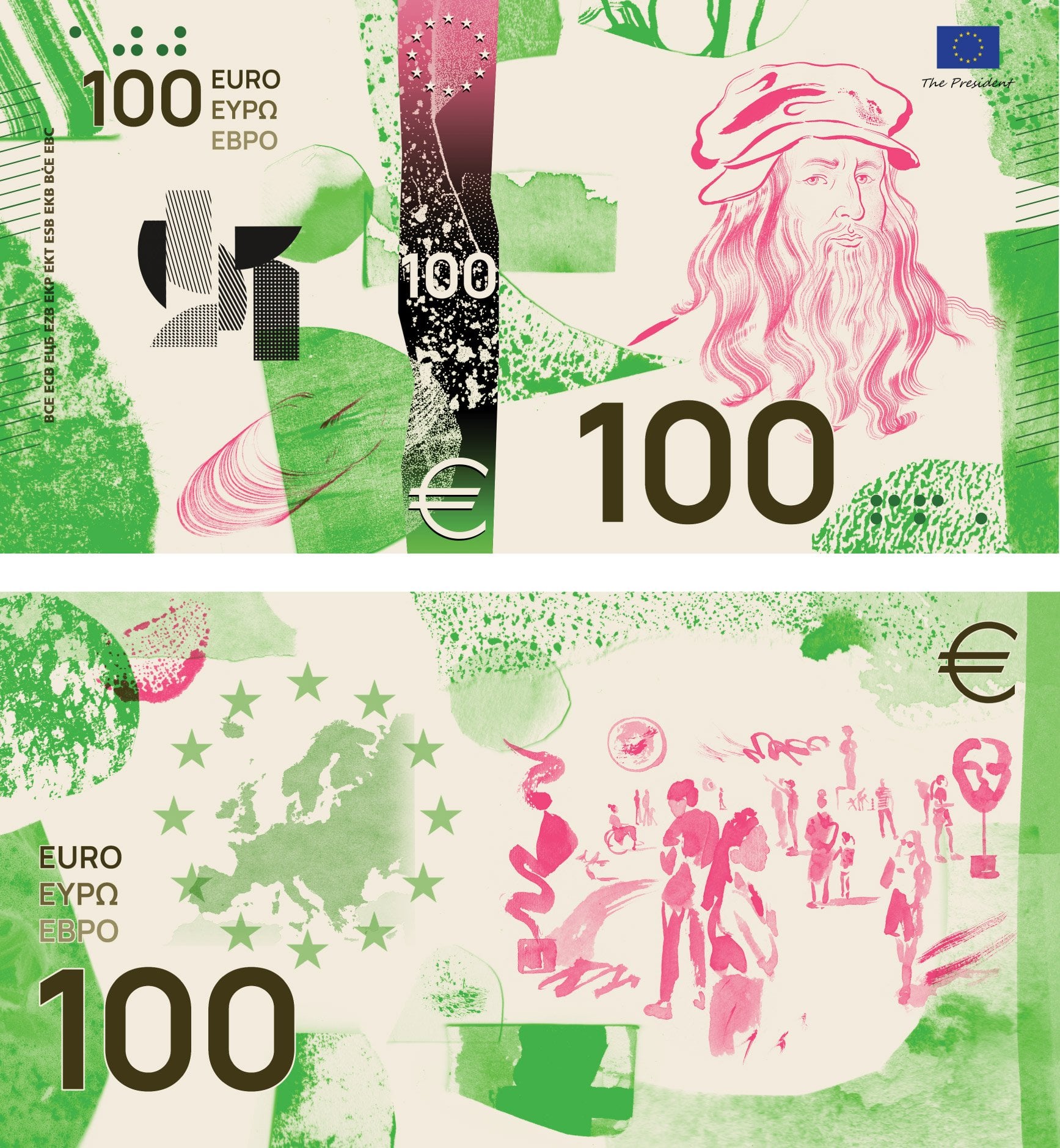
| β¬100 Museums and exhibitions | Leonardo da Vinci | Adults and children admiring some examples of street art, contemporary art, etc. | ||
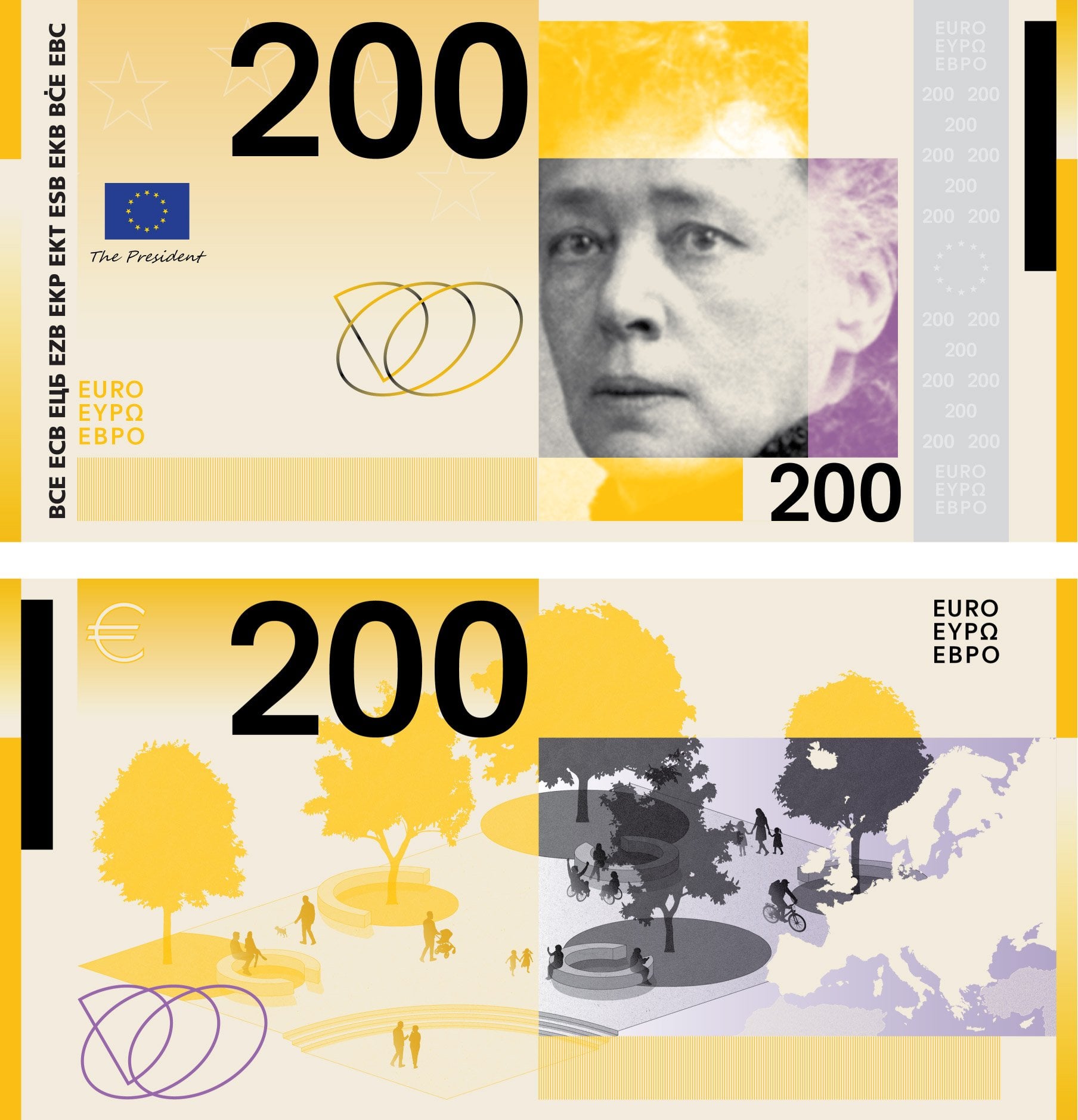
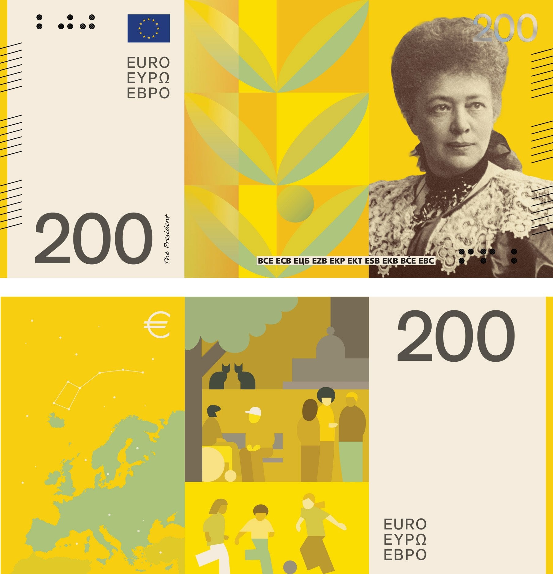
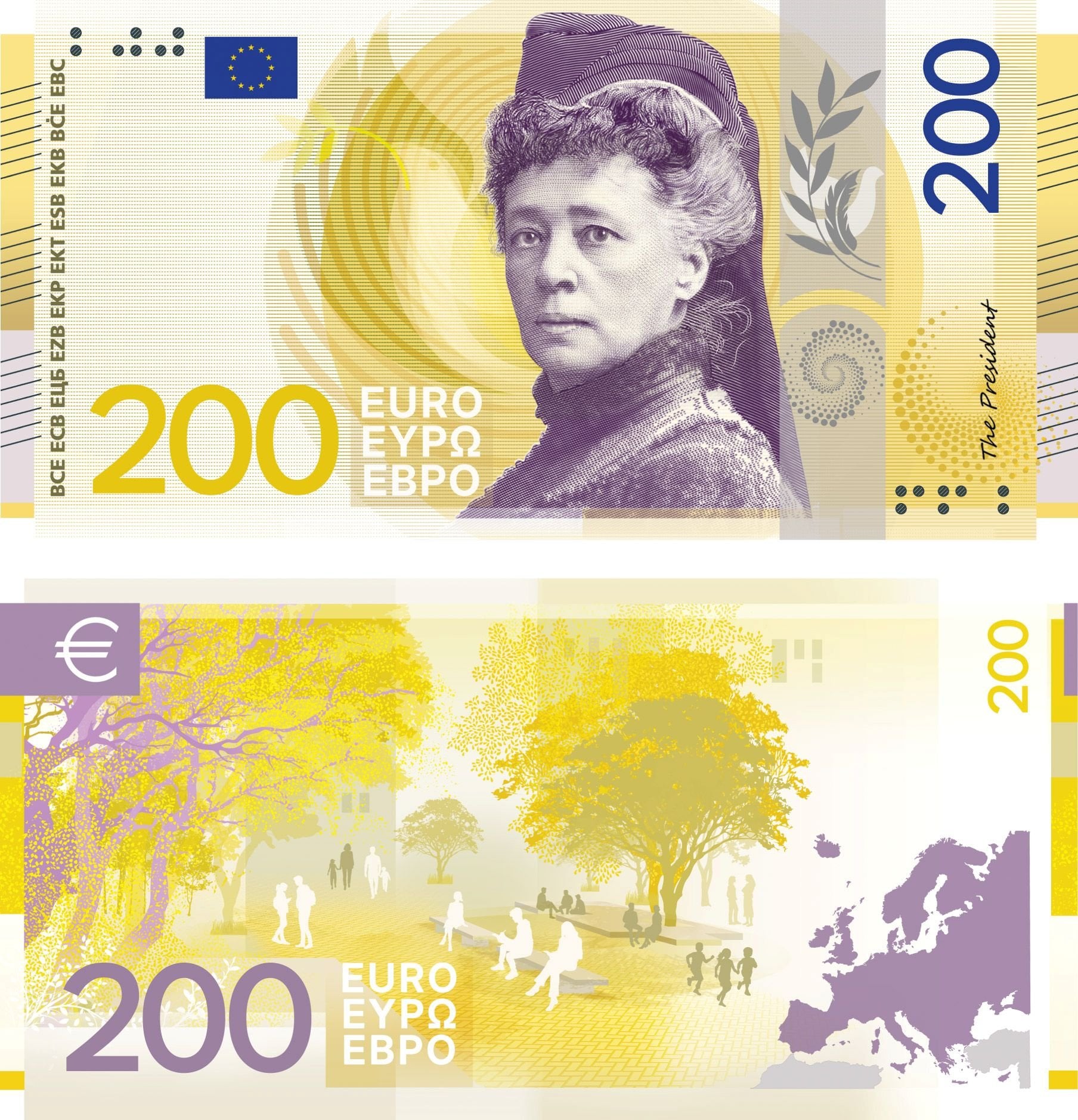
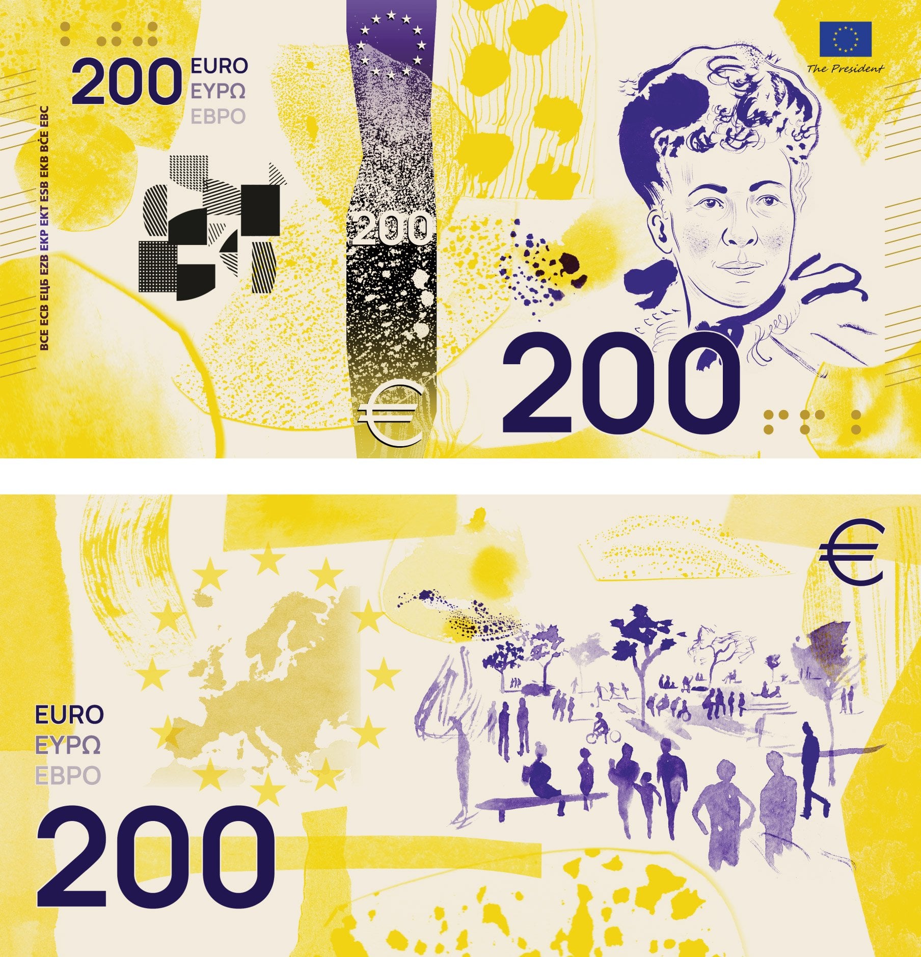
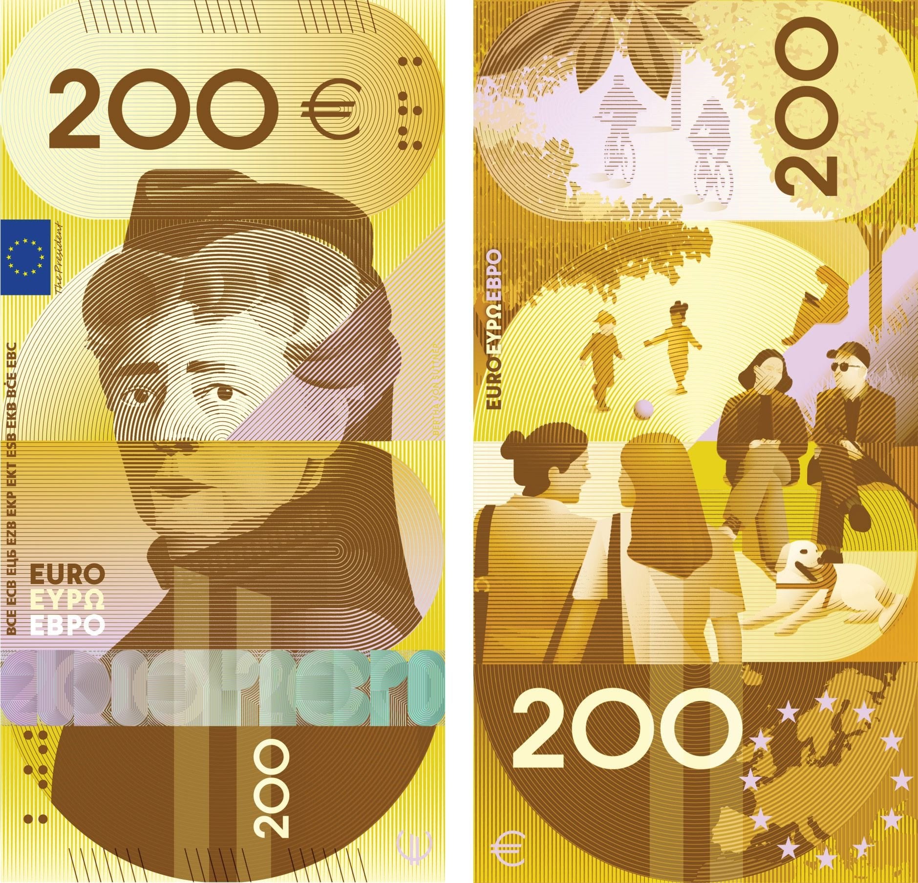
| β¬200 Public squares | Bertha von Suttner | A tree-covered square allowing people to come together, with adults and children talking, walking, playing, etc. |
Maria Callas isn't even European by birth. She's born in the USA.
Great of you to put the images here, thank you!
Just for the sake of completeness, that's not all the series. I really liked series I, for example.
Here are the descriptions of the motifs.
It's naming that the European parliament is on the lowest bill, while the unknown institution european court of auditors and the UN demographic european council are on the highest.
Parliament on the lowest bill: Yes, disgraceful.
Court of auditors on the 200β¬ bill: Well, when do ordinary people use this bill anyway? On the other hand, I like the idea of giving a subtle reminder about the Court of Auditors to those who primarily handle high-denomination bills. (Plus, this bill is first in line for being potentially discontinued, like the 500β¬ before it, so little sense to have more important institutions on it.)
Birds! π¦ββ¬
I don't understand why they included vertical designs and suddenly want pictures of real people on the banknotes when they used to say it is better to have something neutral on there. From the comment here I like B and D most, but I don't know if the images from the comment are the same as the ones in the survey because I think there were more designs. Still B and D are worse than the current designs.
I really like design D. F is cool as well, really unique design, but I think I prefer the birds because they're more inclusive than people from specific countries.
D was really nice, but I absolutely loved the colourful stork on I. Maybe cause I'm Bulgarian and biased, but it was my favourite one. In any case I agree - hope they pick the birds over a whole bunch of central/western European people.
edit: added missed word, removed extra space
I am kind of in love with F and H.
F because it's the only design that really tries to be differnet, fun and daring. I love the color combinations and how expressive they are. I am aware that this probably isn't going to be the one that's picked, but man, would it be cool it this was what the Euro looked like in the future.


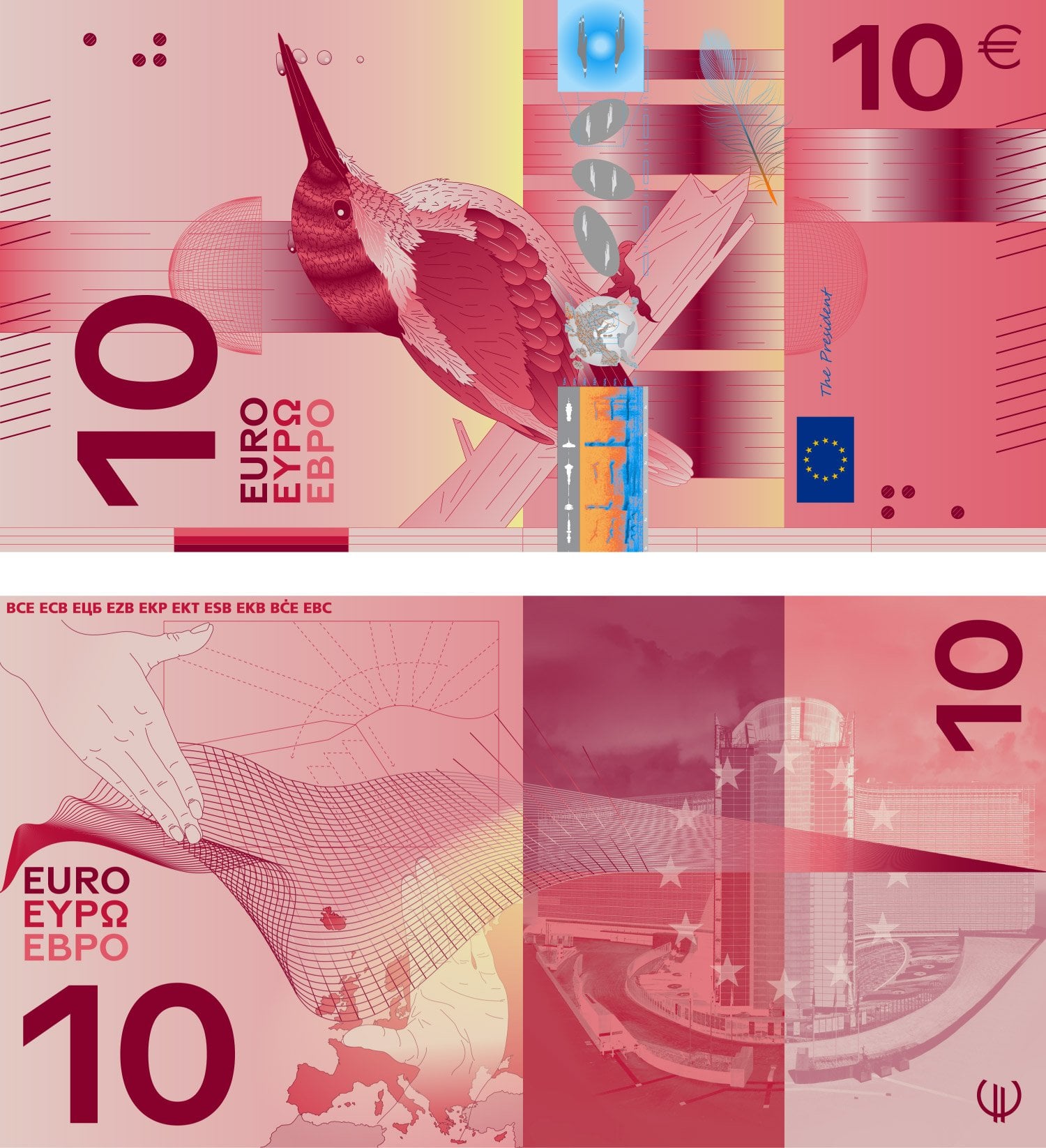
H because they are, in my opinion the prettiest animal notes. Again, lively colors that are combines beautifully, and I like that they are horizontal. The tenner with the kingfisher is so pretty, I would frame it and put it on a wall.


I'm not voting, though, because I'm Danish and we still use our own currency. We probably will make the shift to Euroes someday, but until then, I don't feel it's appropriate for me to vote for the design of a currency that isn't used in my country.
I donβt feel itβs appropriate for me to vote for the design of a currency that isnβt used in my country.

H and J for me. I prefer birds much more than people on the design and those two designs are actually colorful and distinct from the current more bland colors.
I really like some of them and some look like prints on bus seat covers.
And Ludwig van Beethoven looks mean as hell on some.
Series F or G for me. F has hand drawn images which is incredibly unusual but I really love it (even more so in the time of AI). It just feels radical and unexpected. G feels both retro and current, more of a typical banknote but still a striking design.
The birds bore me and the institution buildings aren't the worst idea but there was a reason why we only had fictional architecture on the old notes and some of the buildings just aren't that exciting.


These two are my favourites as well. Really like the design of both of them. G is number one for me because I like the change of format.
I think for me as well, if you check the flip side of the G notes I also love that the people show a fair bit of diversity. There's a figure in a wheelchair (50), some people of colour and two sets of people who could well be same-sex couples (or siblings, or friends - imagine your own adventure, 100/200). None of the other designs have this.
Why only birds, no cats?
They're very similar, either people, buildings or birds as main designs and feels boring as well as the designs being mainly ugly. Some are nice but don't feel inclusive for all of Europe. I feel like the designs should be more generic to be inclusive of all countries, so no famous people or country-specific buildings/geography. I like the EU stars, constellations, the map of Europe, symbols of what Europe represents.
Iβve voted; but basically all designs are beautiful: colorful, optimistic, modern.
The survey seems very AI. Anyway, I prefer the bird ones, though really they should just pick generic symbols again. The bridges and buildings worked just fine for this.
Series D reminds me of 90βs guilders, though, so I liked that one.