439
you are viewing a single comment's thread
view the rest of the comments
view the rest of the comments
this post was submitted on 22 Dec 2023
439 points (98.5% liked)
Climate - truthful information about climate, related activism and politics.
5282 readers
530 users here now
Discussion of climate, how it is changing, activism around that, the politics, and the energy systems change we need in order to stabilize things.
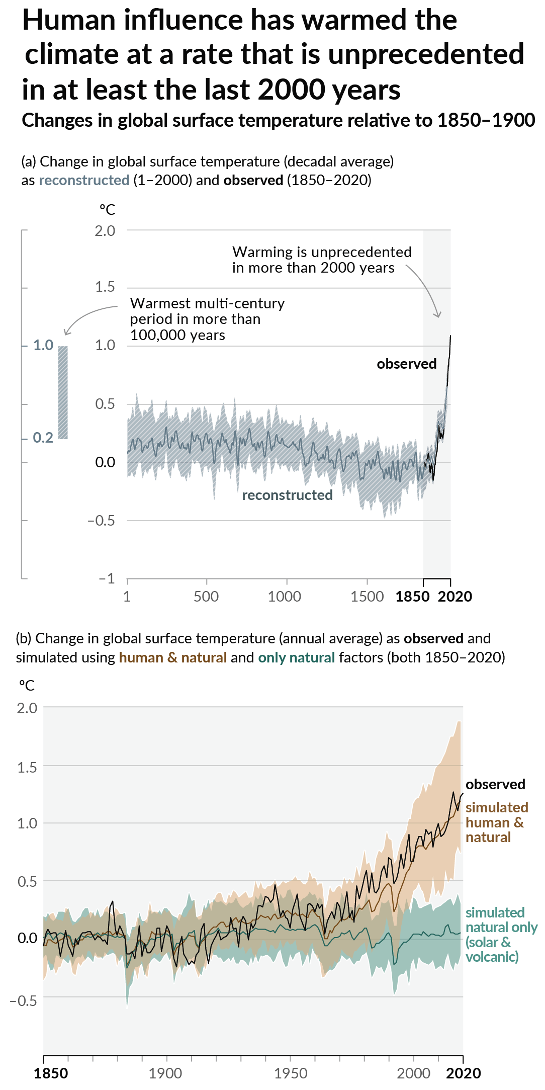
As a starting point, the burning of fossil fuels, and to a lesser extent deforestation and release of methane are responsible for the warming in recent decades:

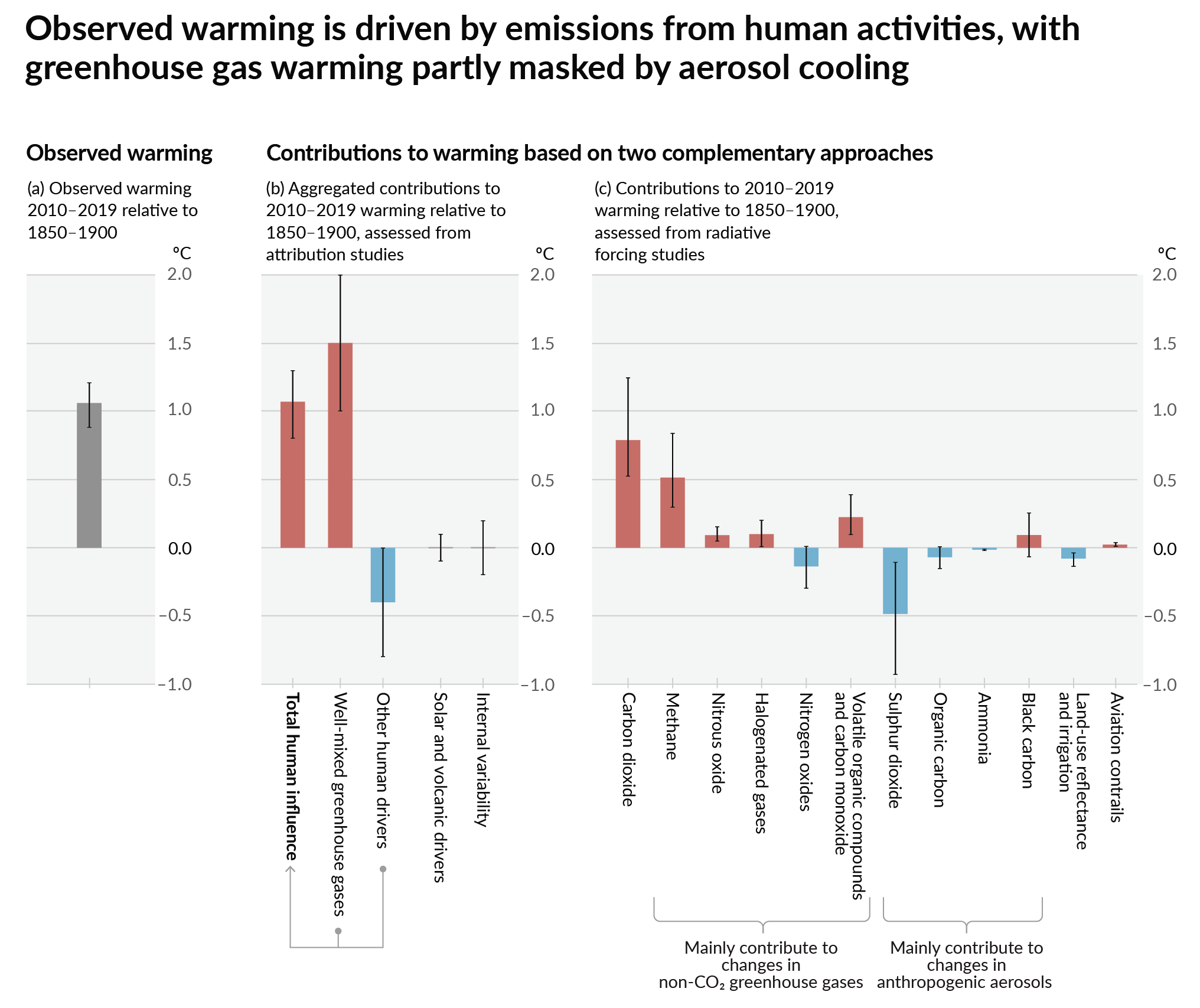
How much each change to the atmosphere has warmed the world:

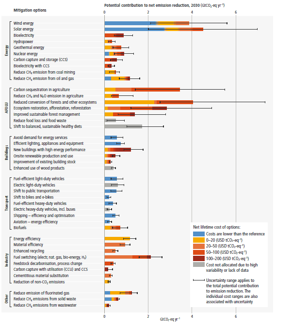
Recommended actions to cut greenhouse gas emissions in the near future:

Anti-science, inactivism, and unsupported conspiracy theories are not ok here.
founded 1 year ago
MODERATORS

Rating wealth by income (which this study does) is unusual and difficult. I don’t actually see any income numbers attached to their analysis which is suspicious.
Anyway, anyone with a net worth of around 90k USD is in that top 10%. Median net worth in the US was 127k in 2019. Which means that more than half of the 350M people in this country are in the worlds richest 10% (by wealth)
Picking a random American off the street gives you better than coin toss odds of finding a person in the “mega polluter” group you see in the thumbnail graph.
Even doing everything you can to "reduce carbon footprints" it's still going to be orders of magnitude larger than a small village farmer in the middle of Nepal.
Doesnt mean it's not worth doing, it just means there's a lot more to be done.
Still though, if you're gonna split up that top 10% into 10 more parts, you will probably once again find that the top 1% is responsible for most of the emissions that the top 10% is responsible for.